works, Commonweal guides founders to find the right moment, rally the right people, and move all the necessary pieces into place to solve the toughest challenges facing America.
OVERVIEW
Nate Loewentheil served in the Obama White House as a Special Assistant to the President at the National Economic Council, where he advised President Obama on emerging technology. With Partner Ron Bloom, Nate contacted C42D to develop a comprehensive rebrand strategy for Commonweal Ventures.
CHALLENGE
Commonweal Ventures helps early-stage founders see government not as an obstacle, but as a powerful accelerant. Led by Nate Loewentheil, former Special Assistant to President Obama, and Partner Ron Bloom, the firm brings decades of public and private sector experience to solve America’s toughest challenges.
When Commonweal approached C42D, its portfolio and influence had grown, but its brand and website still reflected an earlier stage. Our mandate: create a brand and digital presence that matched the sophistication and momentum of the firm today.
DISCOVERY
C42D’s engagement with Commonweal began with deep discovery: a series of immersive workshops, interviews, and landscape analyses designed to uncover the brand’s unique opportunity in a shifting political economy.
What emerged was a clear gap in the market: while others positioned government as a barrier, Commonweal saw it as an enabler — a powerful but underutilized partner for early-stage founders tackling America’s most critical challenges.
This phase allowed us to surface the brand’s core beliefs, emotional drivers, and behavioral traits. It also clarified what truly set Commonweal apart: a commitment to investing in companies that build what matters for America, guided by a nuanced understanding of how public-private partnerships unlock value. These insights laid the foundation for a brand that could confidently lead — not just in message, but in mission.
BRAND STRATEGY AND STORY
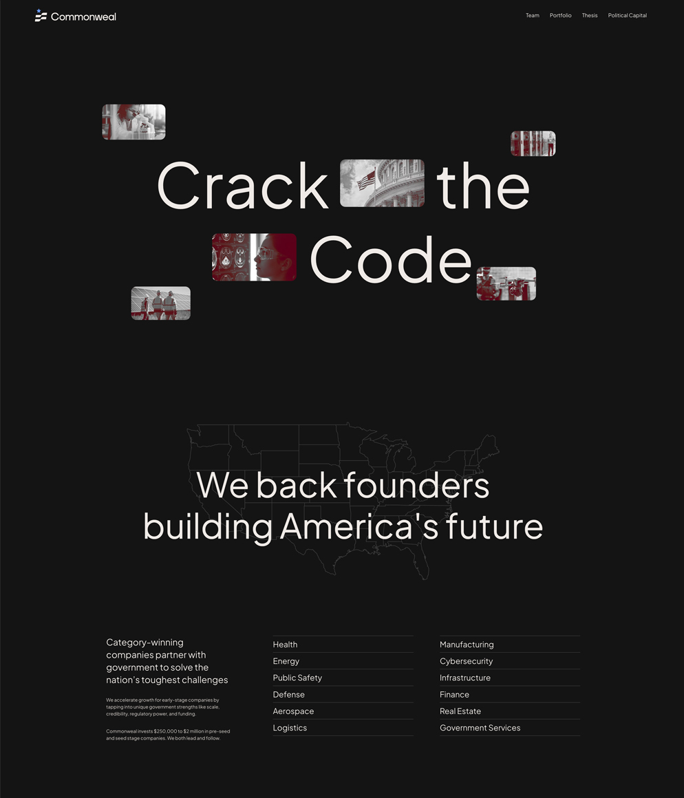
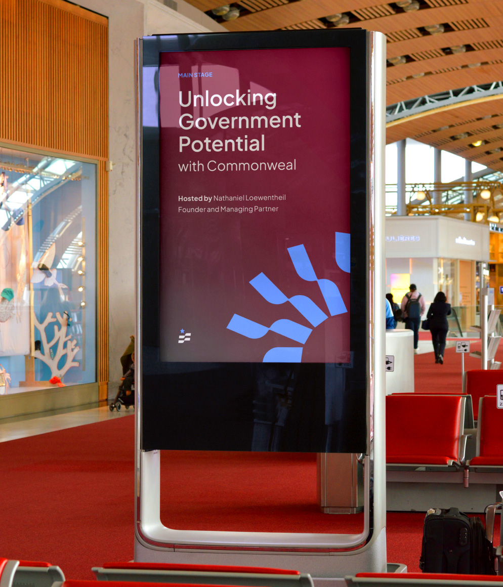
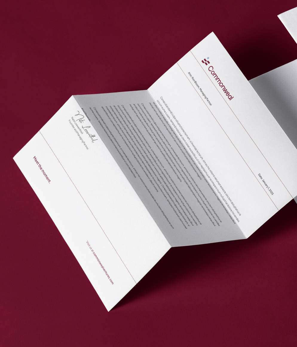
From this foundation, we developed a brand strategy centered around the rallying cry: Meet the Moment. This became more than a positioning statement — it served as the strategic linchpin for the brand’s identity, messaging, and decision-making. In a time of increasing political and economic complexity, Commonweal’s strategy focused on revealing opportunity through alignment with public priorities.
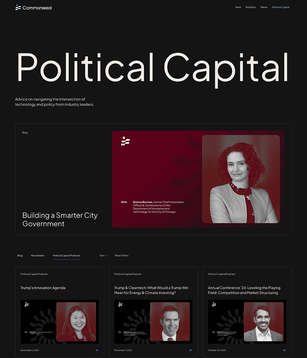
Importantly, we crafted messaging for multiple audiences — founders, investors, and government stakeholders — while anchoring it all in patriotic optimism and grounded expertise.
To bring the strategy to life, we shaped a brand story with both emotional resonance and strategic edge. At the center was the idea of The Intuitive Maestro — Commonweal’s archetype — a unique blend of matchmaker and engineer. This character captures the firm’s superpower: sensing patterns, building bridges, and orchestrating precise alignments between founders and the public sector.
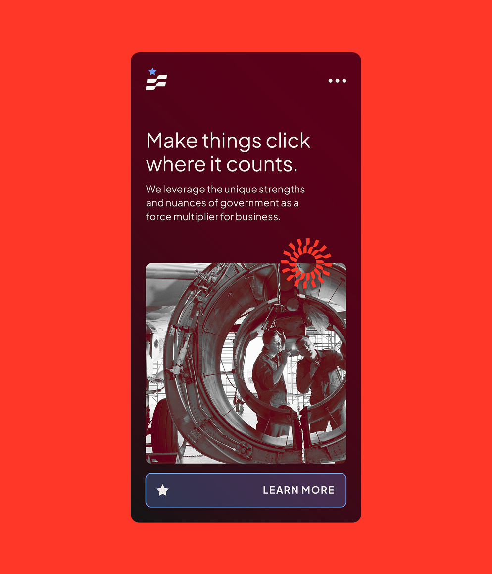
Messaging themes like “Force Multiplier for Business and Government” and “Pulse on the Future of Politics” give Commonweal a powerful narrative to own, while the manifesto and storylines tap into a deep sense of patriotic purpose. The result is a brand that doesn’t just explain what it does — it stirs conviction in why it matters.
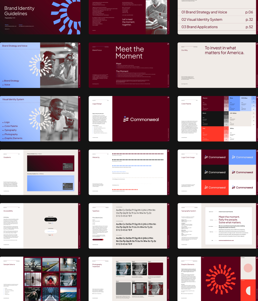
VISUAL IDENTITY
To bring the Commonweal brand to life visually, C42D translated the strategic foundation into a bold, differentiated creative direction. Our goal was to craft a visual system that would resonate with Commonweal’s unique positioning—patriotic yet modern, authoritative yet humble—while standing apart in the venture capital landscape.
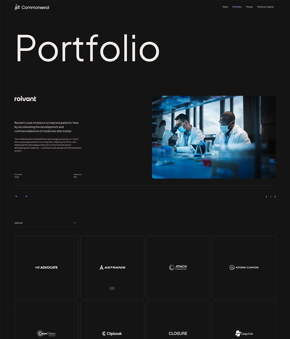
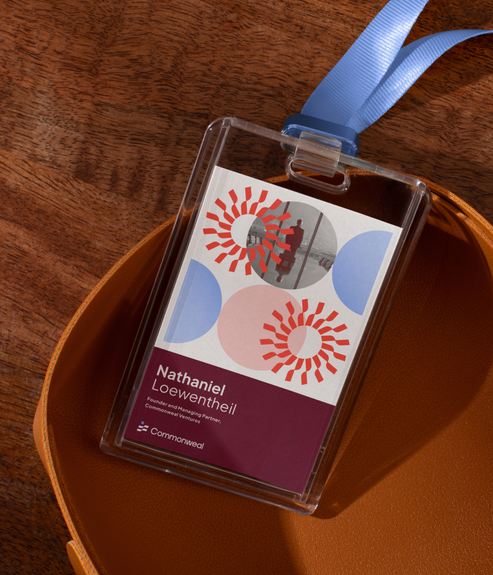
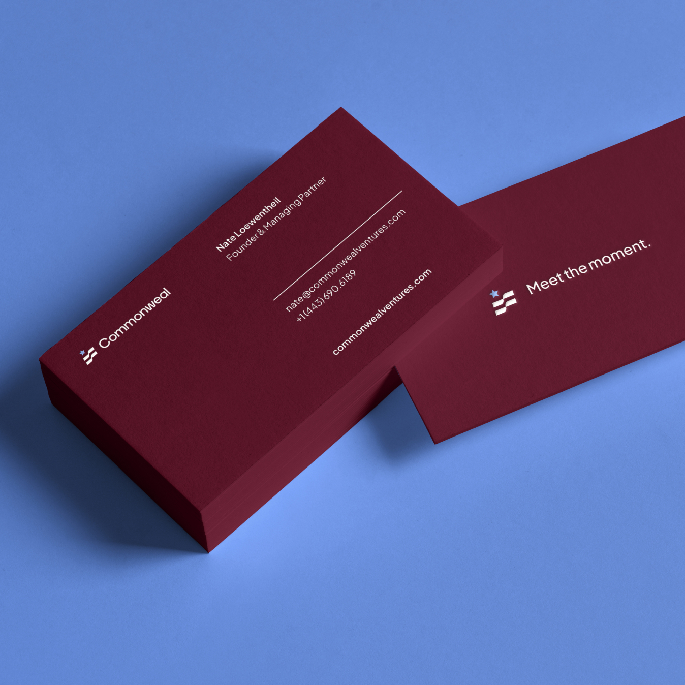
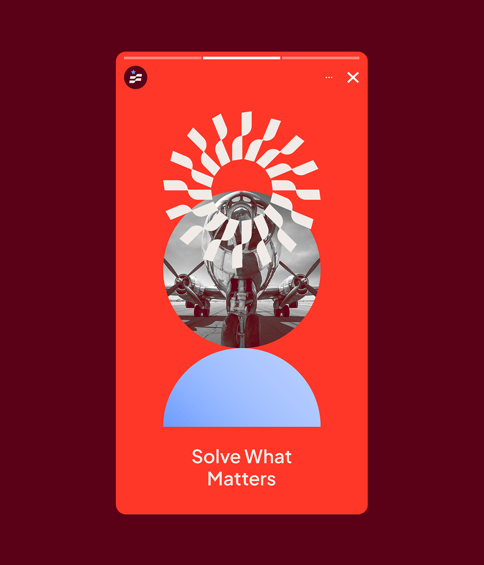
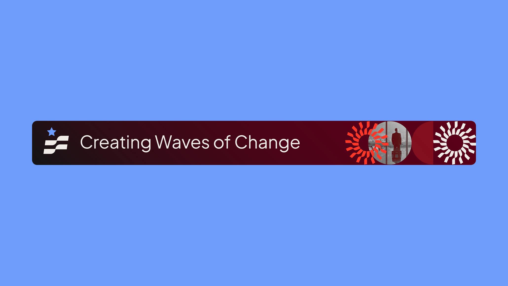
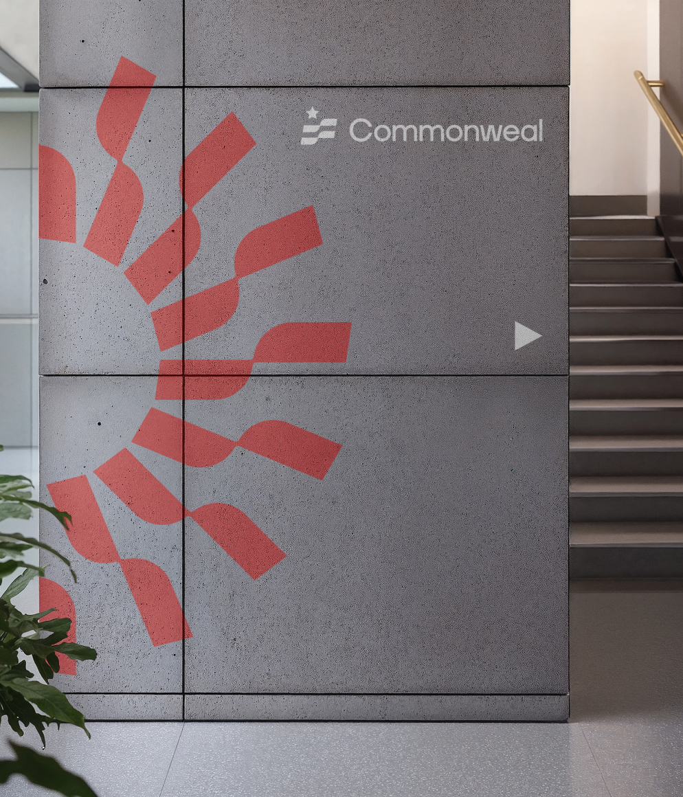
C42D began by analyzing category norms, identifying opportunities to break from the sea of blue-heavy, geometric, and overly tech-driven identities. We recommended a nuanced, subtly patriotic color palette anchored in burgundy, orange, olive green, and light blue—balancing energy, credibility, and warmth.
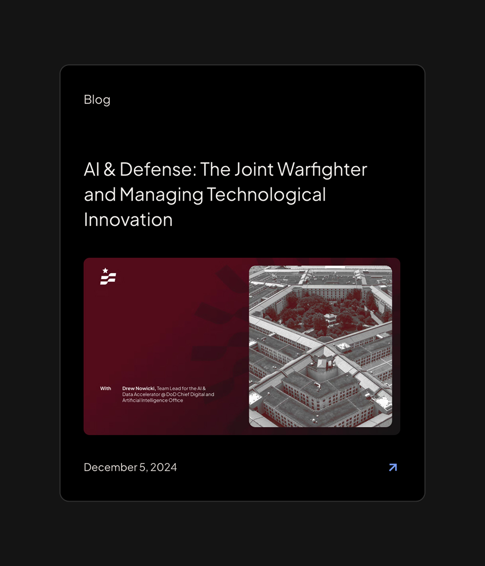
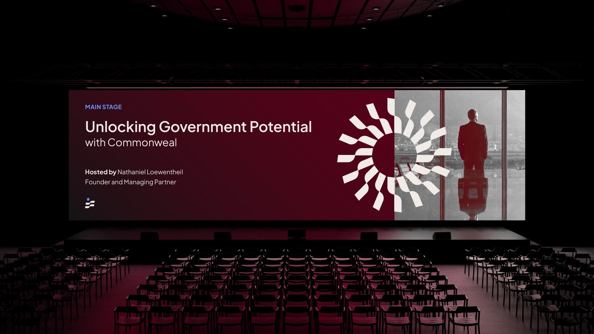
For graphic style, we introduced a system centered around concentric circles—visual metaphors for momentum, partnership, and unlocking opportunity. These elements convey how Commonweal pieces together people, insights, and timing with precision.
Photography was another key lever. We proposed a warm, hope-filled approach focused on real moments of progress and collaboration—underscoring the brand’s commitment to solving what matters for America. Finally, we presented typographic directions built around clean, sans-serif fonts that communicate clarity, humility, and energetic forward motion.
The final creative direction serves as a robust toolkit—strategic, scalable, and distinctly ownable—giving Commonweal the visual language to match its powerful brand voice.