CHALLENGE
The founding team came to C42D with the strategic work already done — brand platform, messaging pillars, competitive analysis, audience segmentation. They knew who they were. What they didn’t have was a visual identity. Our job: translate a well-articulated strategy into a complete identity system. Logo, color, typography, graphic language, photography direction, and a set of brand guidelines the team could build from.
VISUAL STRATEGY
We built the visual strategy around a dual archetype: The Caregiver and The Guide. The Caregiver side — empathy, compassion, emotional support — mapped directly to how Sunfish shows up for patients through their IVF journey. The Guide side — expertise, mentorship, clarity — reflected the practical value proposition: helping people navigate cost, logistics, and clinical decisions they’d otherwise face alone.
The competitive landscape confirmed the direction. Most fertility brands default to soft pastels and stock families (emotional, generic) or fintech-clean interfaces with teal gradients (transactional, cold). Neither worked for a company whose point is that patients shouldn’t have to choose between emotional support and financial clarity.
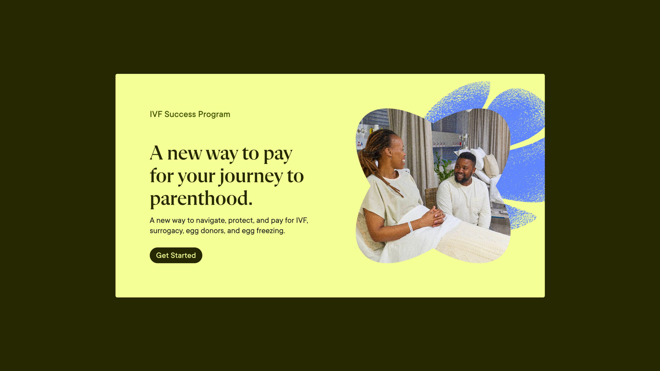
From there, we set preliminary recommendations across four areas. Color would lean into olive greens for growth and resilience, with lavender for wisdom and transformation, warm tones for approachability, and yellow-gold for optimism. Typography would pair a classic serif for headlines — warmth, trust, relatability — with a clean sans-serif for body copy. Photography would use sunlit, golden-light imagery to convey emotional depth and authenticity. And the graphic language would draw on organic, nature-inspired forms.
CREATIVE DIRECTION
The logomark is two fish forming a circle, their bodies curving to suggest babies nestled together. The circle reads as an egg.
The color palette sets Sunfish apart more than any other element. Deep olive and mid-tone olive ground the brand — a direct departure from the pastel fertility default. Citrus yellow and periwinkle blue serve as primary brand colors, with orange and gold at the edges.
Typography pairs Flecha M — a modern serif — for headlines with Inter for body copy. The serif gives headlines an editorial quality most healthcare brands skip.
Graphic elements draw from nature: flowing botanicals, coral-inspired forms, organic shapes that reference growth while nodding to the Sunfish name.
Photography splits into two modes: sunlit (golden light, film grain, emotional portraits) and realistic (neighborhoods, communities, environmental context). Both share the same grain treatment, tying the system together as one visual series.