OVERVIEW
The Maybe is a consultancy and collective challenging the power and politics of technology. Led by founder Alix Dunn, the organization consults with people-centered organizations, runs the Computer Says Maybe podcast, and cultivates a network of change agents through its New Protagonist Network.
When The Maybe came to C42D, the work had outgrown the brand. What began as a one-person consultancy had expanded into three distinct offerings across consulting, media, and community, but the identity was still fragmented across four separate sub-brands. Our mandate: consolidate everything under one name, one visual system, and one digital presence that matched the organization’s ambition and reach.
EXPLORATION
We started with stakeholder interviews across the founding team to understand what The Maybe actually was and where it was headed. The answers were instructive: part consultancy, part media platform, part collective, but none of those labels captured the whole.
Through competitive analysis, we mapped the landscape across three categories: social impact consulting, tech-and-society media, and advocacy collectives. The Maybe didn’t fit neatly into any of them. That was the opportunity. The organization sat at the intersection of the private sector and civil society, offering something the category lacked: strategic direction grounded in critical thinking about technology, delivered with the rigor of a consultancy and the reach of a movement.
The key insight from discovery was that The Maybe needed to stop explaining itself through its parts and start leading with what it stood for.
CREATIVE DIRECTION
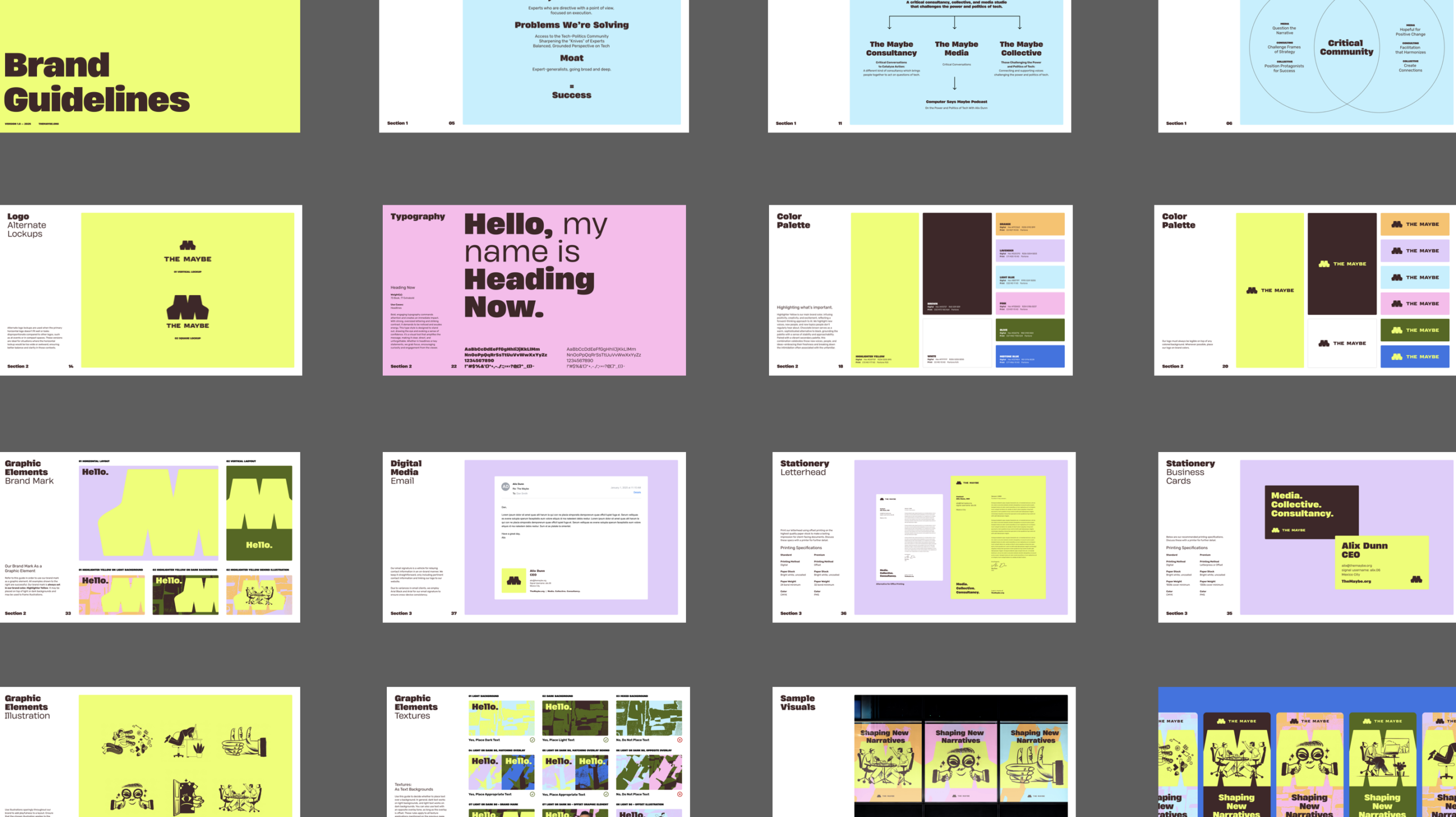
The visual challenge was specific: The Maybe needed to stand apart from three adjacent categories at once. Social impact consultancies default to dark blue and data graphics. Tech podcasts skew eclectic and 8-bit. Advocacy organizations lean into red-white-blue and parchment.
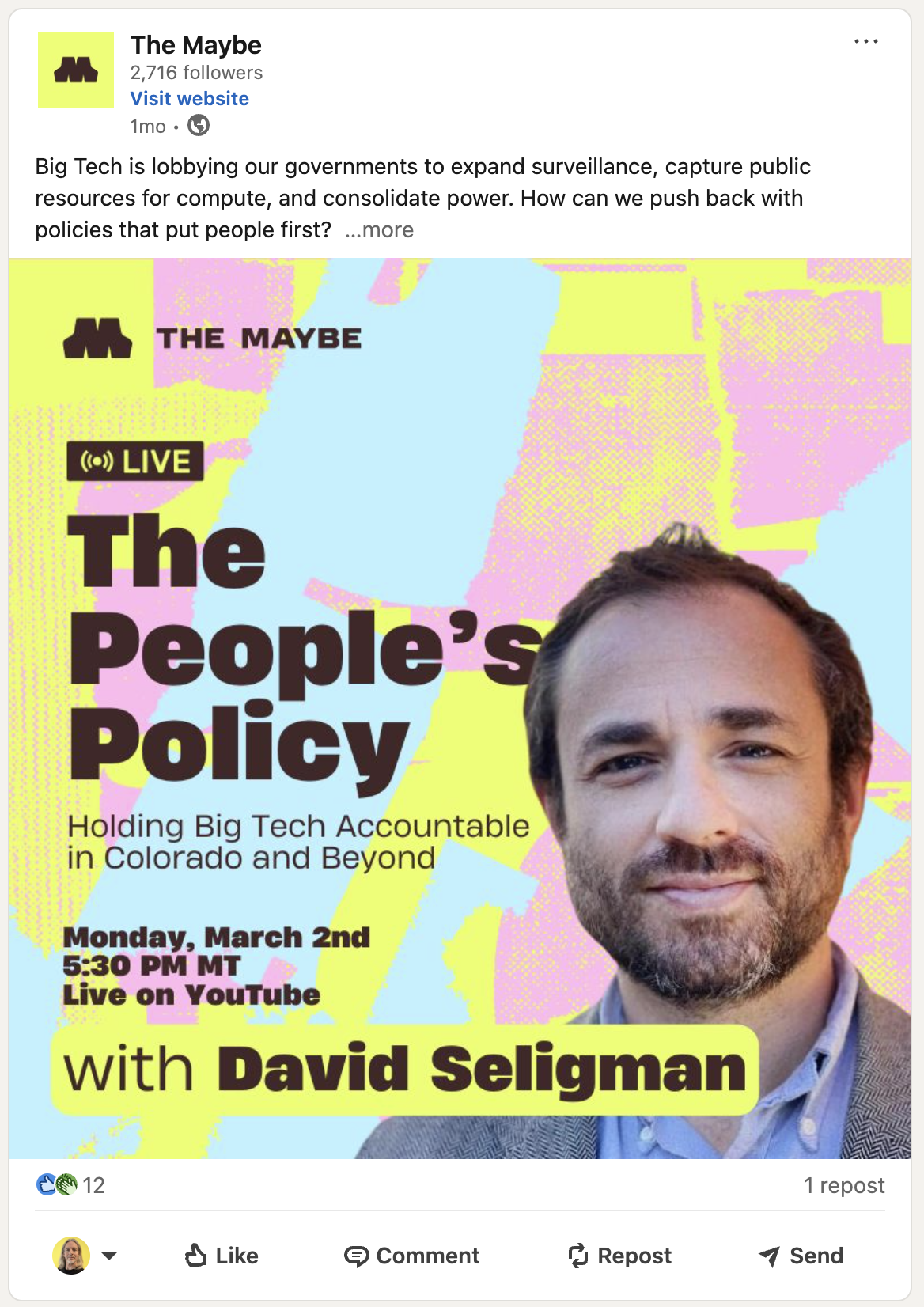
We designed a screening process to filter out anything that could be mistaken for a competitor, then built a system that owned its own territory. The result was a bold, high-contrast identity anchored by a chartreuse-and-chocolate-brown palette, a wide geometric M mark, and a custom illustration system that brought warmth and personality to every touchpoint.
The typography was set in a heavy, rounded typeface, commanding attention while staying approachable. The illustration style used hand-drawn characters and objects, layered over abstract color fields, to evoke curiosity and movement. Together, the system gave The Maybe a visual language that felt energetic, grounded, and unmistakably its own, as comfortable on a podcast thumbnail as a conference stage.
ACTIVATION
With the brand and creative system established, we turned to the digital presence. The existing site reflected an earlier, more fragmented version of the organization and didn’t communicate the breadth or credibility of the work.
We redesigned the information architecture to guide three primary audiences: organizations seeking consulting, experts looking for community, and the broader public following the conversation around tech and society. Content was restructured to lead with the mission and make the relationship between offerings intuitive.
The site was designed and built in Webflow, drawing directly from the new brand system. The chartreuse palette, bold typography, and illustration library were integrated into a modular layout built for flexibility and easy content updates. The result was a digital presence that matched the ambition of the brand: distinctive, accessible, and built to scale.