Six Key Principles of Brand Typography
Work on any brand design project and the term “typography” inevitably pops up—but it’s not just a buzzword you can afford to dismiss. Read on for our guide to six key concepts to understand.
Typography is the art and technique of arranging and designing text to make it visually appealing, readable, and effective. A thorough and deliberate approach involves selecting and arranging fonts, font sizes, spacing, and other text elements. The way your type is presented goes beyond mere aesthetics to convey information, evoke emotions, create a distinct visual identity, and establish trust.
Typography plays a central role in shaping how your audience perceives your brand—across all communication channels, from printed materials like books and posters to digital content like websites and apps. This makes it a key consideration in your branding journey.
The elements of typography
As you work through comments and considerations around typography, you will likely be asked for feedback on each of these different elements.
- Typefaces
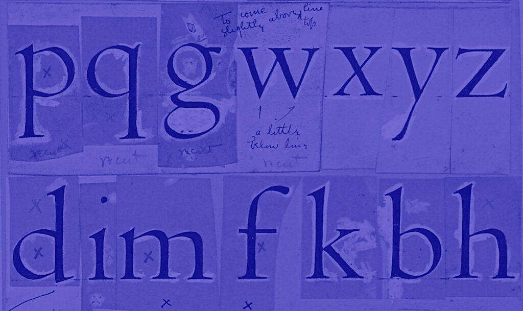
Commonly referred to as “fonts,” typefaces are the basic building blocks of typography. Choose between the clean edges of sans serif or the statelier presence of a serif font, or from other styles like a cursive script, handwritten scrawl, or even boldness. When choosing a typeface for your brand, consider its readability, appropriateness for your audience, and alignment with your brand personality.
- Font Size
Use size strategically in print versus digital settings. Different typefaces may require different sizes for optimal readability, but you will also want to factor in the impact for headlines and how easy it is to scan a piece of longer-form copy. Body text should generally be larger than decorative text. Mobile devices and desktop screens also have different size requirements, so responsive design is crucial.
- Line Spacing (Leading)
Line spacing, also known as “leading,” is the vertical space between lines of text. Proper leading ensures lines don’t feel cramped, making text more comfortable to read (and users more likely to engage). Too much leading can make text seem disconnected and sloppy, while too little can make it hard to distinguish between lines. Leading should never be considered in isolation; considering it within the context of your print or digital designs lets you factor in the impacts of media or colors, which can affect how leading is perceived.
- Line Length (Measure)
The length of a line of text, or its “measure,” directly impacts readability and, therefore, can impact brand relatability. Lines that are too long can be challenging to read, as readers may lose their place. On the other hand, lines that are too short can make text feel fragmented. These sorts of uncomfortable experiences when trying to engage with your brand may trigger negative associations, pushing your audience away. Careful consideration of the experience around reading your text will help drive engagement.
- Color
Color, including the color of the text and the background, plays a significant role in typography. It affects legibility, with major impacts ranging from accessibility concerns to emotional effects. Always ensure that your text has sufficient contrast with the background to make it easy to read, but consider using muted tones and shades to help smoothen out the text, or pops of color to help draw the eye in. Always consider the colors you choose within the context of your brand values, and make sure your choices support and reinforce the right direction for your brand.
- Hierarchy
Typographic hierarchy involves using different font styles, sizes, and weights to establish a visual order in your content. It guides readers’ eyes, indicating the importance of various elements. Headings, subheadings, and body text should all have distinct styles to create a clear hierarchy. Particularly within digital settings, this can have far-ranging impacts from user experience through SEO.
How you present your words can help make or break their impact on your target audience. As you navigate branding and marketing, carefully consider how people will interact with and experience your content. Use the parameters above to get specific with your design feedback during the development process so you can have more productive conversations.