Subway Startups Survey: Edition III
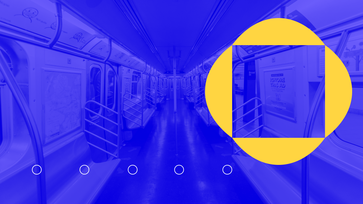
Welcome to our third and greatest-yet installment of the C42D Subway Startups Survey!
The Subway Startups Survey is C42D’s review of the brands we see plastered on the walls in NYC subway cars and stations on our daily commute. Sort of an art-school critique on the latest startups, micro-brands, and disruptive tech firms that beg for our attention every morning.
In other words, It’s a great way to see what’s on-trend in the largest market in America, and where the startup world is headed, design-wise.
We’re also introducing a new award for the best branding for each quarter: The Golden Token, a tribute to the glory days of the MTA when tokens were the currency and the trains were downright scary (and not full of startup ads).
So, without any further delay, here’s the third (and greatest-yet) installment of our Subway Startups Survey!
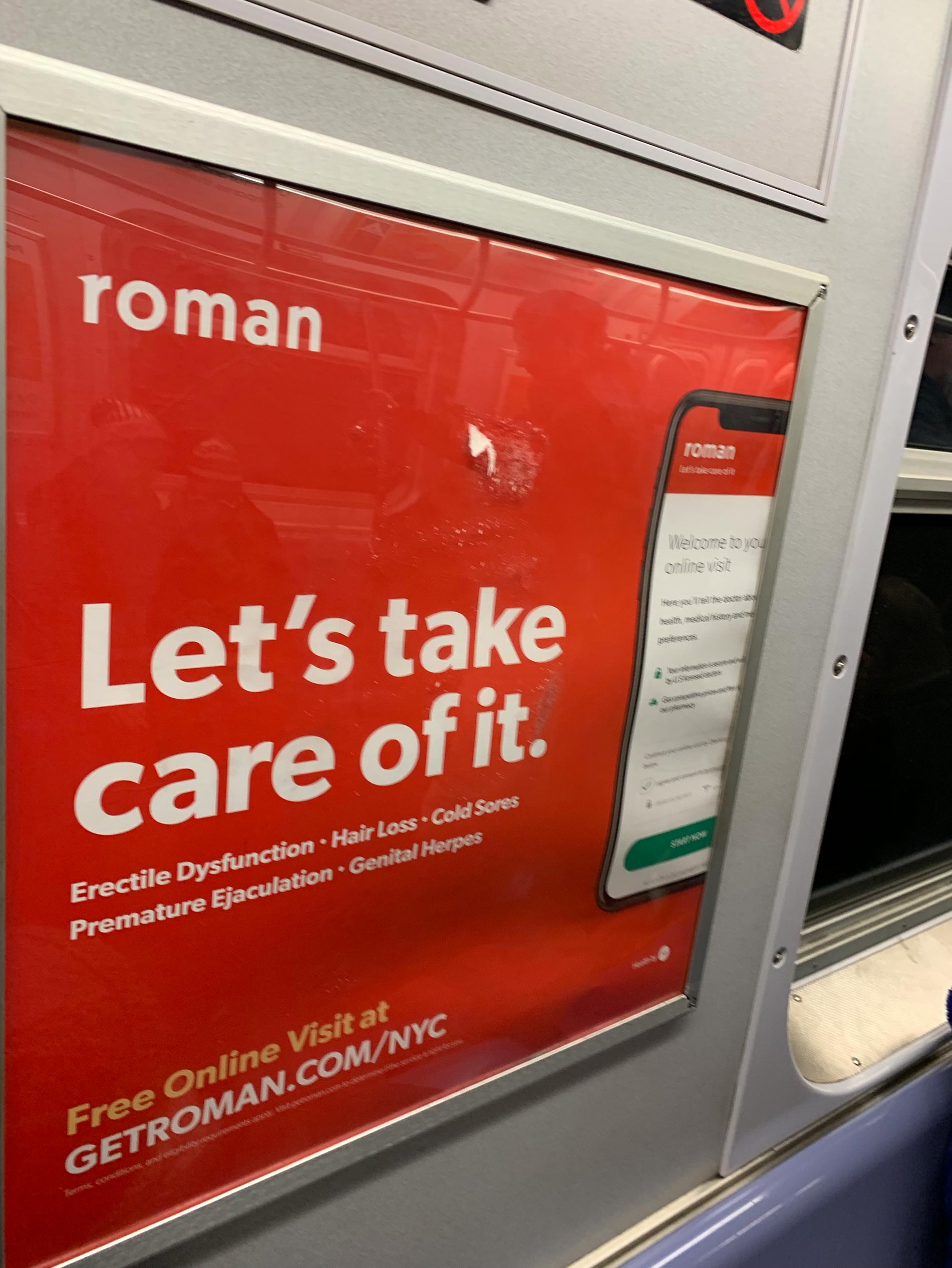
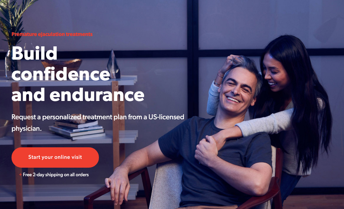
No. 1: Roman
Vertical: Pharma
Tagline: Let’s take care of it
Total Funding: N/A (Privately Held)
Target: Millennial men with embarrassing health issues
Pain Point Solved: Not having to actually tell another human about the above
The Concept:
Erectile dysfunction. Hair loss. Cold sores. You get the point. What guy in his right mind would want to discuss these messy, personal problems with another human being? How to take care of it?
Enter roman to the rescue, delivering the answer via chariot to your door in a discreet unmarked package. Your secret is safe. Package received. Problem solved.
Why we Dig This Brand:
Roman has a good point. I’m a man in his 40’s and I am uncomfortable imagining what my co-workers are thinking as I write this article with the roman site on my second monitor. No really – just writing an article here! I don’t actually need this stuff! So yeah, I would say they have their buyer personas nailed to a T.
At a time and in a city with so much information overload and competition for our eyeballs, roman does a good job of simplifying their brand and messaging down to what matters. Color palette: black, red, green. Excessive marketing copy? Nope. Logo? one word, one color.
The strategy of de-stigmatizing embarrassing, Scarlet-Letter-ish personal issues is in line with what other health-tech brands are doing. It’s all about normalizing the formerly abnormal. Hey bro, it’s ok. We all have problems. Come, enter our colosseum. Wrap yourself in this sheet over here. Everything will be just fine, bro. Mr. Happy will come back.
ED you say? What ED?
In summary, less is more and in this case, it works (minus the cliché photo above). And now, I can finally get this website off my screen before someone thinks I’m losing my hair…
No. 2: Sir Kensington’s
Vertical: Food & Beverage
Tagline: Abandon All Bland™
Total Funding: 8.5M
Target: Millennials lacking in Special Sauce
Pain Point Solved: Friends ripping on your lame-o Heinz Ketchup at the back-yard BBQ
The Concept:
Our second, slightly quirky Subway Startup takes us to a new category for this series: Condiments. This brand is clearly in the “problems we never knew we had until you pointed it out” category. Who knew ketchup needed to be disrupted? (and apparently, it’s working).
But, when you think about it, it makes total sense. You can’t drink off-off-label microbrews, munch on Himalayan-salted-organic-sweet potato chips, and then have boring, mom-and dad-ish condiments (think French’s Mustard) when the veggie dogs and impossible burgers are served.
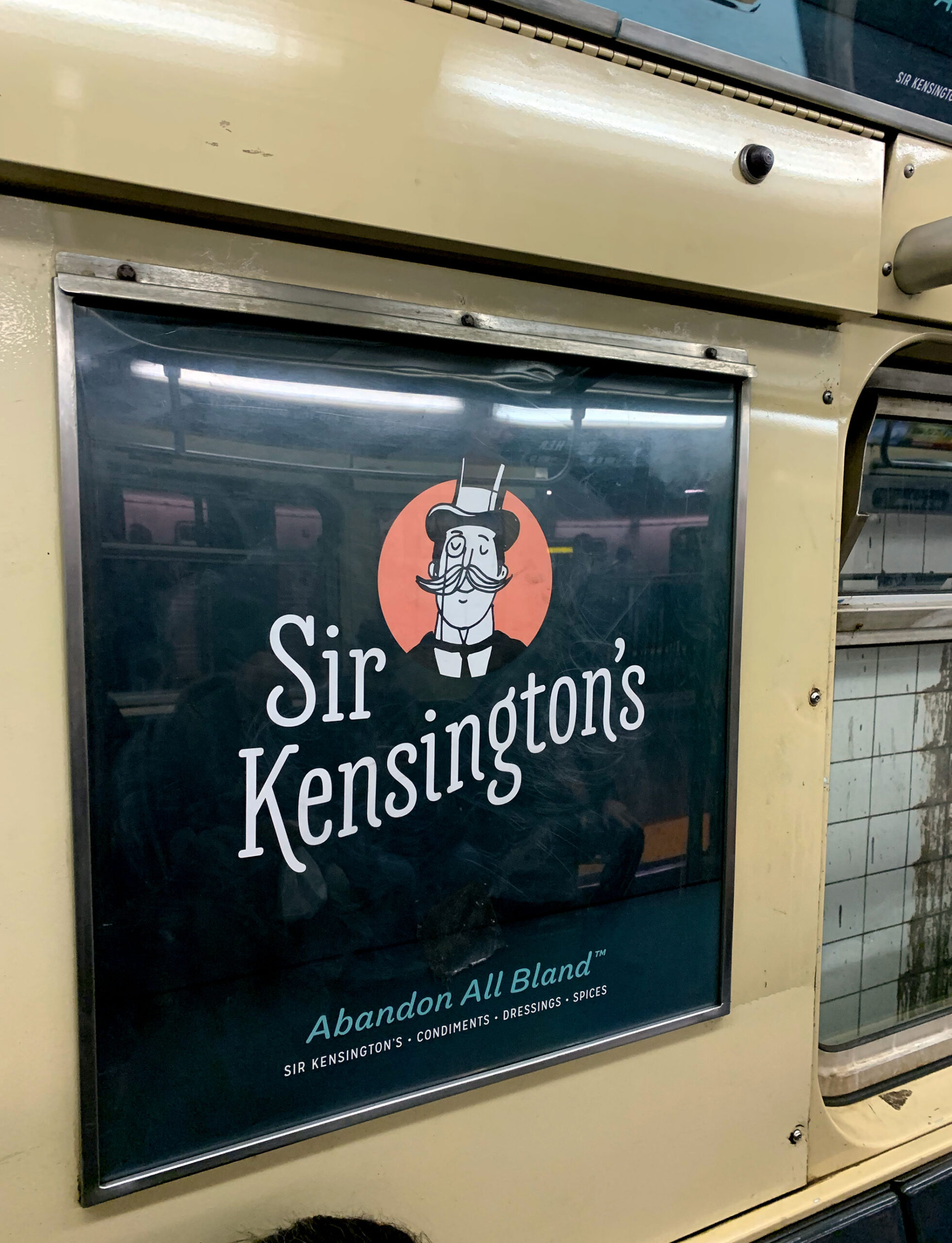
S.K.: disrupting ketchup since 2008.
Why we Dig This Brand:
Sir Kensington, in addition to having an awesome name, has a really cool mission as well: “To reimagine ordinary and overlooked food with fearless integrity and charm.” This means, of course, non-GMO everything, Certified Humane, Free Range Eggs, and less sugar than the Leading Brand. The concept is long overdue and meshes nicely with millennial’s need to one-up each other on the hot sauce scene. And can you say KETO certified? You know it!
The logo manages to pull off the double duty of feeling classic and modern at the same time through the use of color, illustration and an über-cool typeface. “Abandon all bland” is a great tagline that also sounds great when spoken and meets the three-words-or-less tagline goal we have here at C42D. Triple win!
The illustrations are cool, a little quirky, and the package design feels hip, being anchored around an evergreen color you don’t typically see in the mustard section. The copywriting picks up on the off-beat tone and feels on-brand. And, keeping in line with current trends, there is an “SK Lab” on their website. I can only imagine what awesome condiments the Lab is cooking up.
No. 3: Policy Genius
Vertical: Consumer Insurance
Tagline: Our insurance website compares theirs
Total Funding: 51.1M
Target: Millennials who just got kicked off Mom’s plan
Pain Point Solved: Getting a bunch of insurance quotes with minimal effort
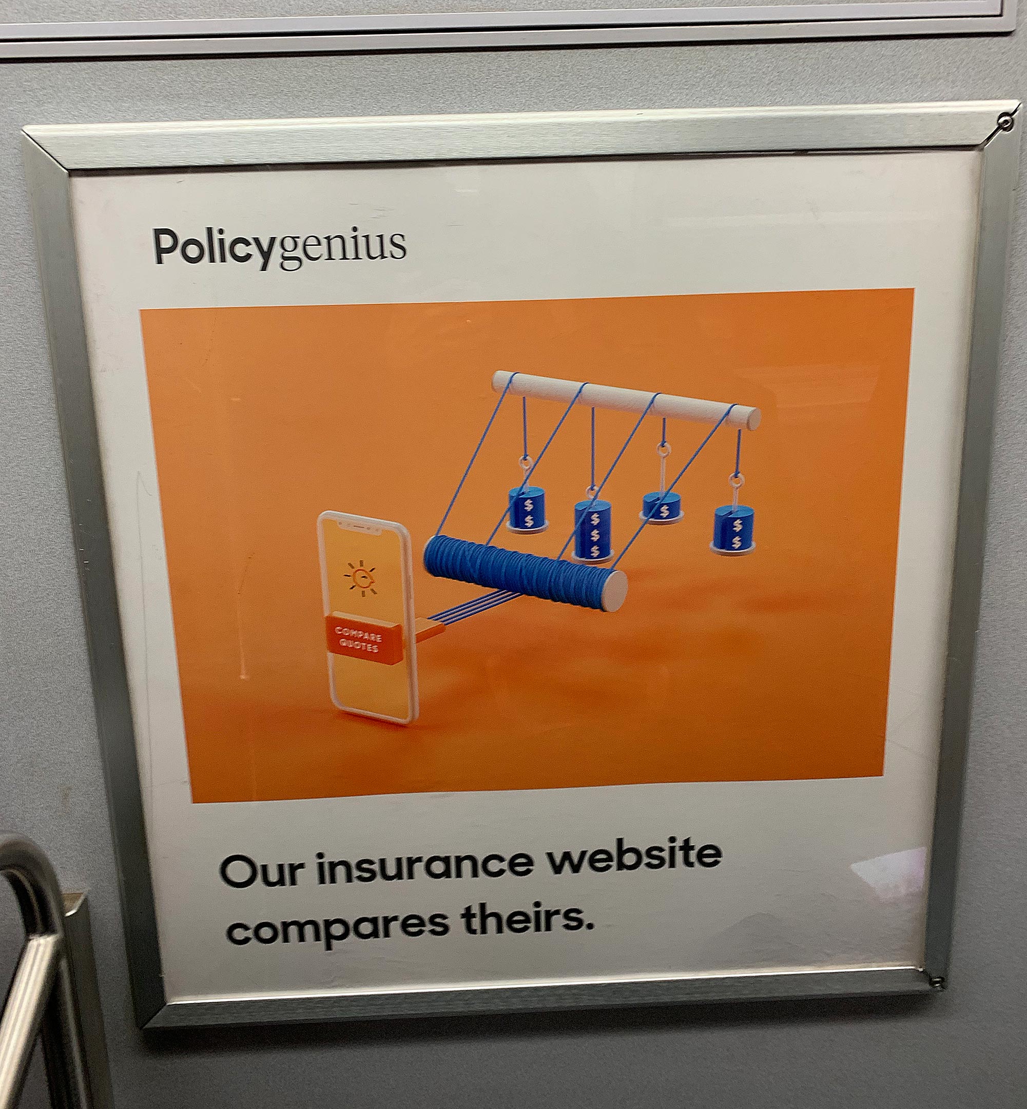
The Concept:
There is nothing fun or cool about finding insurance. Like the Department of Motor Vehicles, it is a necessary evil we all must endure at some point – ideally as little as possible. Wouldn’t it be cool if there was a Kayak-like site that could do all the work for us and come back with a bunch of quotes? And then, we could just, like, push a button and be done with it?
That’s the genius of PolicyGenius, simply learn, compare, and apply. Free of hassle, and free of charge.
Why we Dig This Brand:
At C42D we’ve worked with a few insurance brands recently, and PolicyGenius is hitting the right chords, namely:
- Keeping the marketing language and tone clear and “in plain English”
- Focusing on being advisory and not pushy/ sales-y
- Giving quotes without asking for a zillion bits of personal info.
The logo is a nice mashup of trendy serif and sans-serif fonts, and it works well. If you didn’t think all-black logos were cool before, you will now. And, everyone knows that if you add “genius” to the end of your startup’s name, you get an instantly cool-sounding moniker. Hence, RapGenius, SocialGenius, ThreadGenius, DoctorGenius, and yes, CBD Vape Genius.
The illustrations in the subway campaign are cool because they are 3D and orange. Seriously, who knew if you hooked your smartphone up to a winch and some pulleys it could compare all those quotes? I was clueless about how Policygenius worked it’s magic until this illustration broke it all down for me.
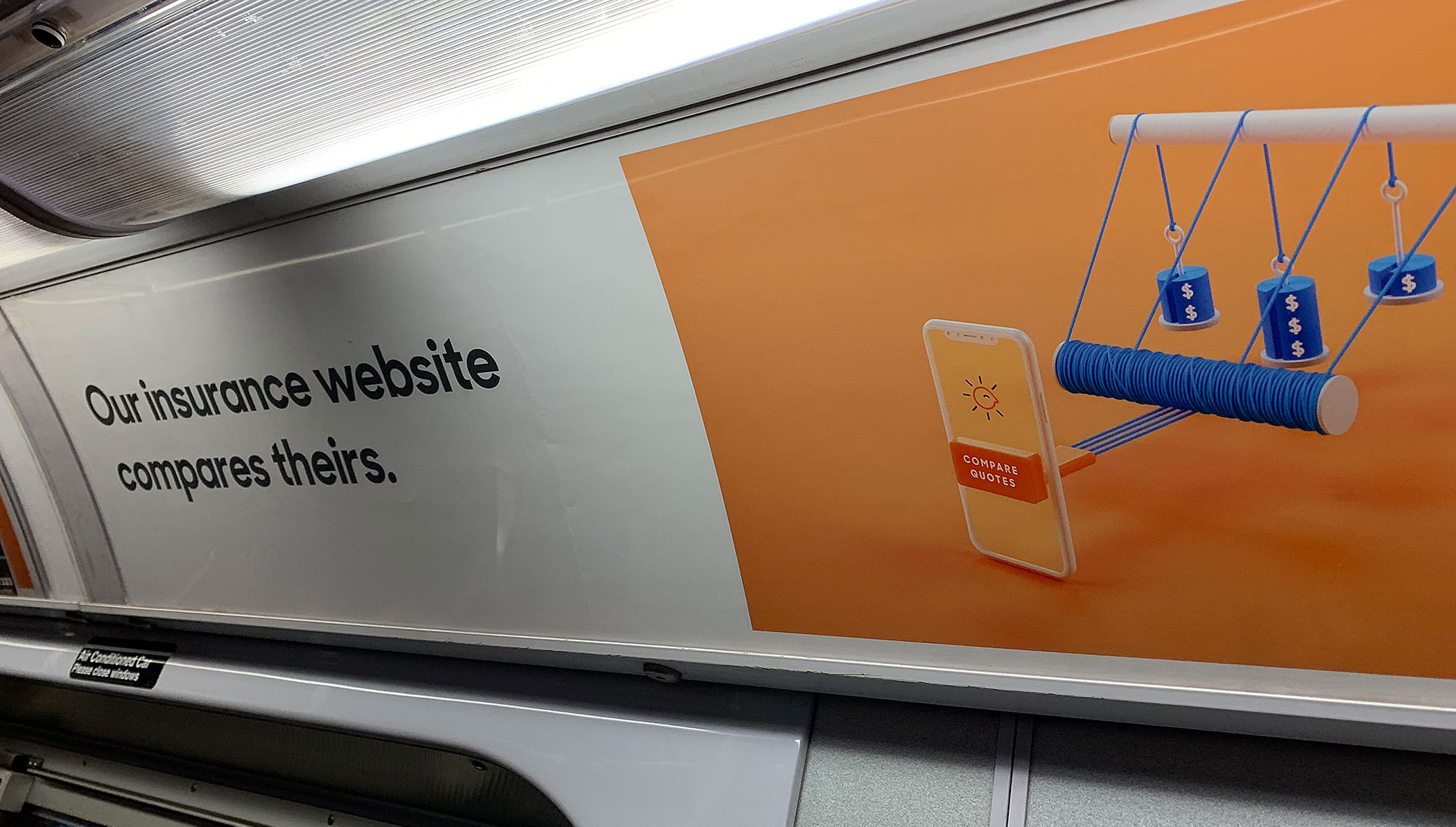
Errr… do you have a logo? a website?
Genius naming strategy and weird-3D-Illustration issues aside, Policygenius does a great job on messaging and overall brand strategy, and crushes user experience on their website. I just wish they could, you know, put their logo or URL on the subway ad. It helps conversion rates, I’ve heard…

And The Winner is…
Well, another Subway Startups is in the can, a genius-session spanning everything from GMO-safe relish to keeping Mr. Happy in shape without anyone knowing your dark secret. As always, it was a photo finish, but the first Golden Token Award goes to… Sir Kensington. Their classic-yet-chic design, super cool mission (healthier, safer food), and bizarre strategy of disrupting condiments is just too awesome to resist. Well done, Sir!
Well, that’s it, we hope you enjoyed another of our forays into the land of mass-transit advertising. Let us know your thoughts: do you have a suggestion or a brand we should check out? Did this edition cut the mustard? Drop us a line in the comments section. Actually, we don’t have a comments section but feel free to reach out to us here for any feedback, we’d love to hear from you!
(most) Photography by David Card. All trademarks are the property of their respective owners. Funding amounts as of 08.05.19 provided by CrunchBase.
If this article helped you, please help us by sharing it or recommending to a friend. Thank you!