Subway Startups Survey: Edition II

Welcome to our second quarterly installment of the C42D Subway Startups Survey.
The Subway Startups Survey is a review of the brands we see plastered on the walls in NYC subway cars and stations on our daily commute. Sort of an art-school critique on the latest startups, micro-brands, and disruptive tech firms that beg for our attention every morning.
In other words, It’s a great way to see what’s on-trend in the No. 1 market in America, and where the startup world is headed, design-wise.
So, without any further delay, here’s the second installment of our Subway Startups Survey!
No. 1: Capsule
Vertical: Pharma
Tagline: NYC’s better pharmacy
Total Funding: 70M
Target: Sick, Lazy Millennials
Pain Point Solved: Not having to walk down the street in January
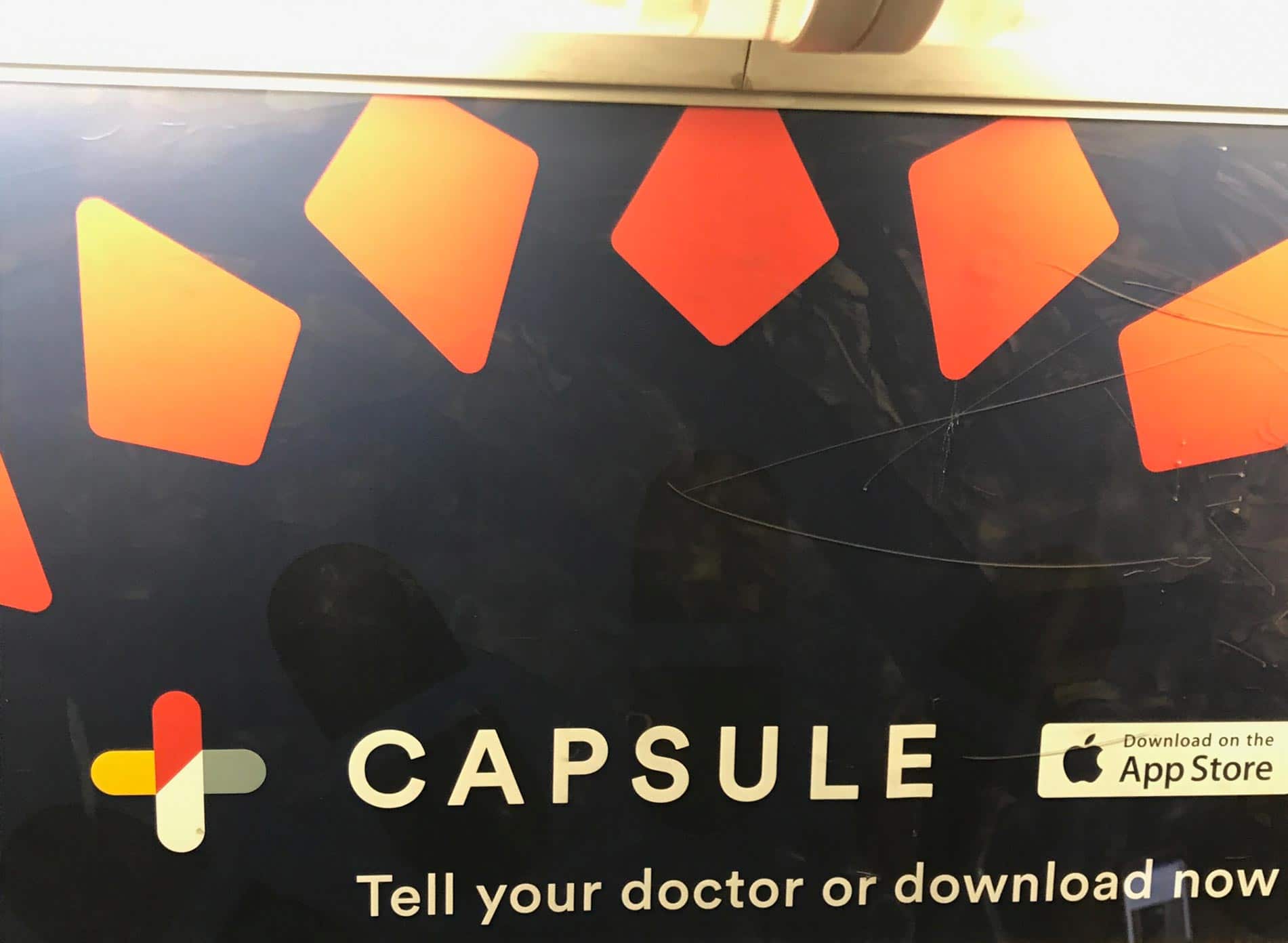
The Concept:
Unless you live under a rock, its been hard to miss Capsule’s entry into the NYC pharmacy market. When you think about it, the idea is solid: what sucks more than waiting like, forever in line at the corner pharmacy behind some 90-year-old senior citizen arguing about his fiber supplement? Or, maybe you’re a tad embarrassed and don’t want anyone to know you’re on anti-depressants (hint: we all are). Either way, you have to admit it’s a stroke of genius.
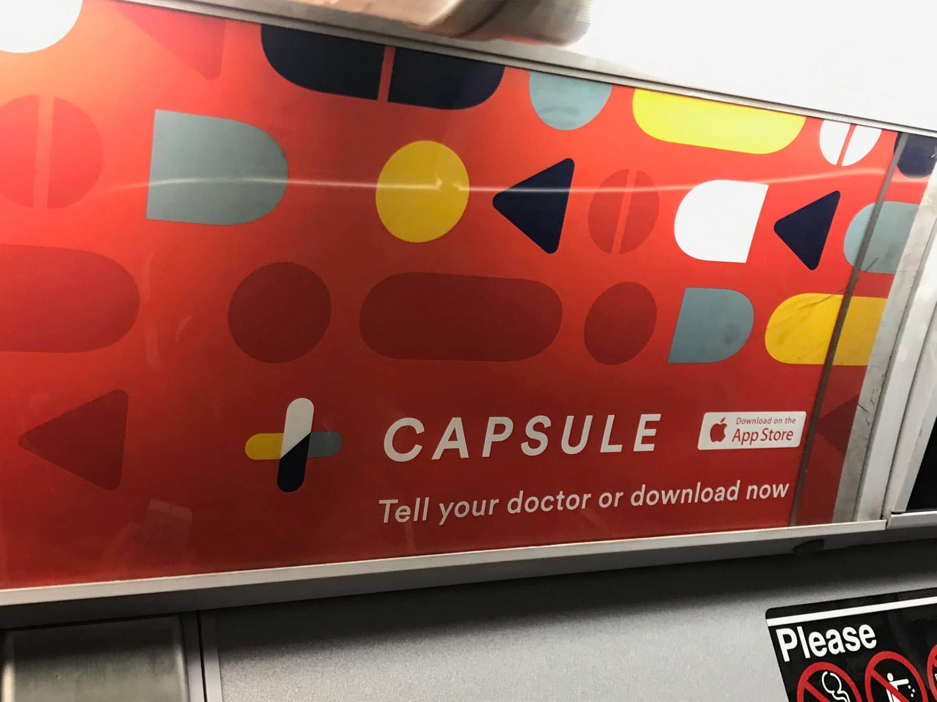
Why we Dig This Brand:
The simplicity of making a hospital cross out of two pills is pretty genius. And look at the background pattern – more pills. There’s even a made-with-pills Chrysler Building on their website. In our pill-laden society, this is some design language I can get on board with. And hey – no photo shoot necessary. Man, I am getting a headache just thinking about all this. In all seriousness, the fonts, colors, and simplicity of this brand are sure to have millennials all across the city walking even less than usual.
No. 2: Figs
Vertical: Hospital/ Medical Employees
Tagline: Get ready to love your scrubs
Total Funding: 72M
Target: Millennials who hate their scrubs
Pain Point Solved: Flirting with co-workers no longer feels so awkward
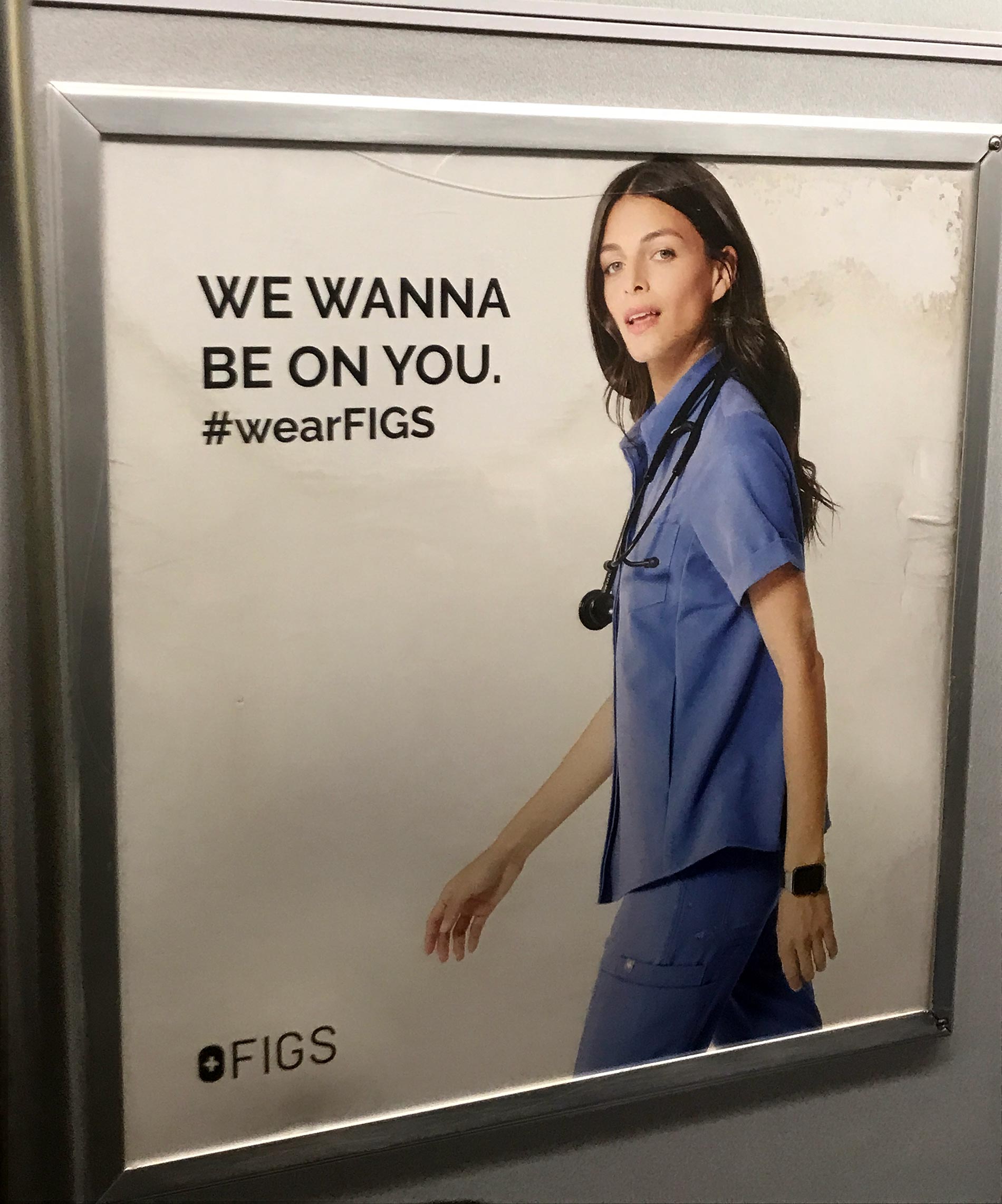
The Concept:
This brand is clearly in the “problems we never knew we had until you pointed it out” category. Who knew hospital workers were so despondent? As if this occupation isn’t hard enough already, you have to wear scratchy, unflattering SCRUBS? Say it ain’t so! Really, when you think about it, it’s a pretty smart play – and I can think of 72 million other reasons why this is a good idea. Heck, I even want to rock some of these outfits (which I believe is part of the plan).
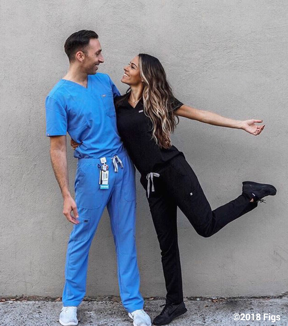
Why we Dig This Brand:
Figs made it into this edition of the Subway Startups on pure concept alone (because it’s like, wow). Brand-wise, there’s not much: A Chanel-esque black and white color palette, A logo that looks like DIN light with a plus symbol, and not much in terms of secondary elements. The photography is more or less par for the course in health-related startups: Super happy millennials in scrubs looking fashionable at work for the first time since… ever. It seems like most of the 72M went into building out a solid e-commerce experience which I can’t fault them for. Overall, a fascinating concept we would have never even thought existed.
No. 3: Daily Harvest
Vertical: F&B
Tagline: Superfoods. Super Fast.
Total Funding: 43M
Target: Lazy Millennials burned out on fast food
Pain Point Solved: Ability to drink $8 smoothies without leaving your sofa
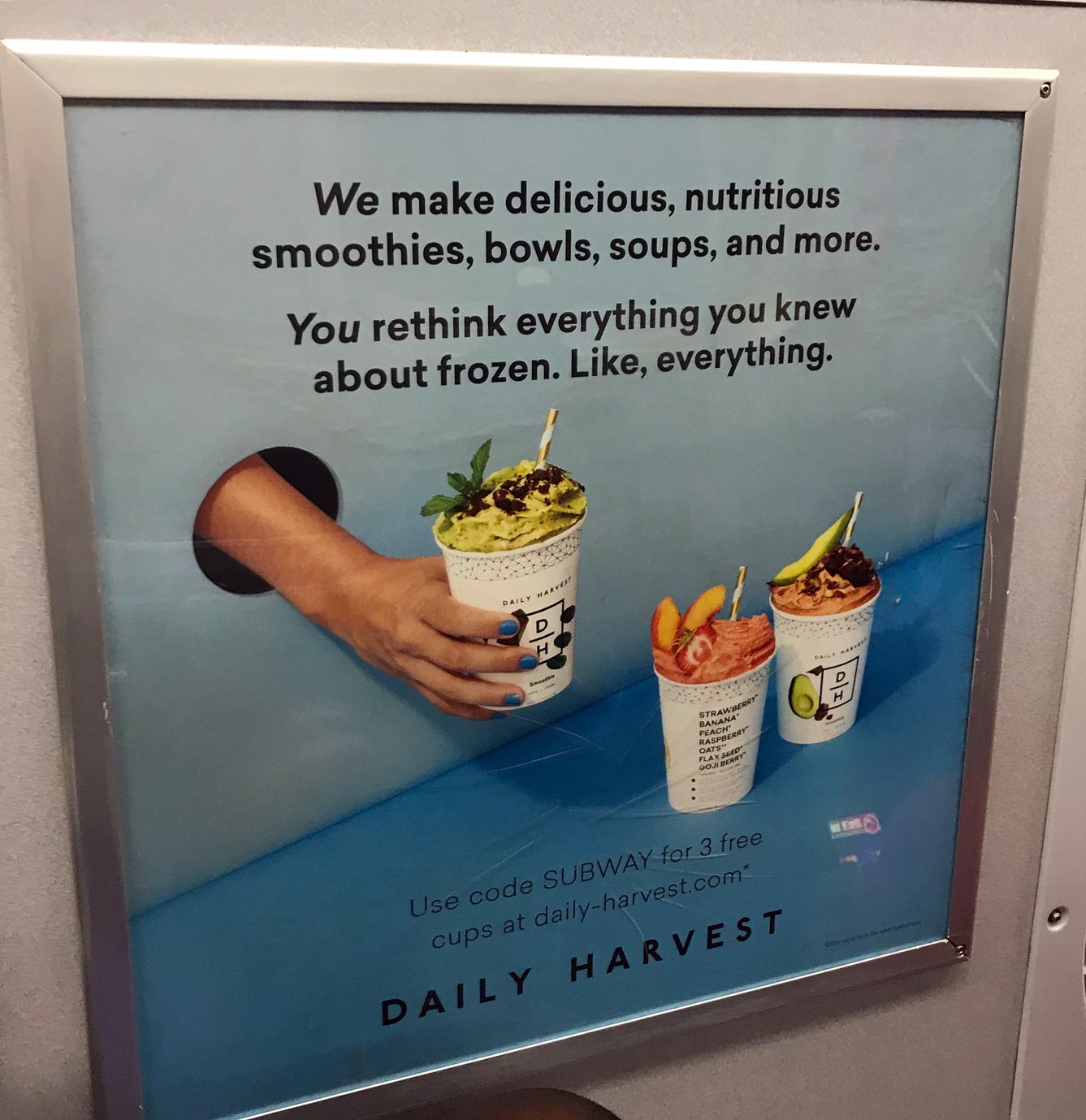
The Concept:
You don’t have to walk far in Manhattan without tripping over something organic, farm-fresh, hand-curated and environmentally sound. My how far we’ve come from 42ndStreet in 1985. These days, it’s all about goodness, and what is better than a ginger + greens smoothie while kicking back and binge-watching Netflix? Heck, it’s the best way to replenish the brain cells that you are killing from watching too many Walking Dead episodes!
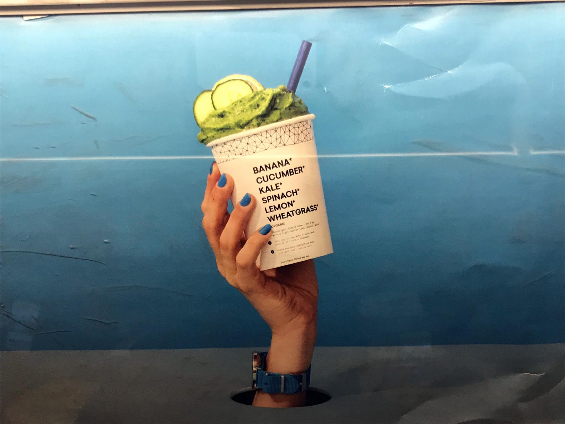
Why we Dig This Brand:
This brand does an excellent job of capturing the fun, good times and positive energy you get from consuming organic, farm-fresh hand-curated smoothies and salads. The logo is definitely fresh with the vertical DH arrangement. The copywriting is well-executed, and there are some active supporting elements as well: patterns, brightly photographed produce, colored backgrounds… and wait! Noooooo… disembodied hands! Not again? Just when we thought this trend was dead…
The Round-up
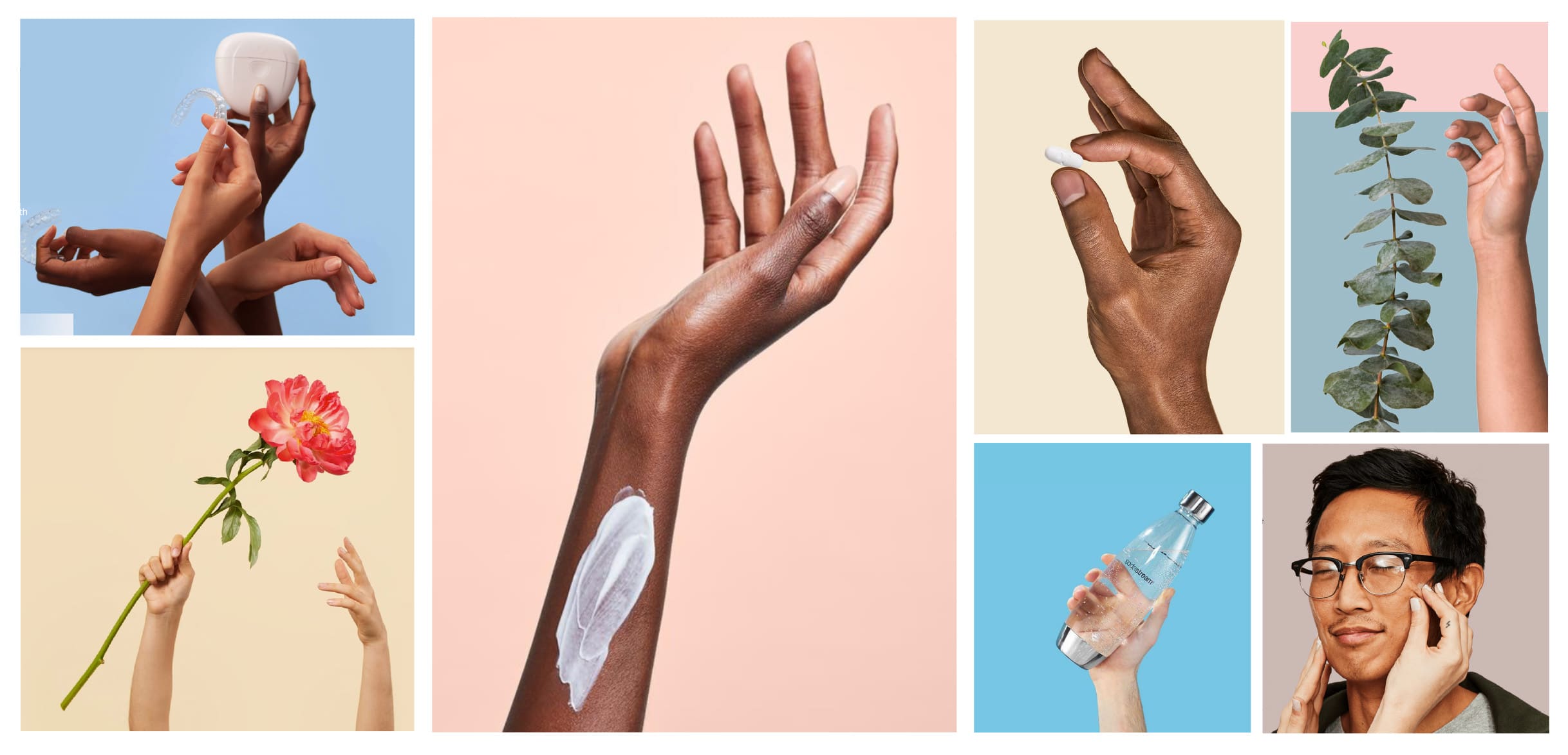
What a month! We had two logos with a cross, an overdose of pills, soap-opera-worthy hospital duds, and the return of the disembodied hands. It was super close, but we’ve got to “hand” it to Capsule for their clean look, spot-on illustrations, and lack of creepy hands.
Well, that’s it, we hope you enjoyed another mass-transit rant. Let us know your thoughts: do you have a suggestion or a brand we should check out? Do you really dig disembodied hands? Drop us a line in the comments section. Actually, we don’t have a comments section but feel free to reach out to us here for any feedback, we’d love to hear from you!
(most) Photography by David Card. All trademarks are the property of their respective owners. Funding amounts as of 12/07/18 provided by CrunchBase.
If this article helped you, please help us by sharing it or recommending to a friend. Thank you!


