CHALLENGE
Our research and discovery phase revealed a product landscape that was cluttered with cheap products with little to no thought for branding or positioning. We saw a strategic opportunity to position Baymax Research® as an industry leader through a contemporary, innovative, clean technical look and feel.
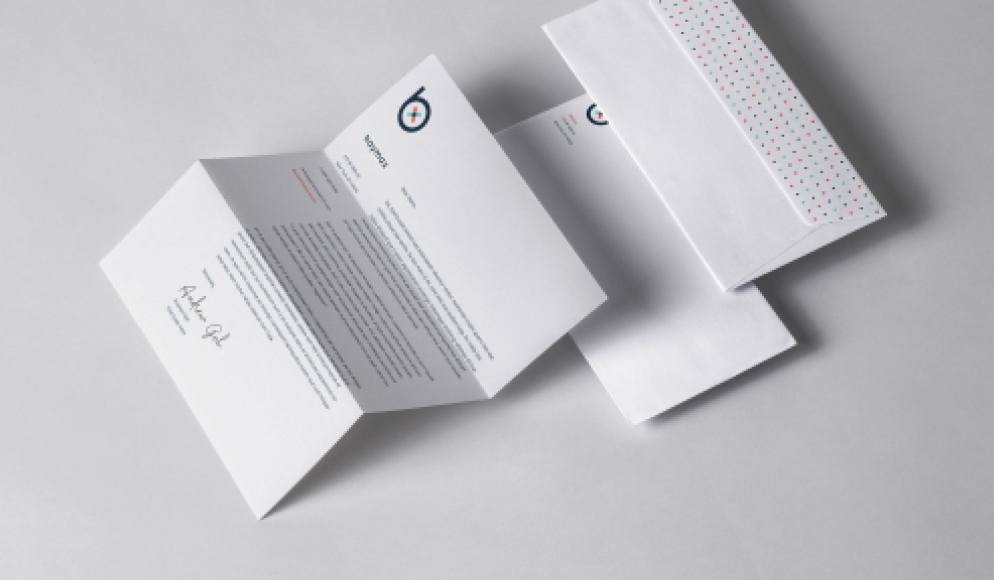
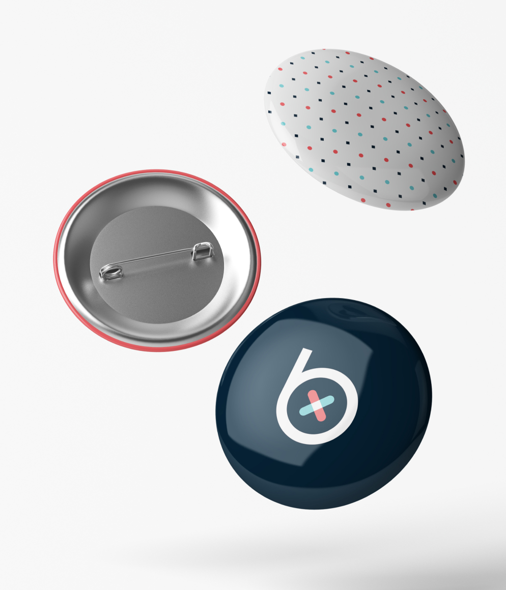
SOLUTION
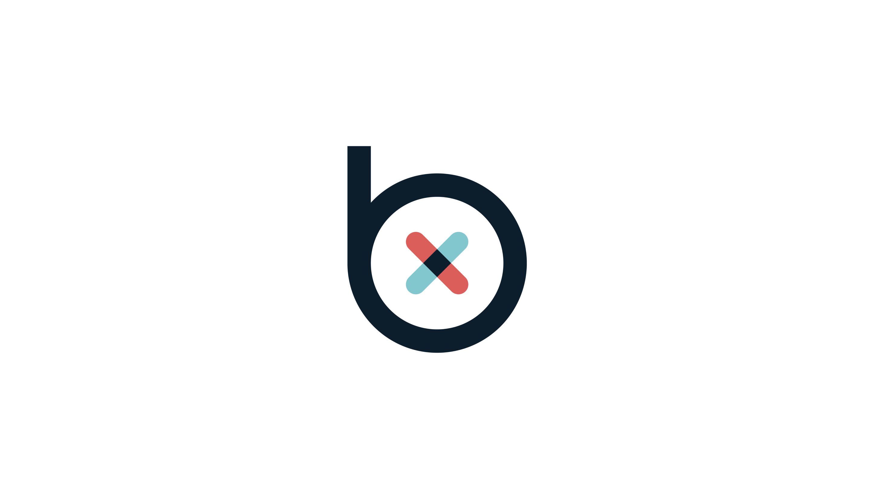
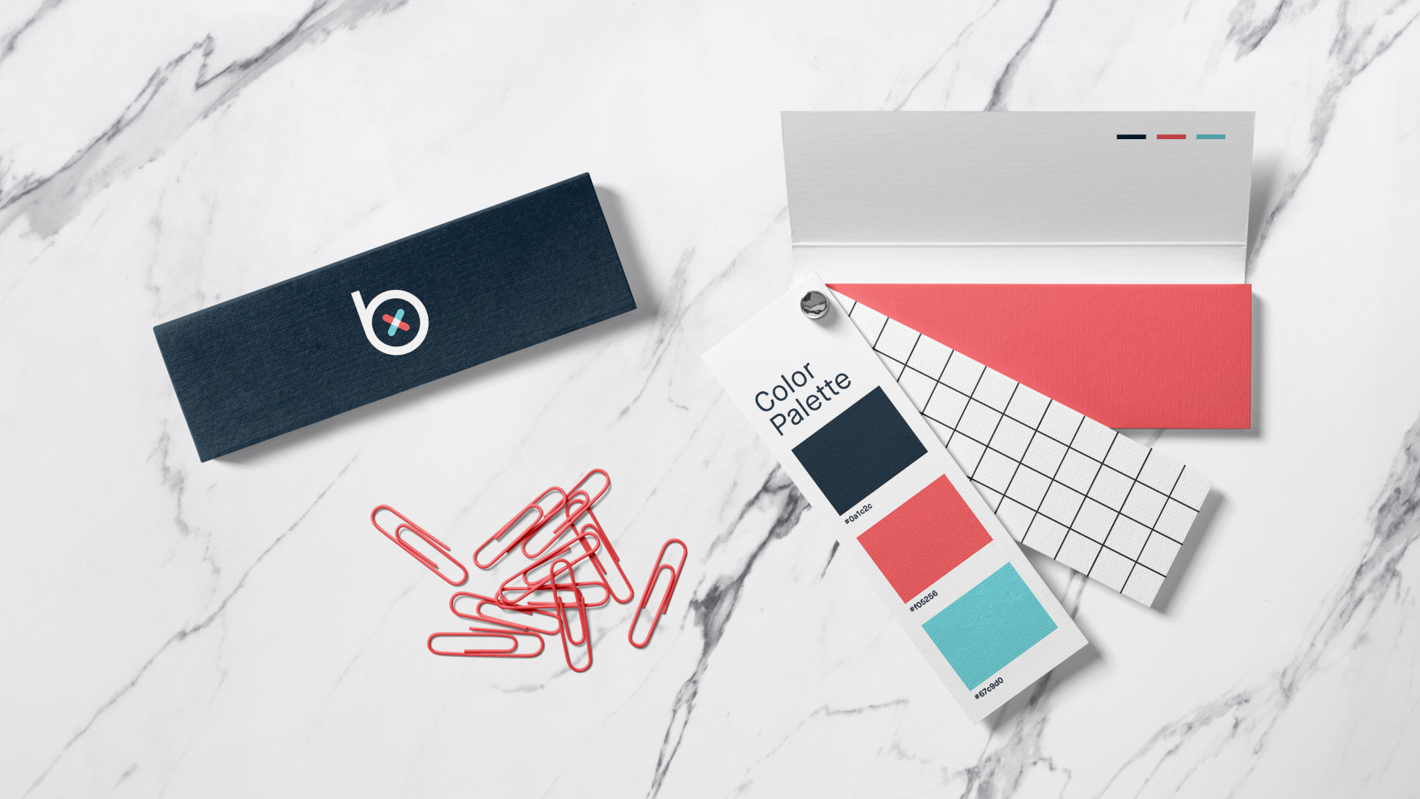
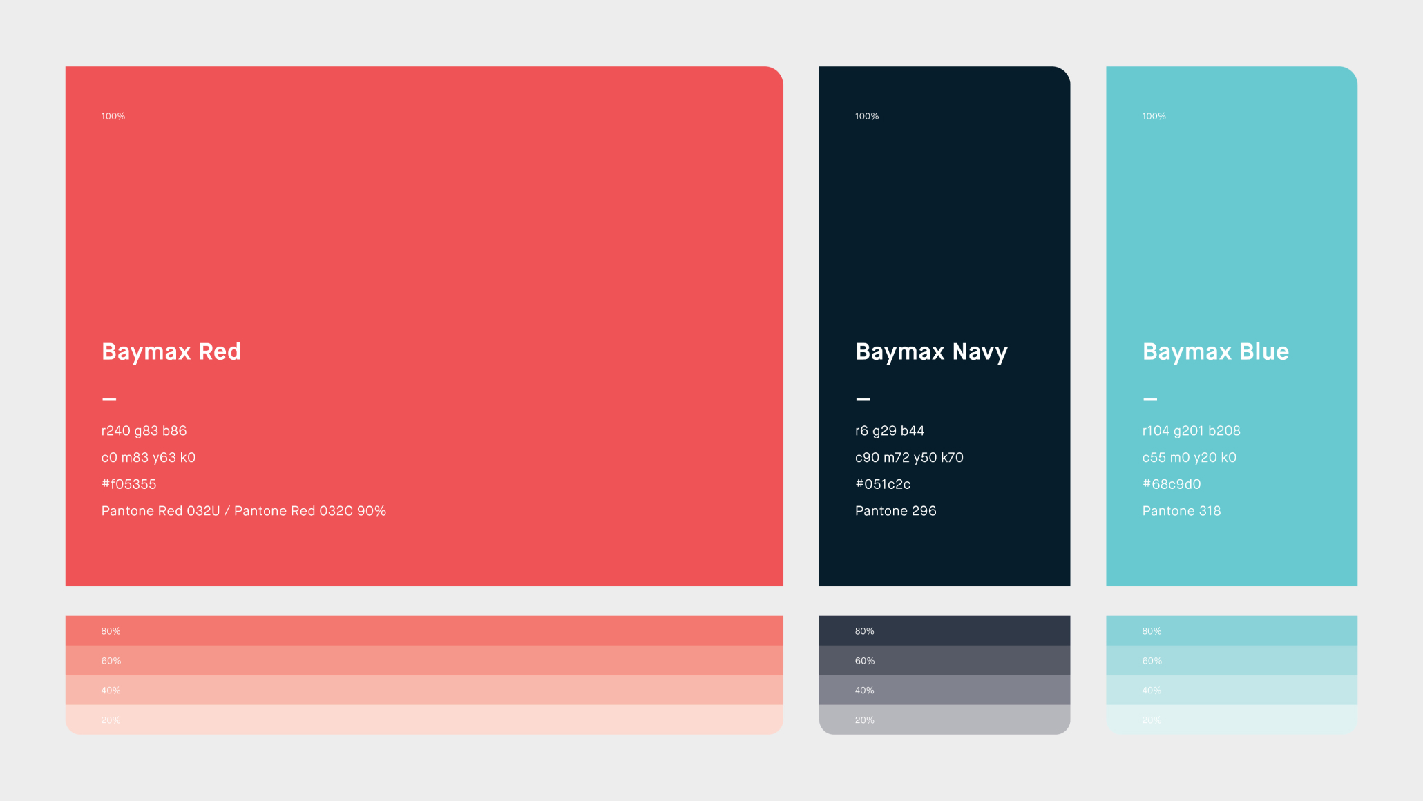
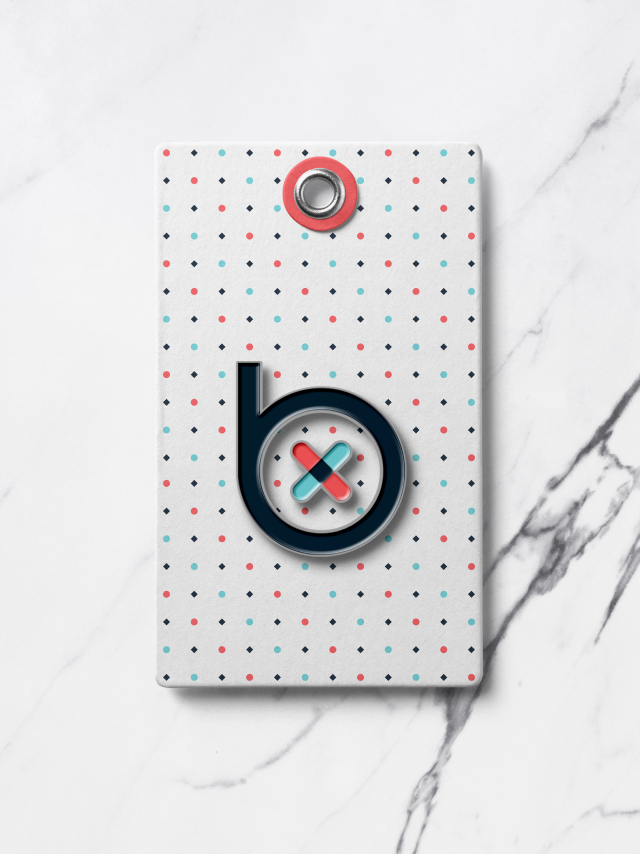
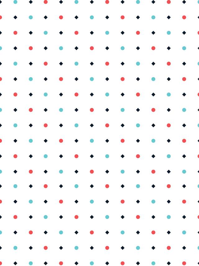
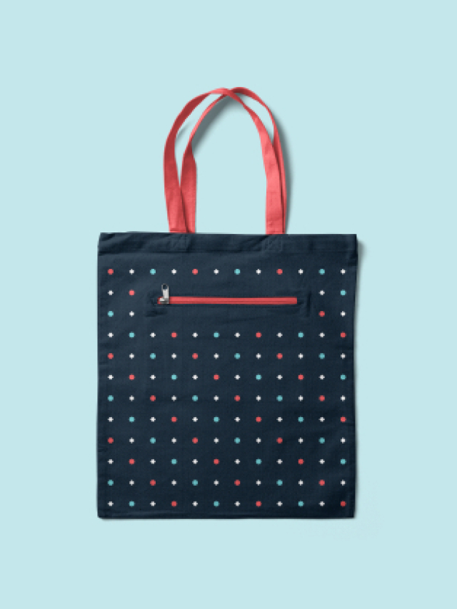
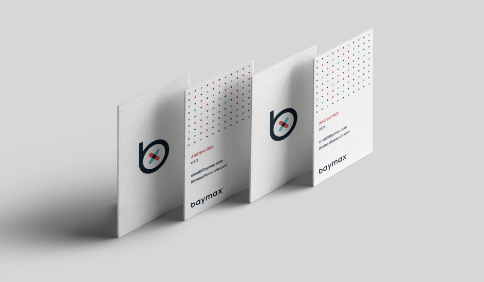
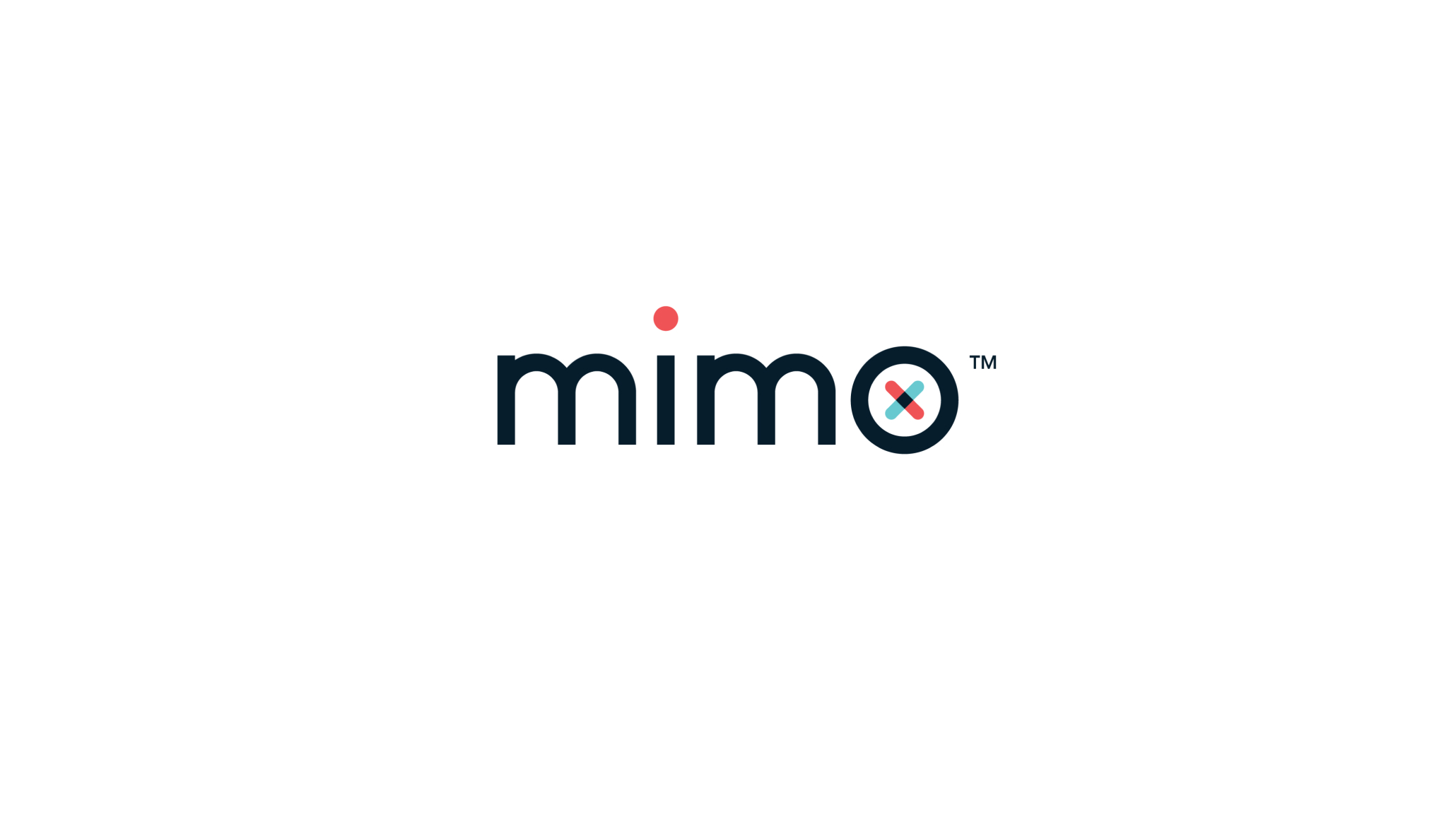
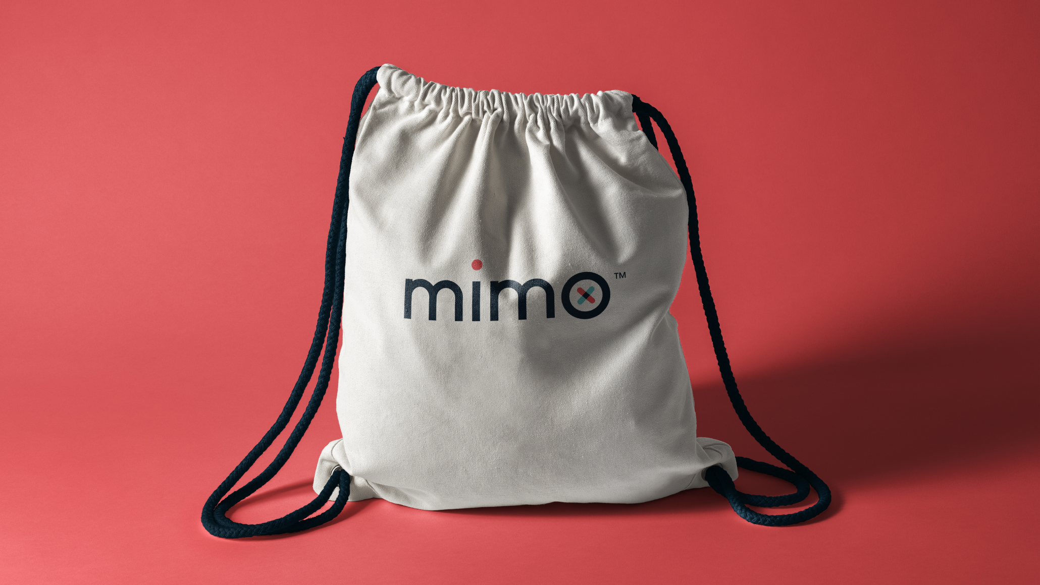
Inspired by modern product design, we employed an all-lowercase font with a bandage suggested by two overlapping shapes to imply transparency and trust. A unique and ownable graphic pattern was developed, and a stationery suite was developed, which used the bold color palette sparingly as accent colors to create a clean and contemporary look. Following the established design language, we then created the product logo for mimo™, a secondary product line.