Challenge
As a bold new agency created by experiential industry veterans, Endorphin enjoyed tremendous success in their first year. But they needed to focus on defining their brand and building a compelling website to communicate their full offering.
C42D worked with the Endorphin team to define the company’s purpose, brand position, personality, pillars, and key messaging. Areas of opportunity were uncovered through rigorous competitive analysis, and a brand framework was created centered around cultural awareness, confidence, and a fun and outgoing personality.
Several mood boards with accompanying design stories were then presented and a final direction was chosen.
Solution
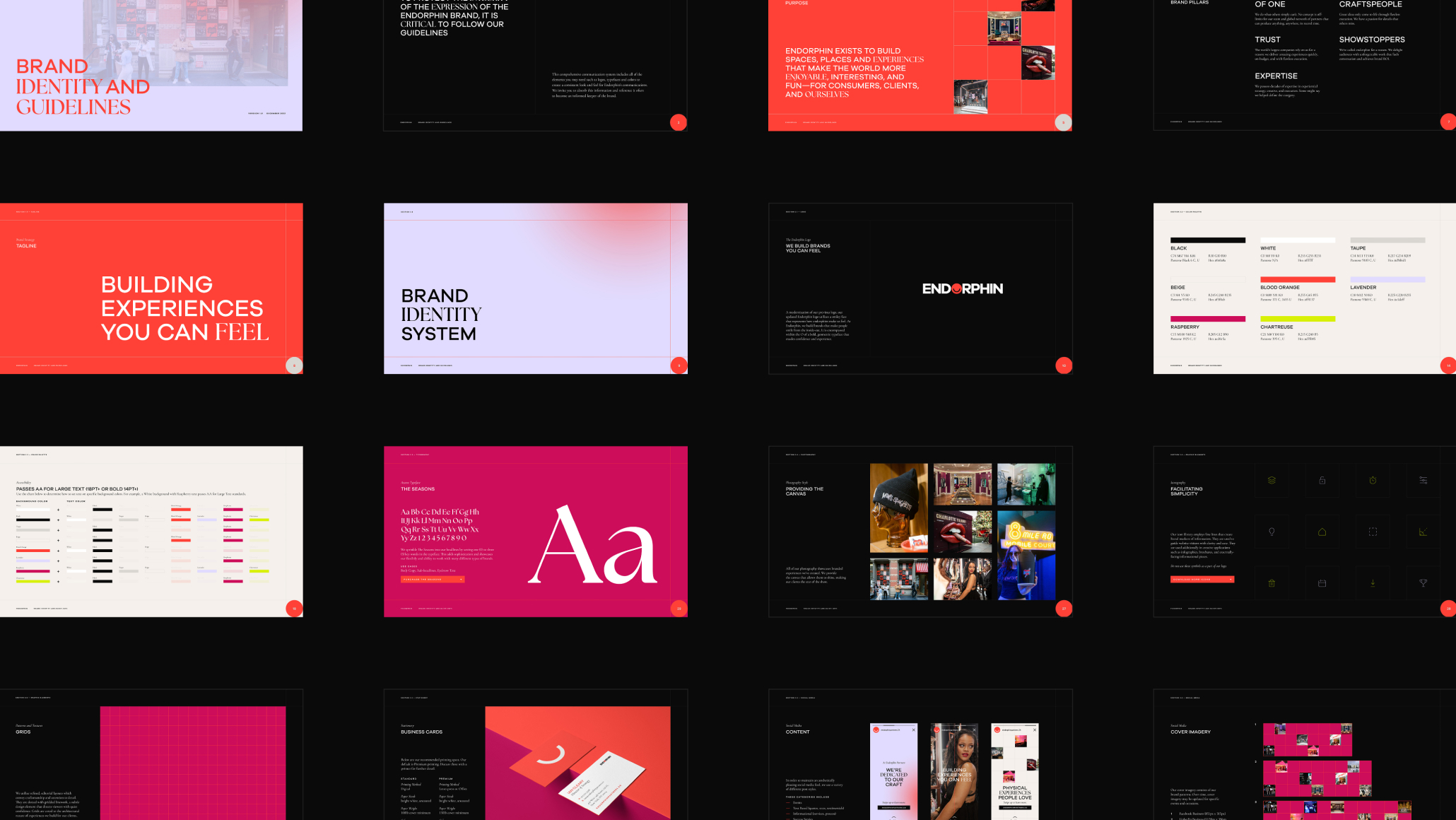
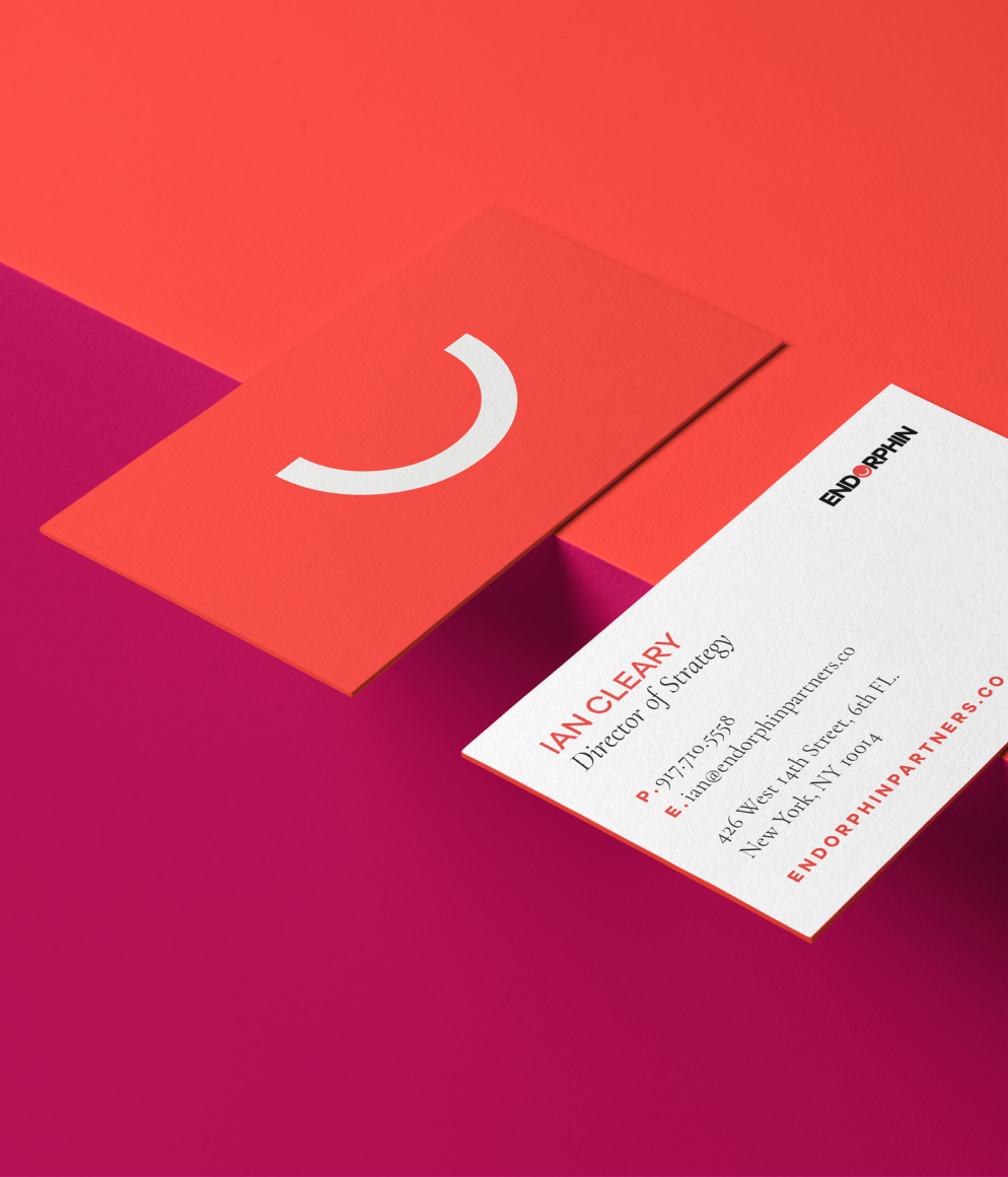
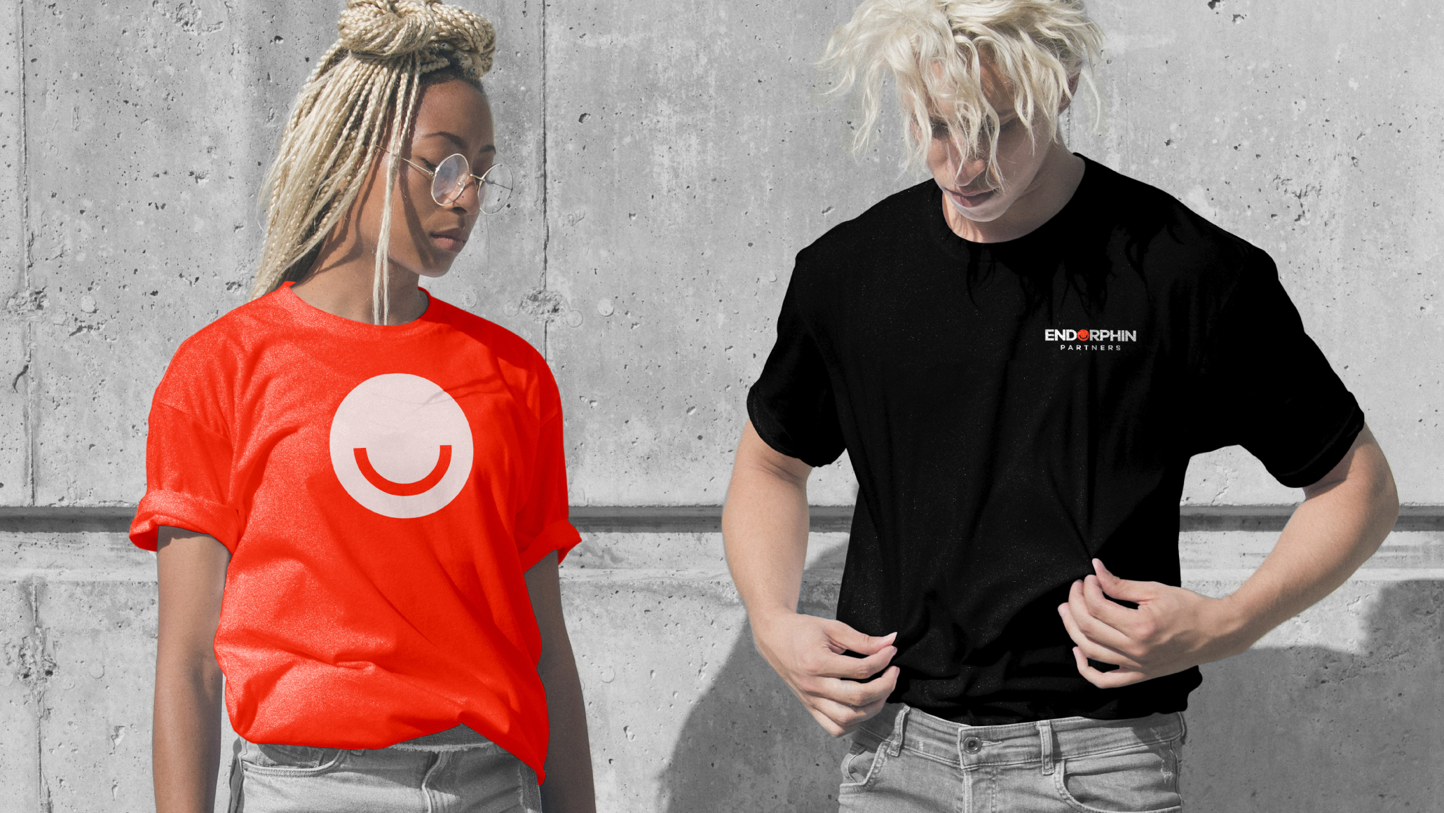
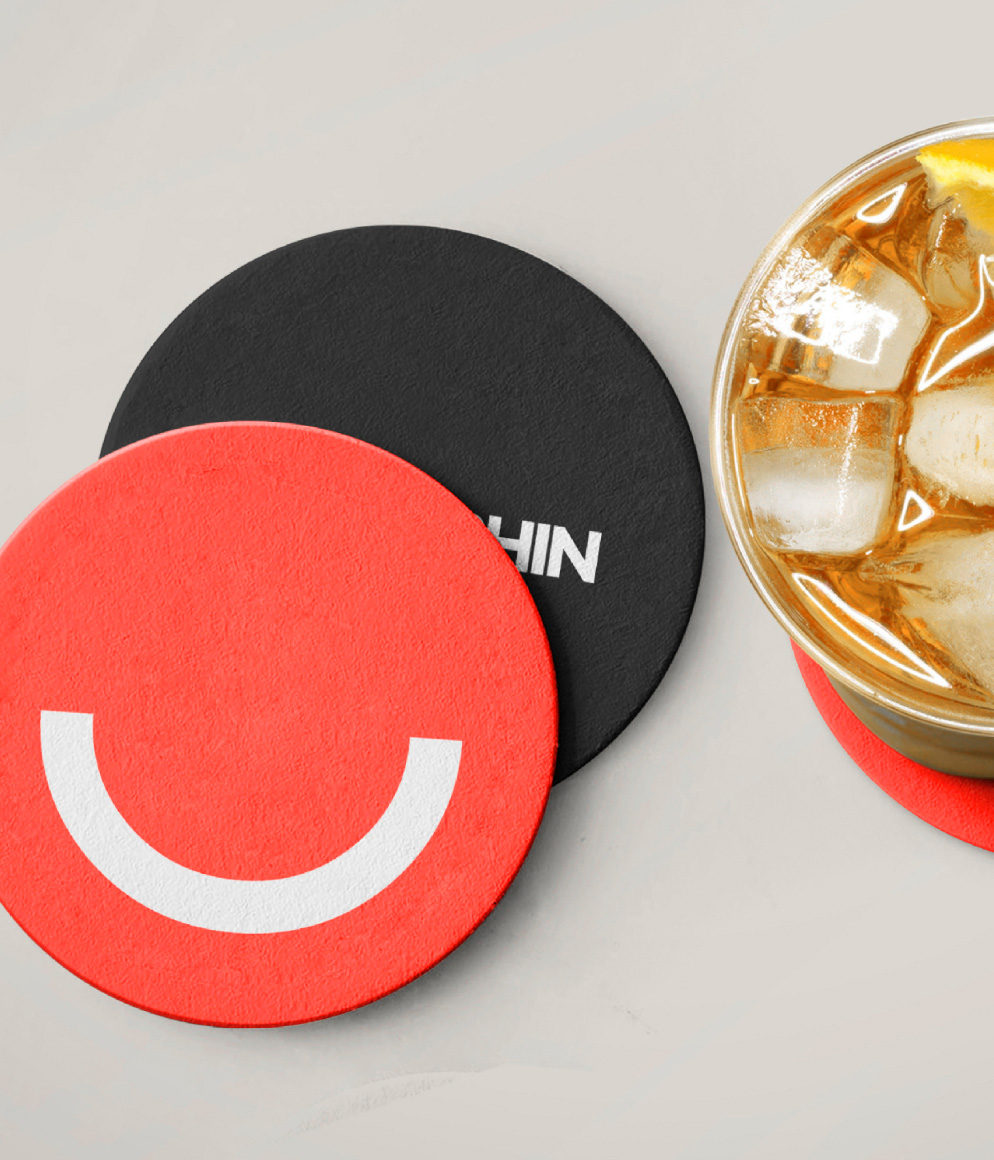
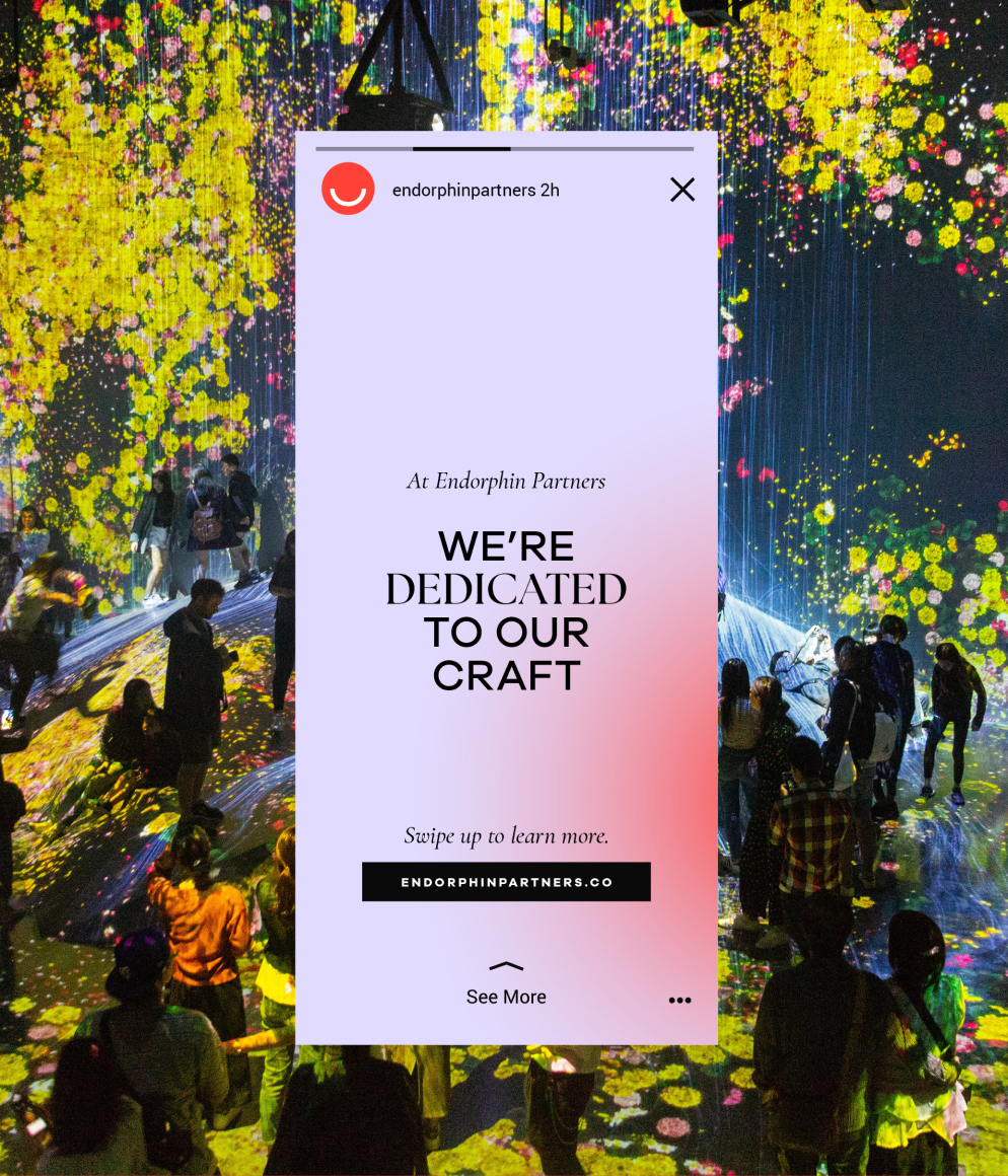
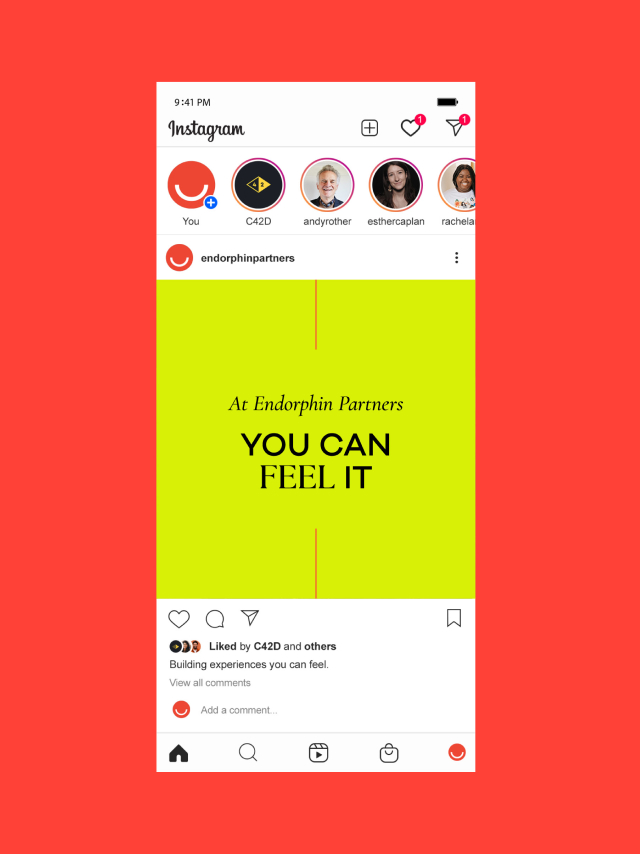
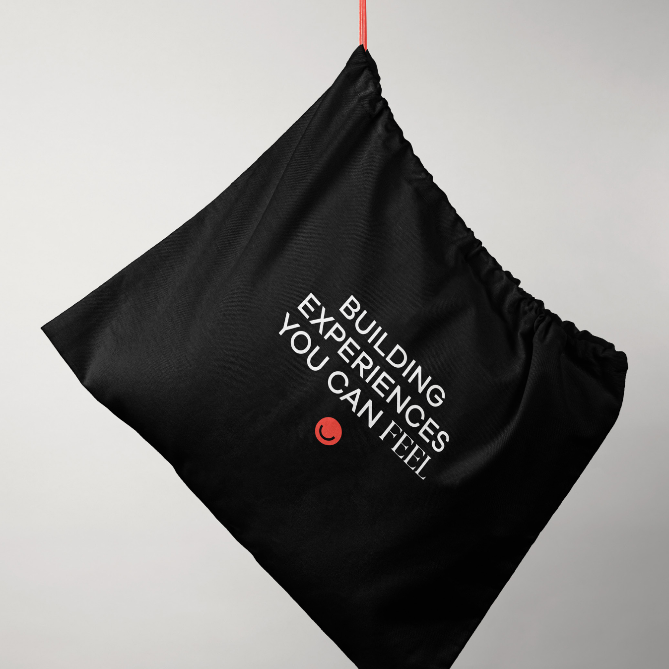
Our solution is a world of contrasts and boundless creativity. Our color palette dances between the timeless elegance of black and white, serving as a solid foundation for our artistic endeavors. But it’s the striking duo of Red and Chartreuse that steals the spotlight, embodying the essence of limitless potential. A delicate touch of Lavender and neutrals adds subtle accents, harmonizing the composition with a touch of tranquility.
In our typographic choices, we harmonize the marriage of experience and innovation. Serifs, rooted in the rich tapestry of design history, stand as steadfast symbols of tradition and timeless beauty. At the same time, sleek and contemporary sans-serifs bridge the gap between generations.
Our layout style is a testament to refined craftsmanship and meticulous attention to detail. Embracing a refined, editorial approach, each element is meticulously placed, expressing the artistry of deliberate design. Inspired by the clean lines of Swiss design, our gridded layout style embodies simplicity, objectivity, and utmost legibility.