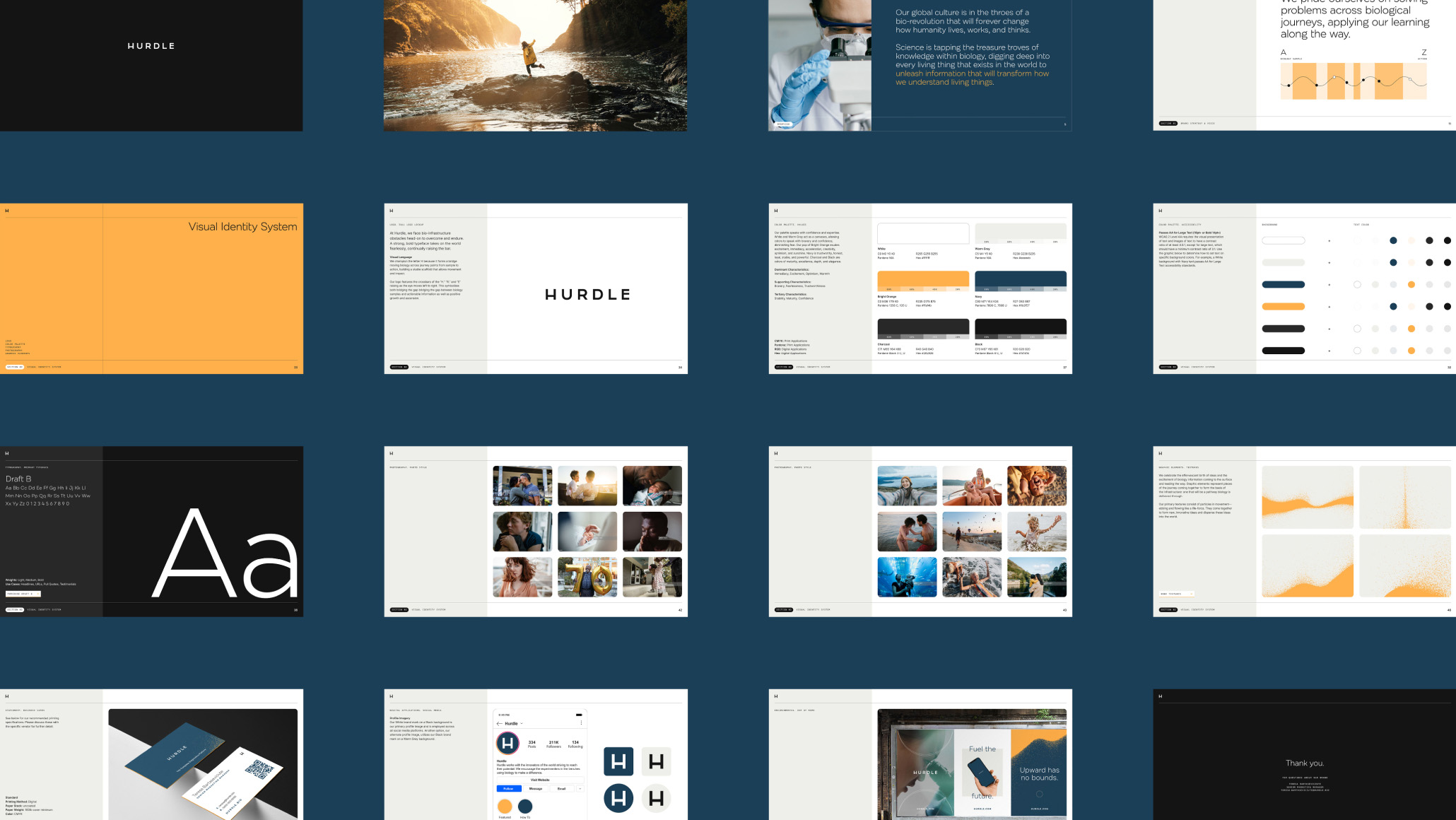
OVERVIEW
Chronomics, after successfully creating test kits for B2B and B2C clients during the pandemic, aimed to rebrand its B2B division with a new name and brand that clearly communicates its offerings, particularly the bio-infrastructure that powers diagnostics and research from sample collection to the final use.
DISCOVERY AND STRATEGY
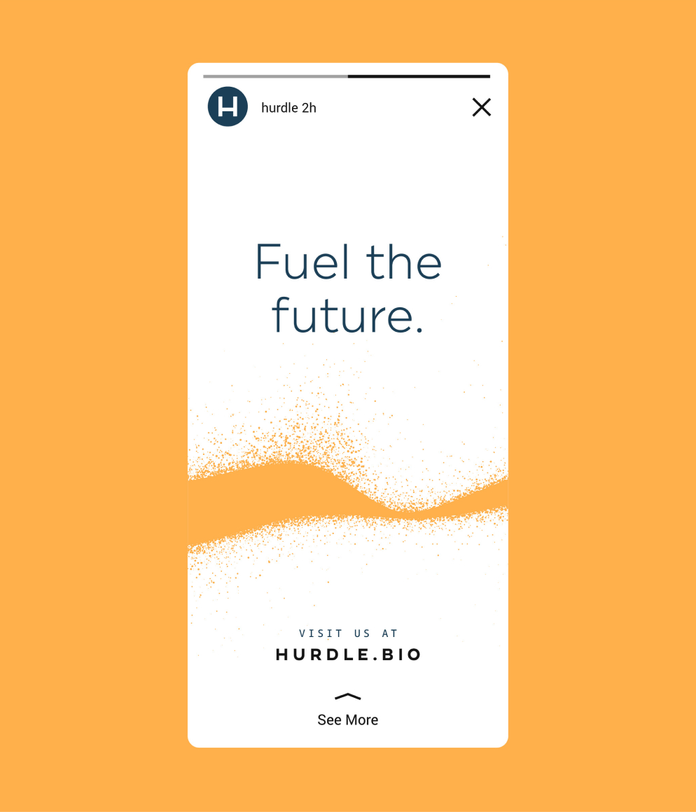
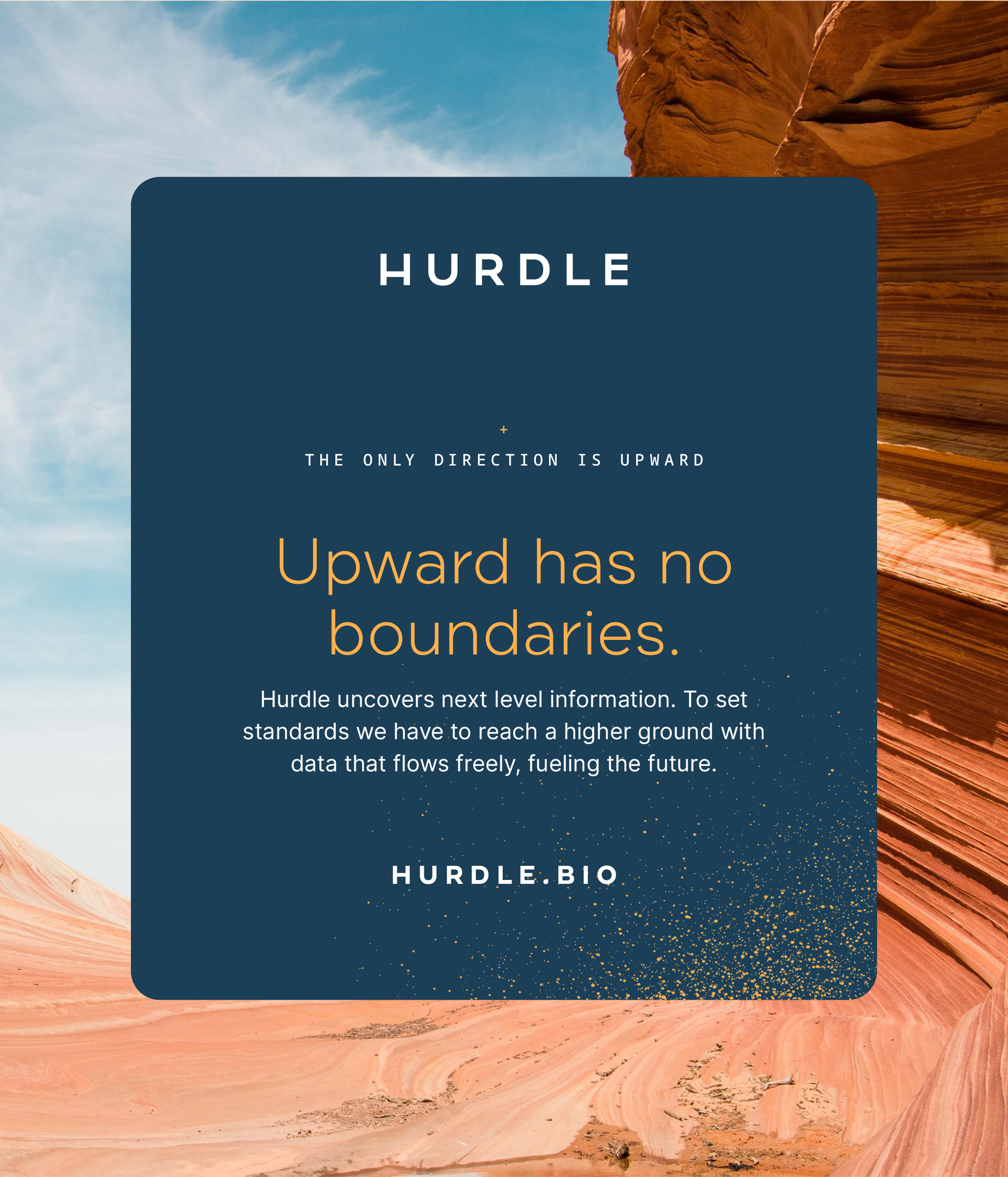
During the discovery phase, we conducted interviews and analyzed data to gain insights into the consumers, category, and culture, which served as the foundation for our strategy phase. We landed on the name “hurdle,” which is symbolic of an obstacle to overcome, a barrier that is ascended toward, leaped over, and cleared with smooth agility—hurdled.
Athletes who compete in the hurdles are often seen as running warriors who take on additional risk. Regular people hope we make it past “the first hurdle” in any daily endeavor, learning valuable lessons along the way.
The Creator archetype inspired Hurdle’s brand personality, which is creative, brave, and reliable. Brand action principles and messaging tactics for specific audiences were also defined.
CREATIVE
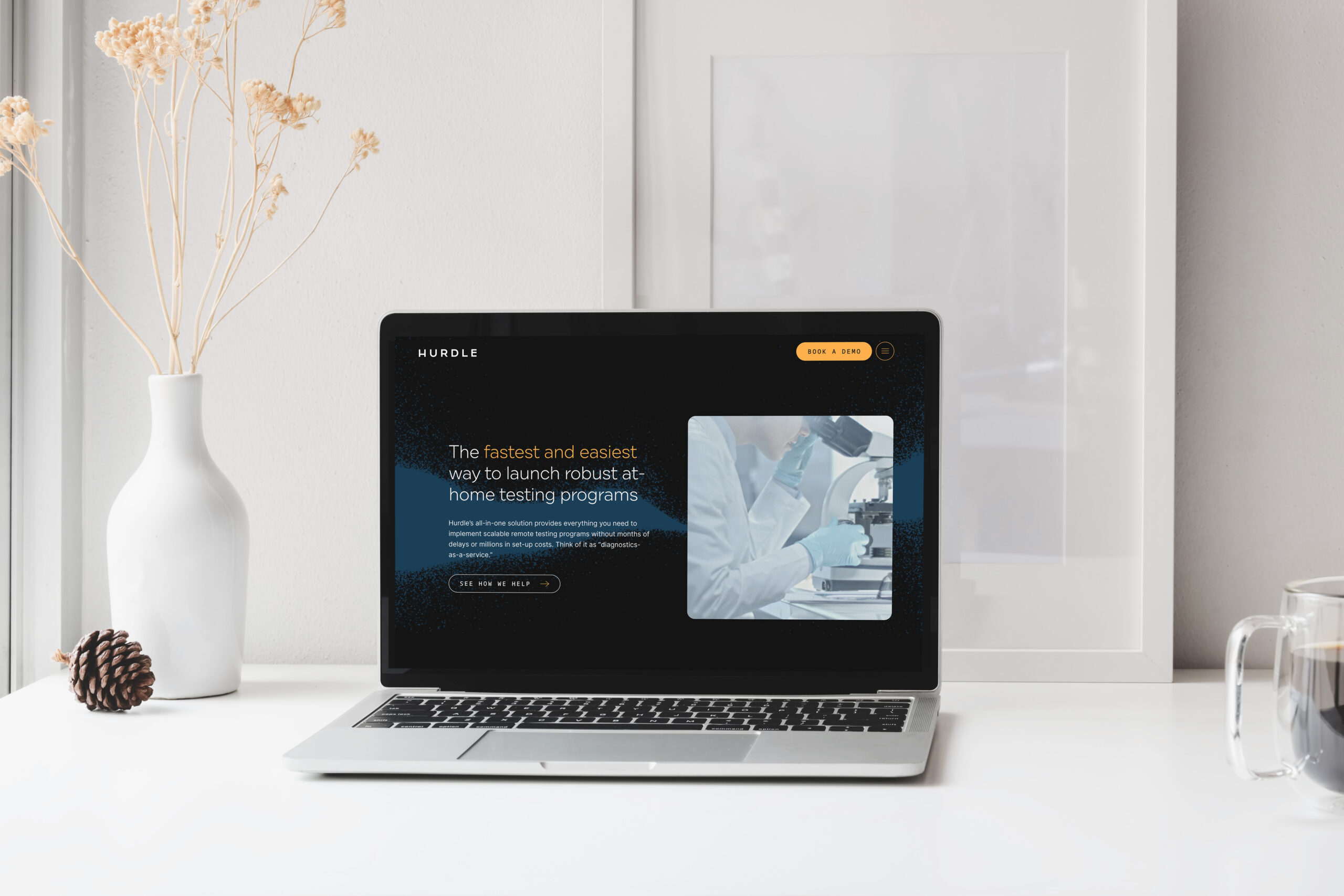
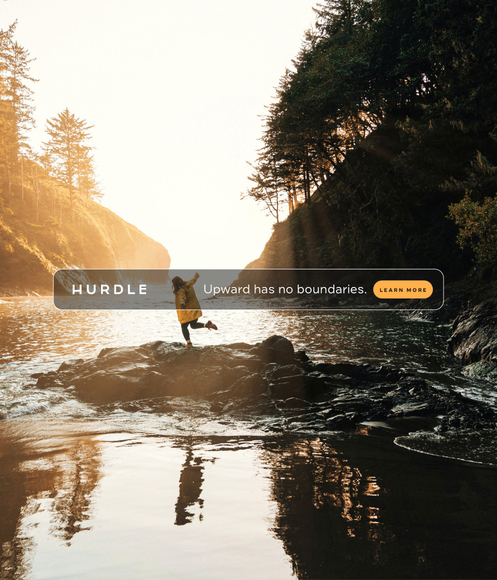
Creative territories for the visual identity were explored. Through analysis of the competition, areas of opportunity were identified for color, type, photography, and other design elements.
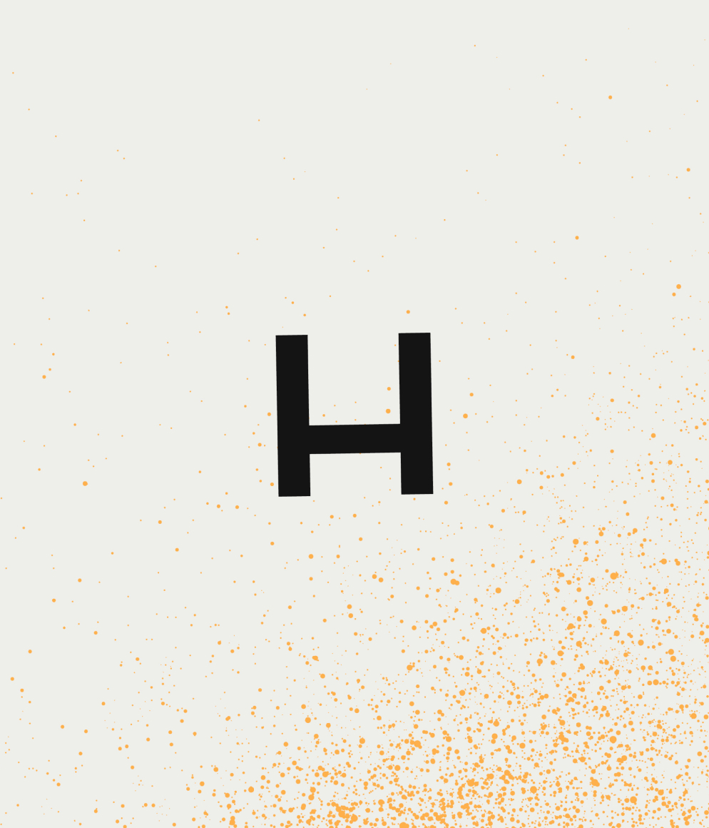
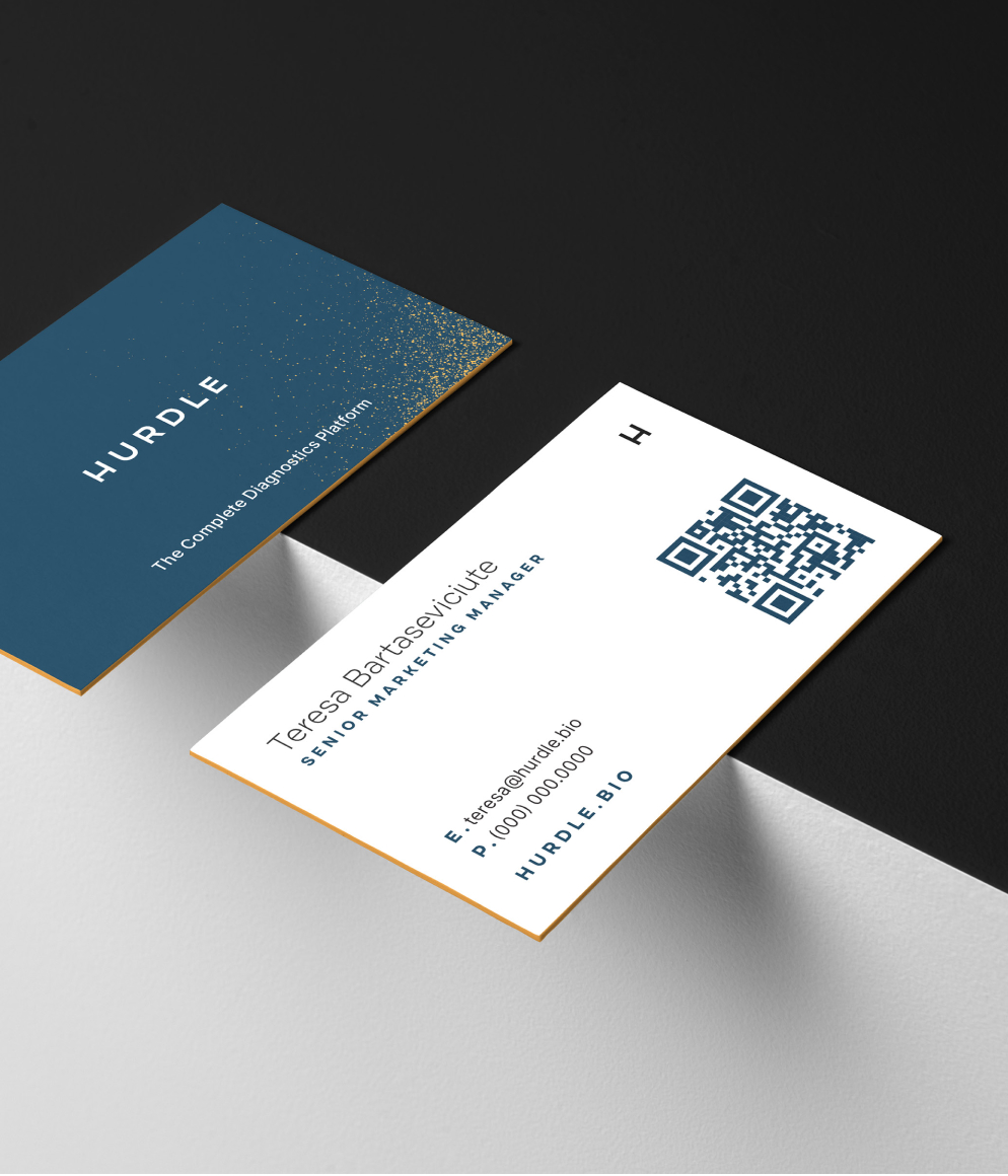
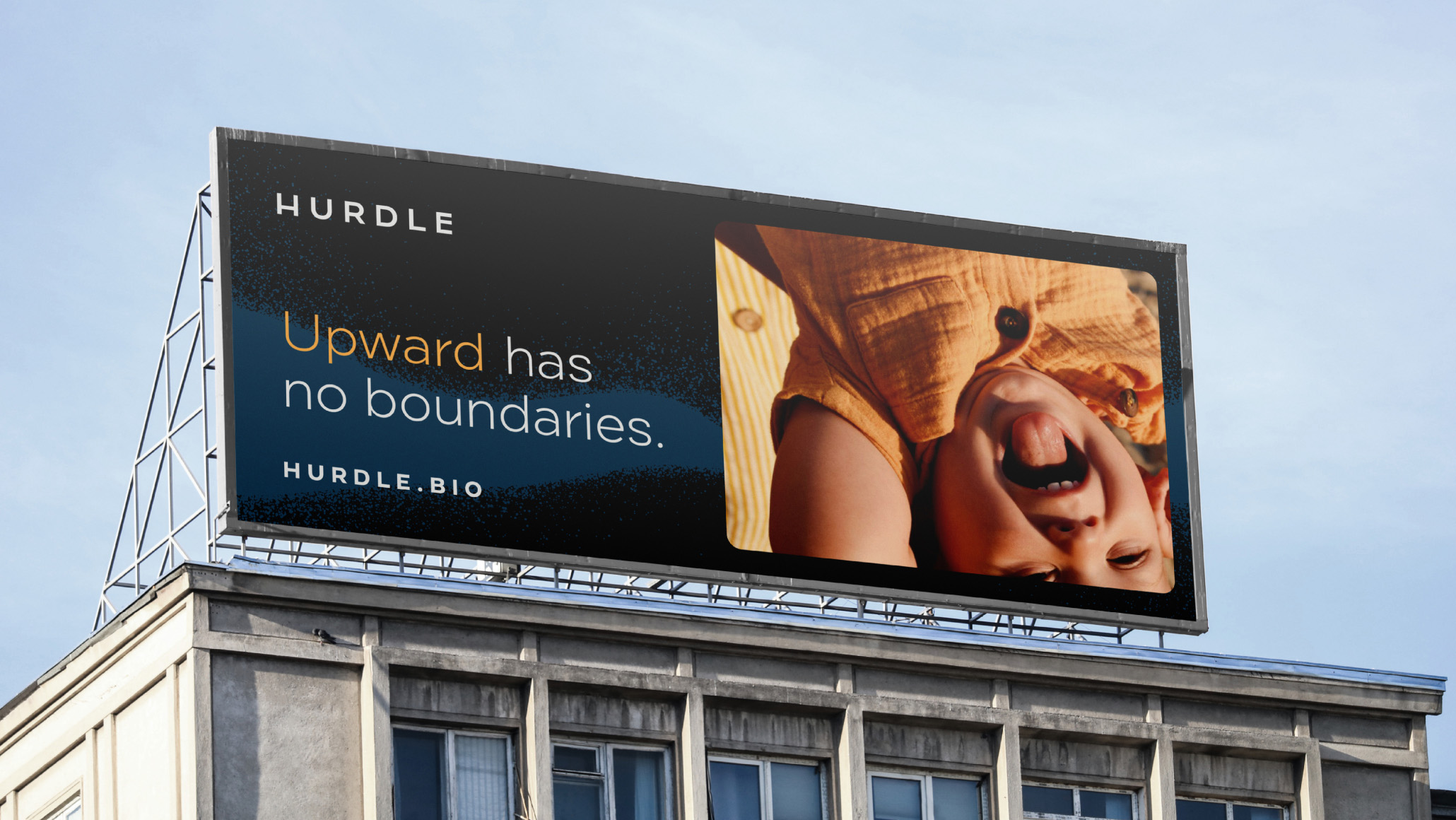
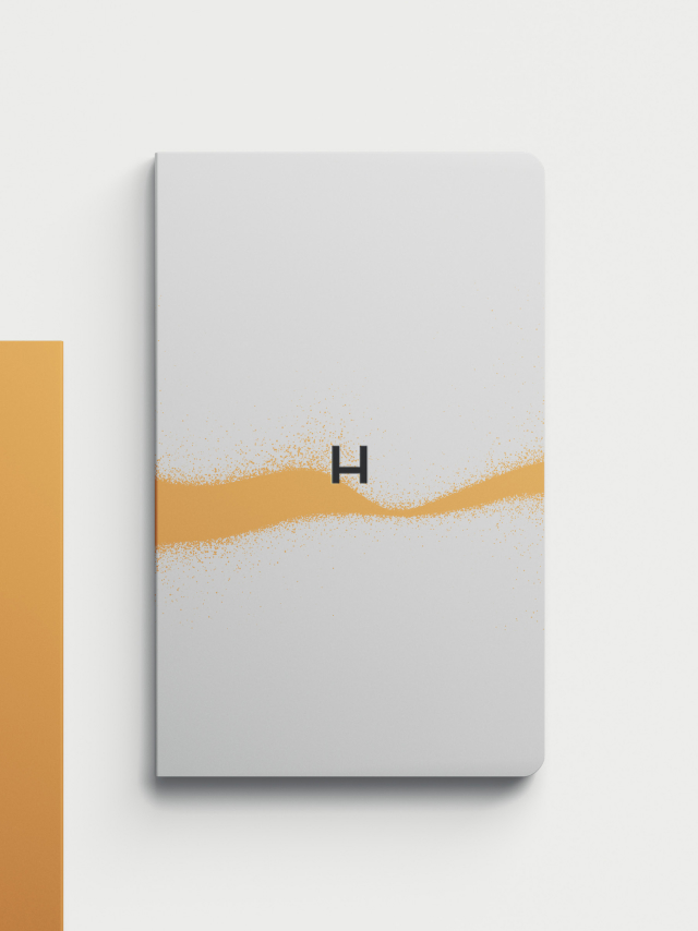
In the wordmark for Hurdle, The letter “H” symbolizes a bridge linking journey points line to line, connecting one entity, location, or piece of data to another, a stable scaffold built from knowledge. The crossbar on the letters H, R, and E ascends from left to right, creating upward momentum and symbolizing raising the bar for both the organization and its clients.
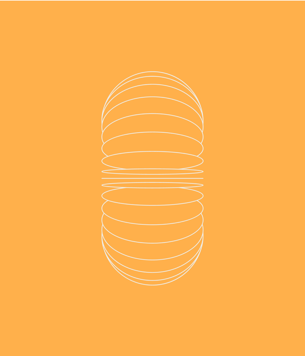
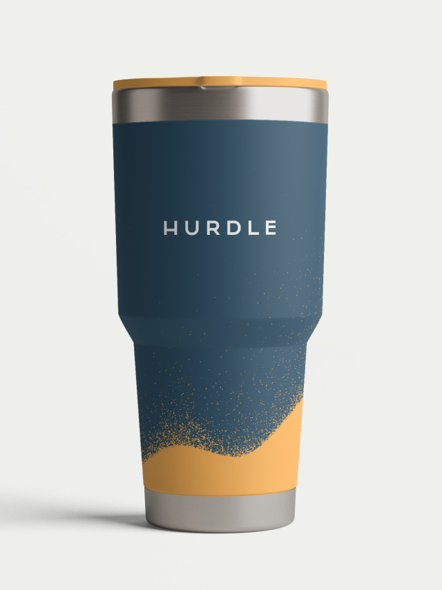
The base color palette is brave with the quiet confidence of a black and white palette. It comes with practice, maturity, and expertise. Yellow-orange is creative and energizing, while the remaining palette is communicative and curious. Graphic elements were developed with simplicity and structure in mind, reinforcing the infrastructure concept as reliable and sturdy. They reduce technologies into their simplest form, revealing the infrastructure that makes them tick.
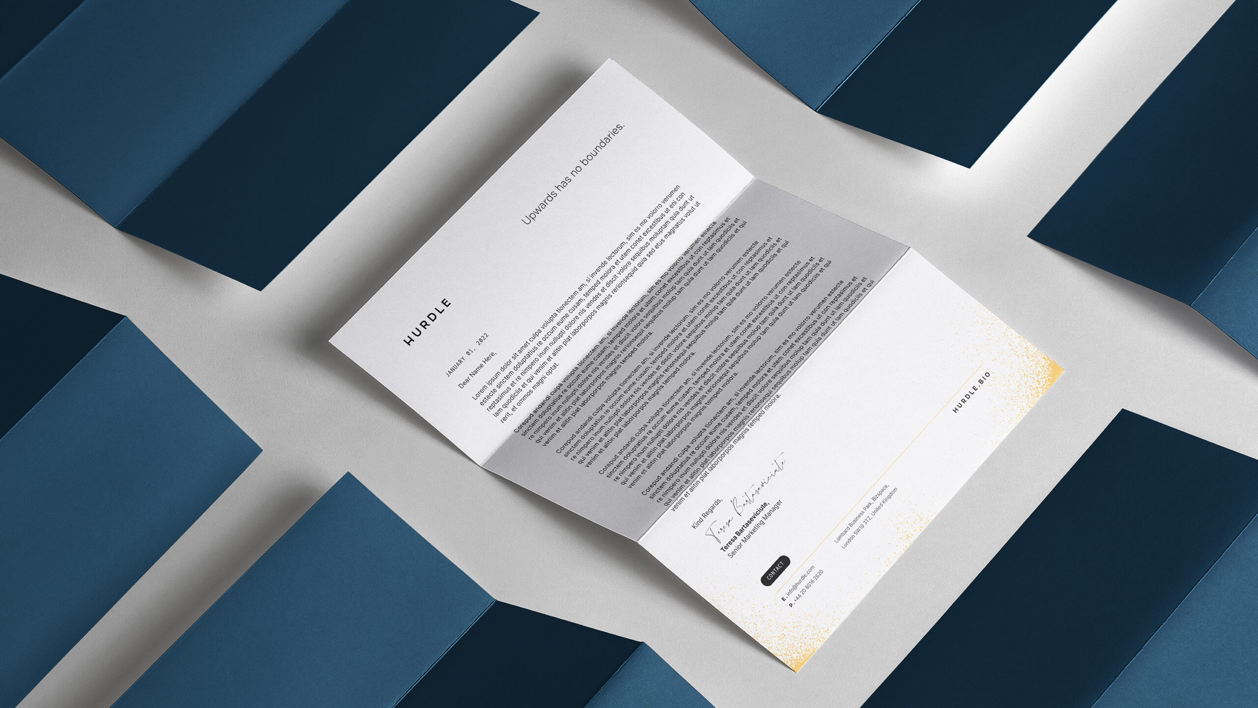
Our typography choices convey information clearly and confidently. Distinctly thin, they speak with quiet confidence and exude expertise and how to drive results.
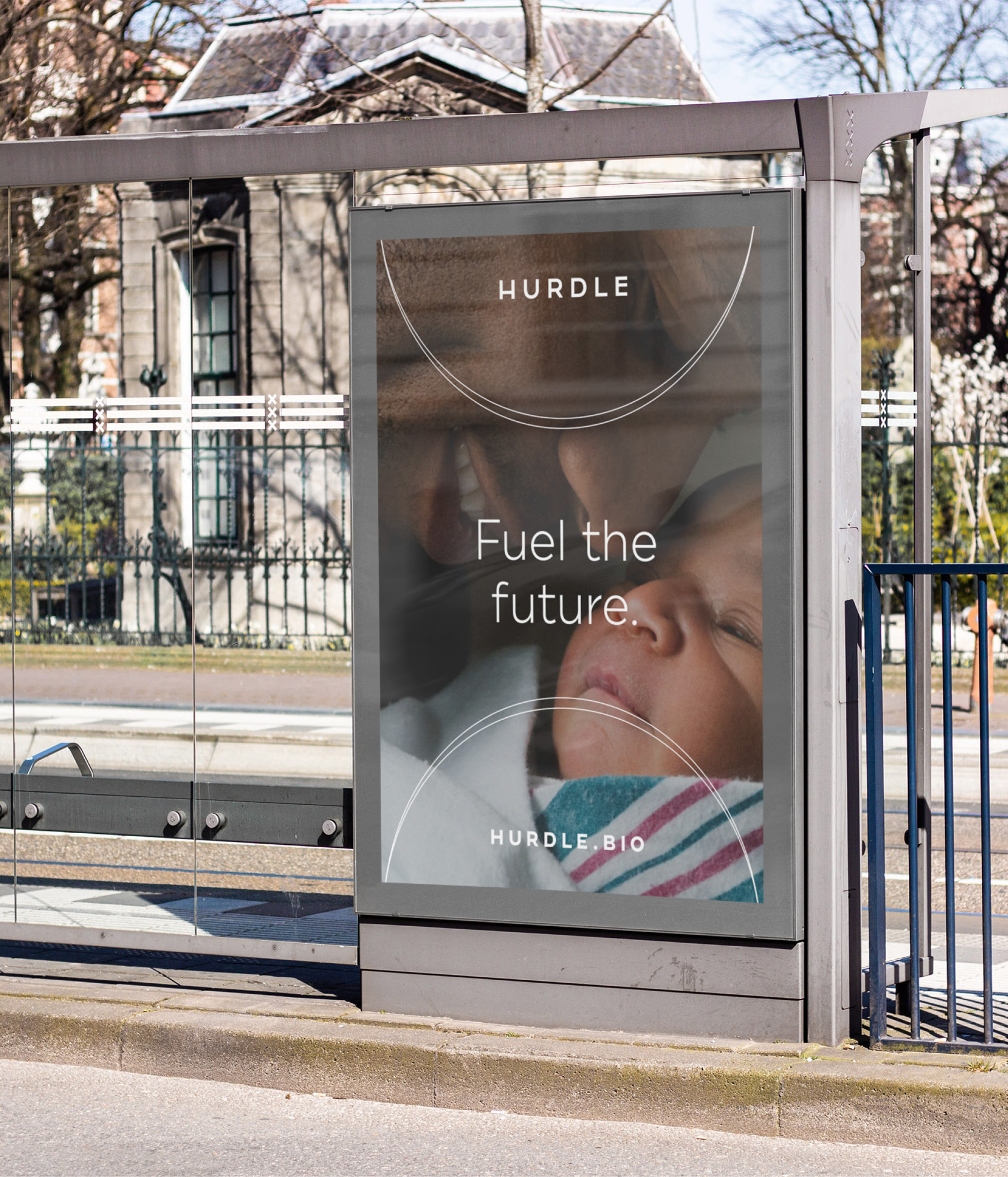
A human photography style was chosen: One moment. One emotion. One connection. One touch. One word. One breath. The first, the 100th, the last. Through technological innovations that have challenged the way biology is accessed and actioned, these moments in life are made possible. With data, knowledge, and information, life can be lived confidently.
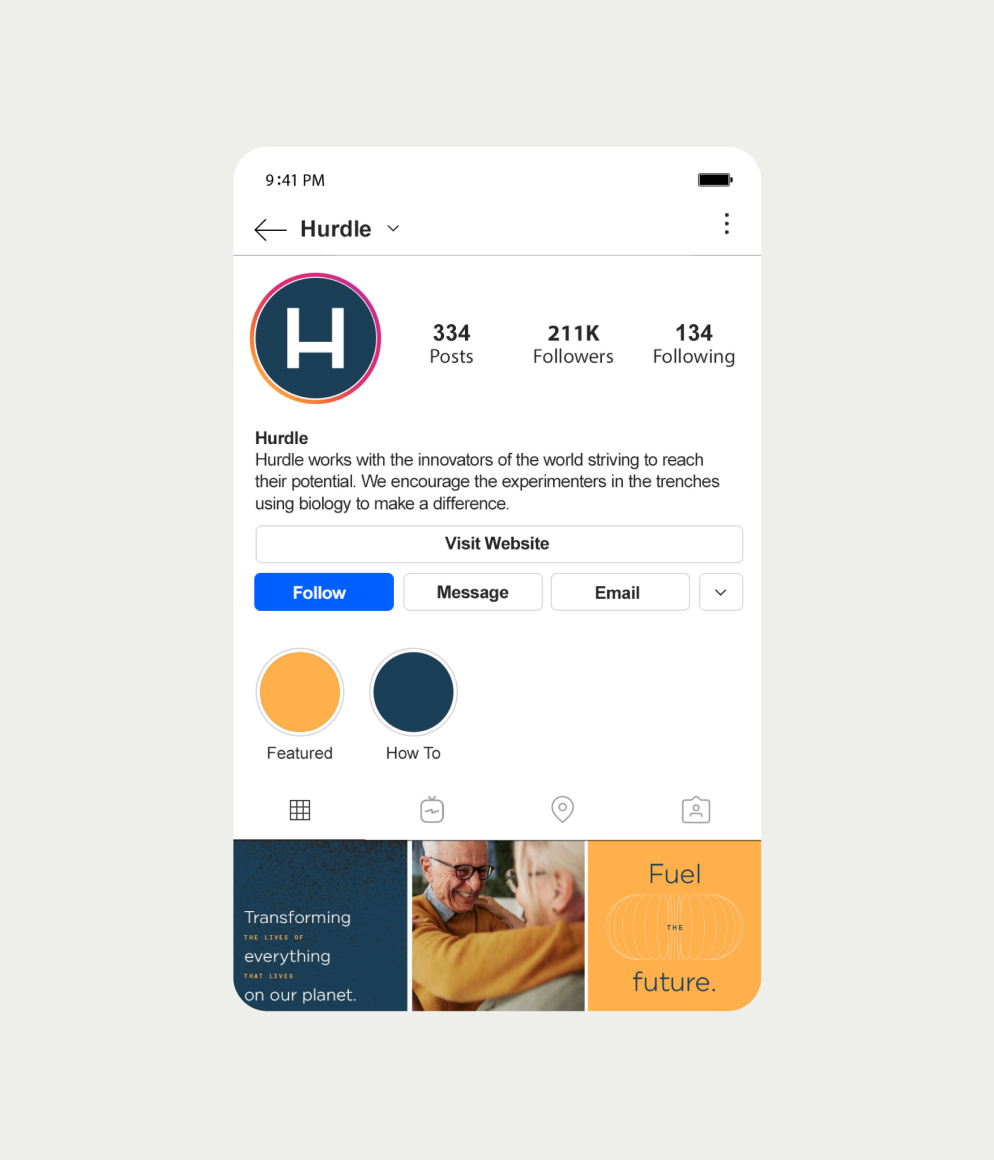
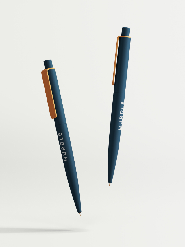
With the Identity system complete, C42D then created a wide range of deliverables, including test kit packaging, business cards and stationery, presentation templates, social media assets, internal communications templates, and website design.