CHALLENGE
There’s tons of noise, promises, and misinformation in women’s health, and it’s hard to know what to believe. Most OBGYN offices (when you can get in) feel clinical and impersonal, like an assembly line.
The fact is, times have changed and the modern urban patient expects more.
The founders at Pure realized this and contacted C42D to design a warm, compelling brand for their practice from the ground up, including research, brand strategy, verbal and visual identity, environmental graphics, print, and digital experience.
SOLUTION
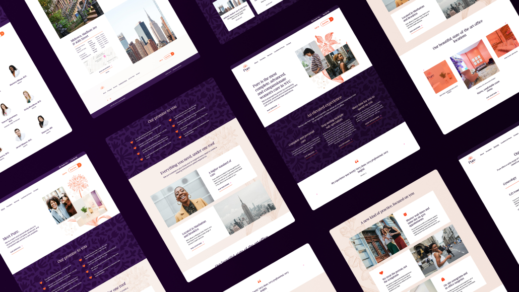
C42D employed our proprietary process for branding, starting with an in-depth discovery including a brand audit, stakeholder interviews, and desk research to fully understand their patients, points of differentiation, and value proposition. Personas and user stories were created. A brand platform based on a curated and warm patient experience was built, focused on accessible, attentive care with all services under one roof. A clear, friendly, positive, and supportive voice and tone were articulated along with key brand messages and pillars.
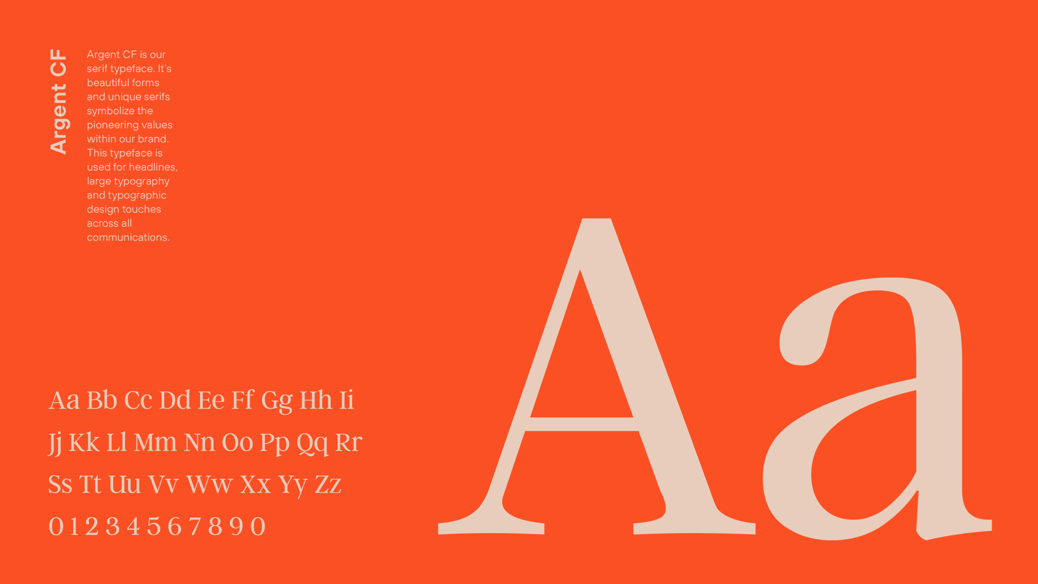
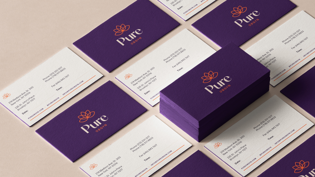
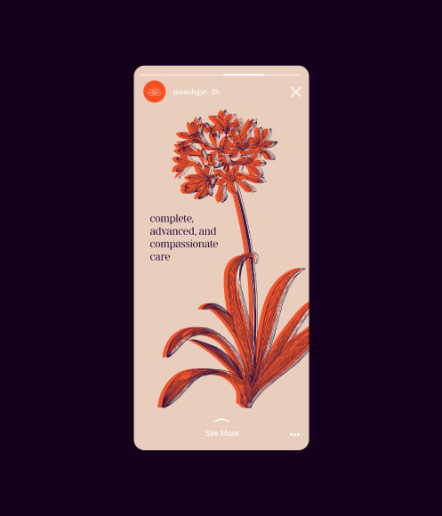
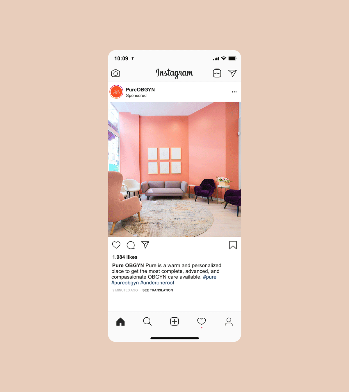
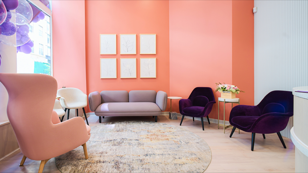
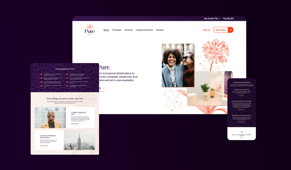
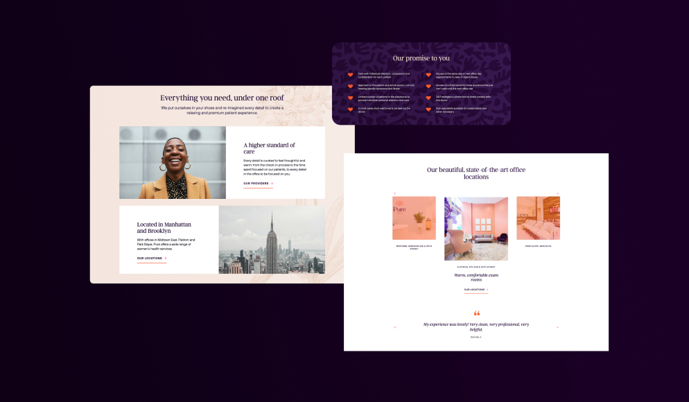
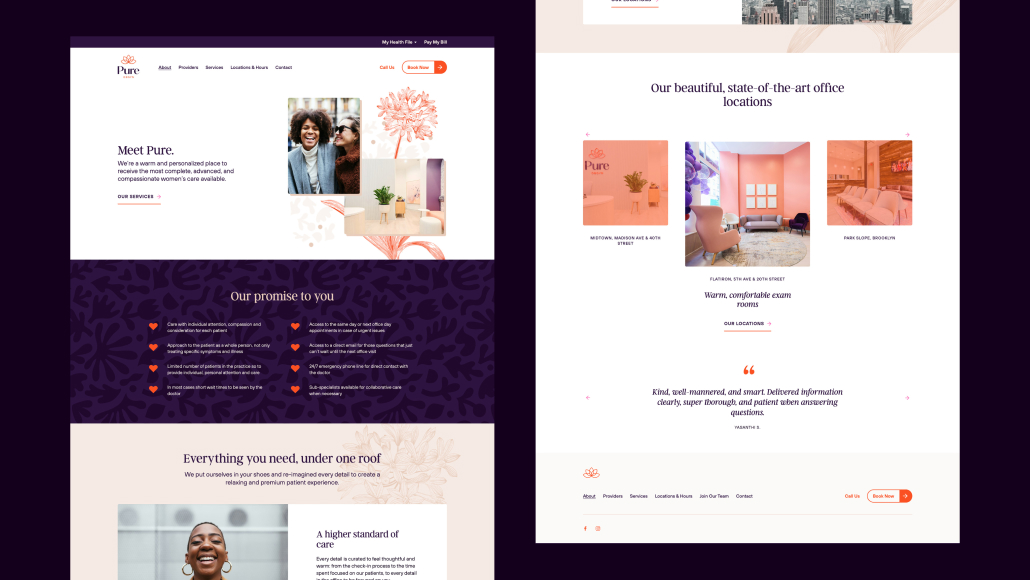
Pure OBGYN’s visual style positions them as an innovative friend and confidant that is the essence of modern women’s care. Their warm, passionate color palette carefully curates empowering reds and pinks that speak in a distinctly feminine tone. A sexy modern serif typeface is used for headlines, creating the feeling of an elevated experience.
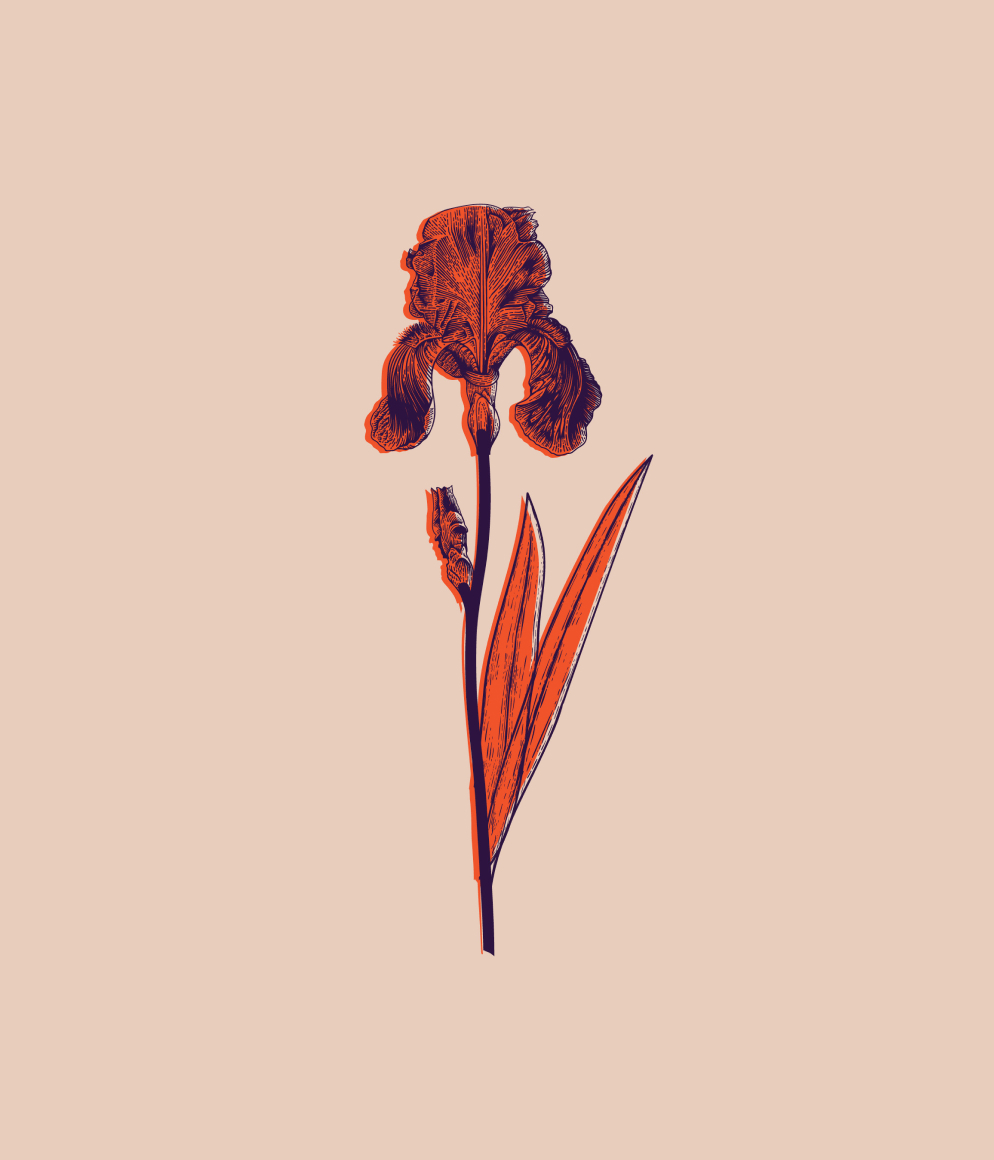
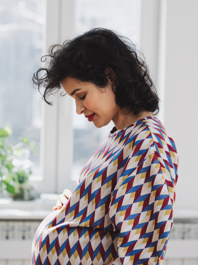
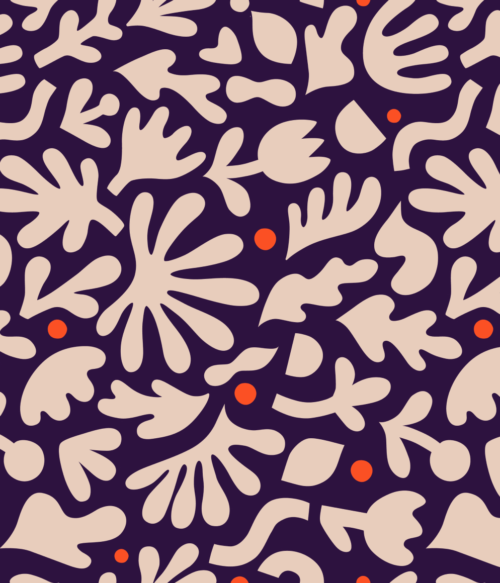
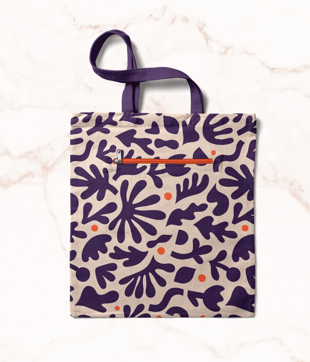
Simple iconography delivers a straightforward statement and informs patients with ease. Pure OBGYN uses portraiture and lifestyle imagery to connect with their female audience. To connect directly with patients, authentic and friendly female portraits are employed to encourage women to see themselves as a patient at Pure. Lifestyle imagery of female friendships conveys the idea that Pure is a place of trust and support. A fun, vibrant brand pattern is utilized to add excitement, movement, and energy to the brand. As a supporting design element, floral illustrations add a tender, feminine touch.