CHALLENGE
Whoever said “Success comes to those who wait” clearly never founded a startup.
Seeking to reinvent how U.S. healthcare is delivered, healthcare startup RevDoc knew they needed experienced hands to handle building out their brand vison and messaging, while also redesigning their app’s look & feel from the ground up. True to their disruptor ideals, RevDoc knew they didn’t want to look like anyone else already out there. And it had to happen quickly.
Knowing how RevDoc is based on real insights from real providers, set on a powerful mission, and using innovative development and UX to get there, it makes sense that they are confident. But in an industry prone to skepticism, making a name for themselves and attracting early adopters could prove difficult if RevDoc does not have a clear brand.
RevDoc came to the table with a clear mission and strong voice. C42D was tasked to move at top speed to translate their vision into visuals that work.
SOLUTION
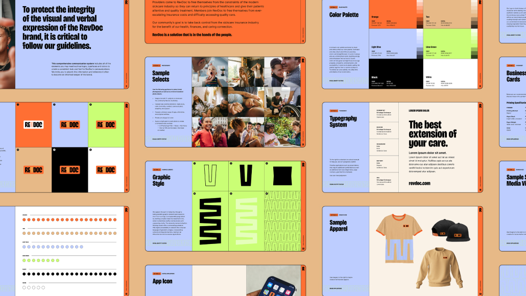
Alongside research toward brand discovery of the pain points and competitive landscape behind the company, customers, and niche, the creative direction for both the overall brand and the app set out to pinpoint non-negotiable visual elements that convey a fresh take on the concept of revolution.
Immediately clear was how RevDoc must conjure up the fervor of change and a sense of urgency without stirring negative emotions like anger or fear. Nostalgia emerged as a beautiful universal, eliciting positive feelings that could drive people to action. Individuality remains intact and respected, since memories vary with each person, but that feeling of longing to connect with something personal and familiar is shared by everyone. Secondary to nostalgia came human touch, bringing depth to the visual landscape.
RevDoc agreed that these two concepts were essential to any brand work. Next to the visual work, C42D was performing research and brand exercises to sharpen messaging. One standout exercise was looking at existing messages in the space—phrases like rally, luxury, and wellness—and exploring how to express related messages with fresh vocabulary. Speaking in terms of a pragmatic movement, holistic healthcare, and cutting out insurance admin costs were among some messages developed to reinforce a new voice leading compelling conversations—and action.
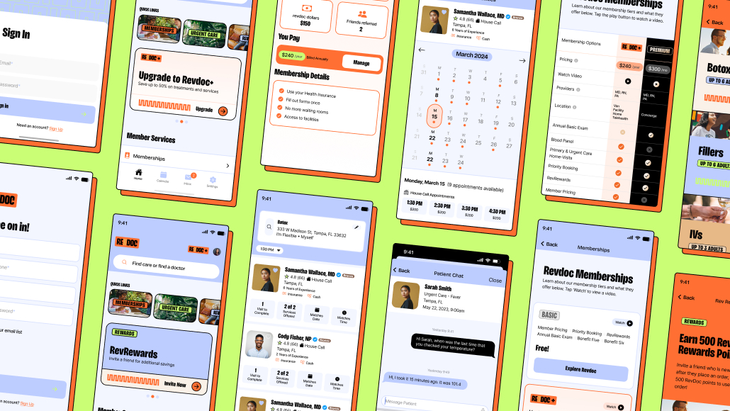
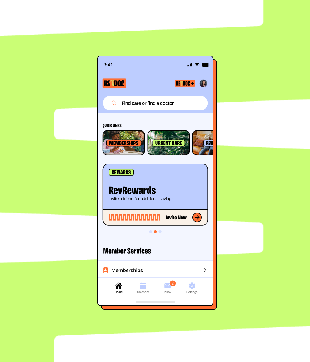
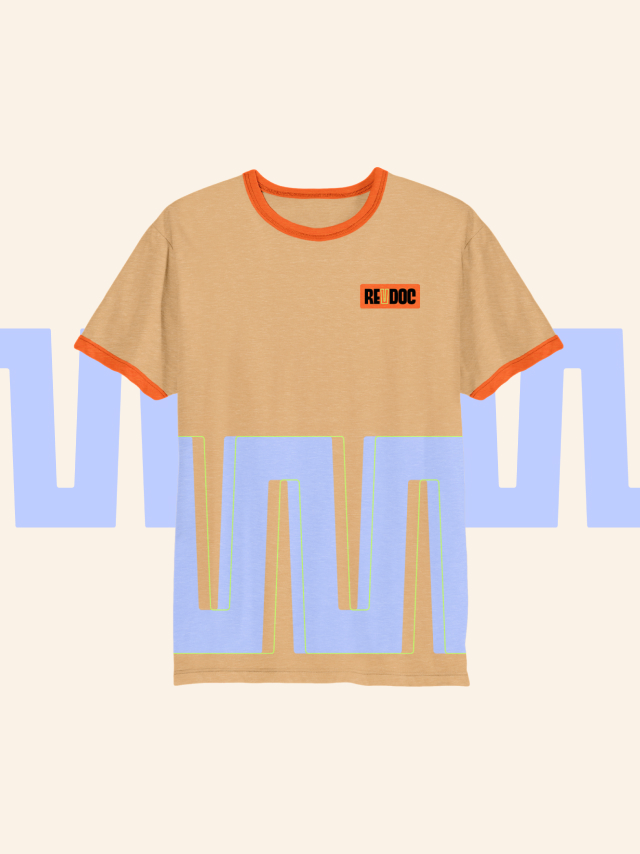
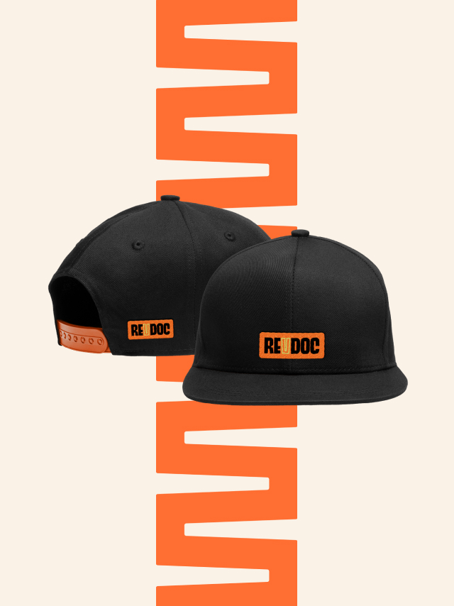
C42D then took these concepts and began to develop specific visual components to bring the brand to life.
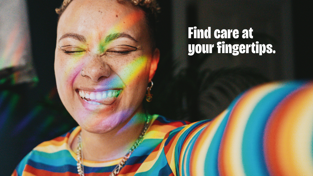
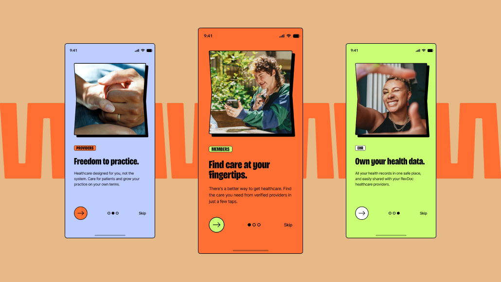
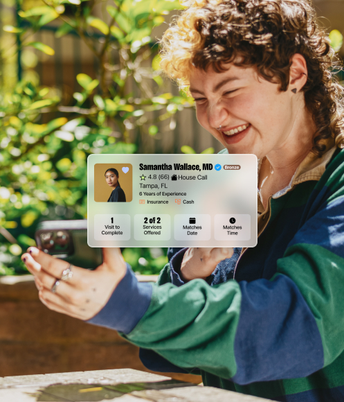
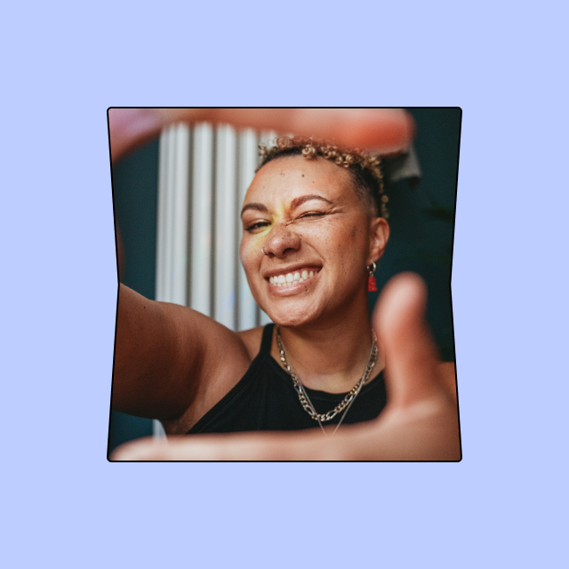
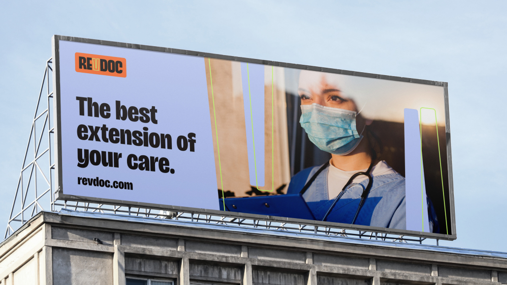
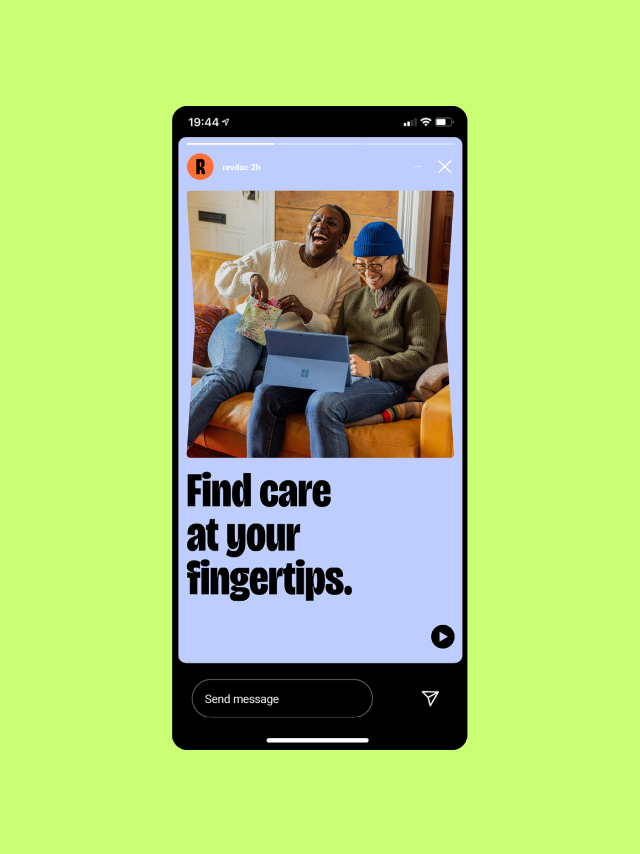
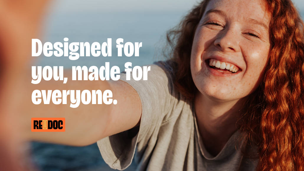
It became clear that the use of full-color reportage photography capturing real-world moments would be one part of the visual brand. By capturing genuine moments and interactions, these images can celebrate everyday life and foster a sense of belonging and unity. The idea that real people can reclaim their livelihood to leave their sick days behind balances authentic with aspirational. A slight grain helps create a consistent look and feel across the brand, while also reinforcing nostalgia.
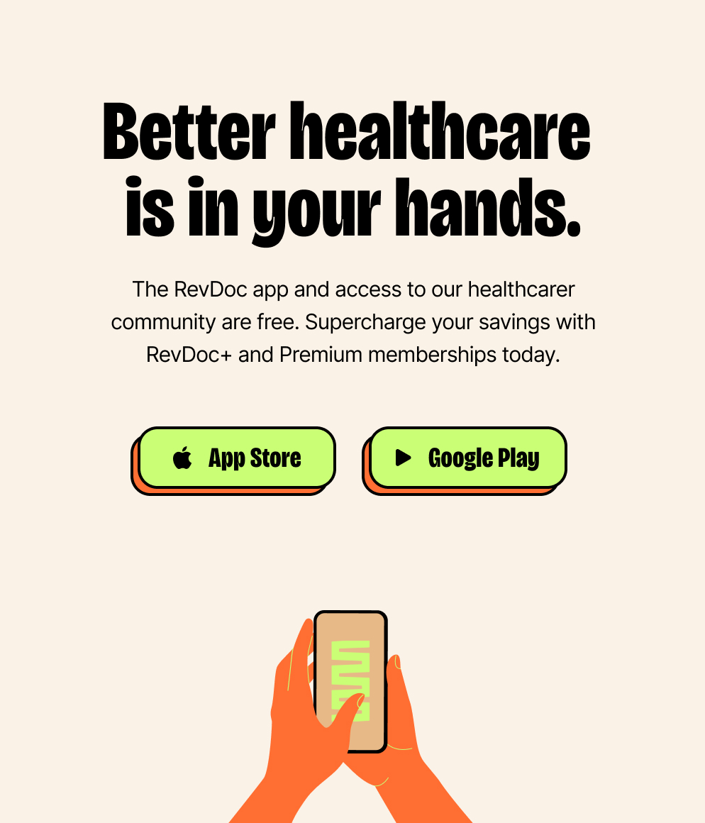
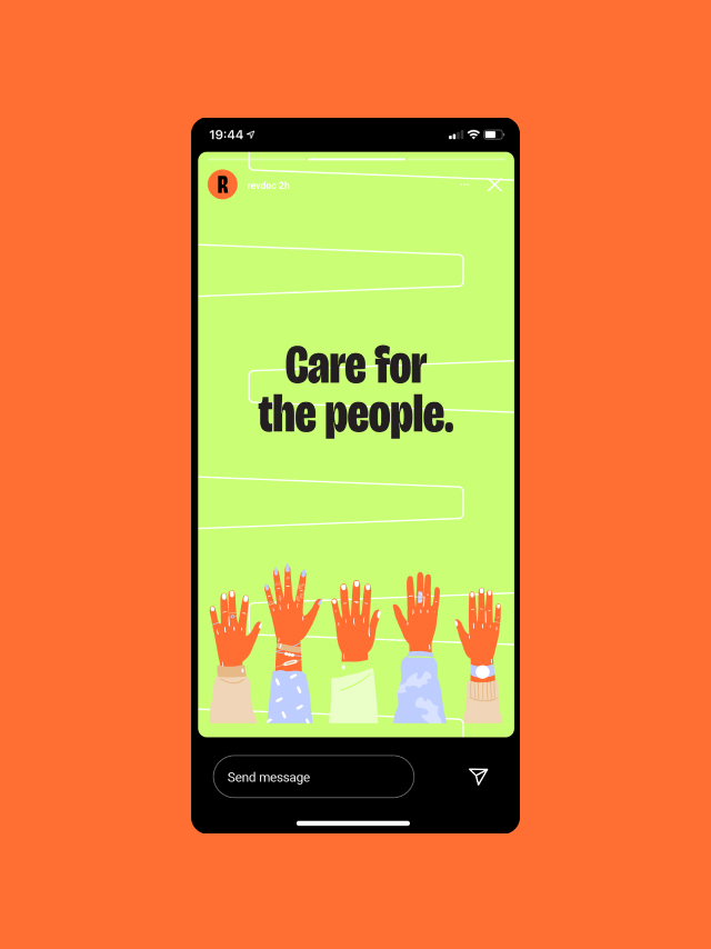
Hand illustrations emerged as another key element. Whether responsible for shaping our world or taking back one’s power, hands are an important visual metaphor for shaping our well-being. Hands are personal and tangible. Hands imply ownership and empowerment, serving as a conduit for accountability and proactively revitalizing one’s well-being. Hands touch every part of life.
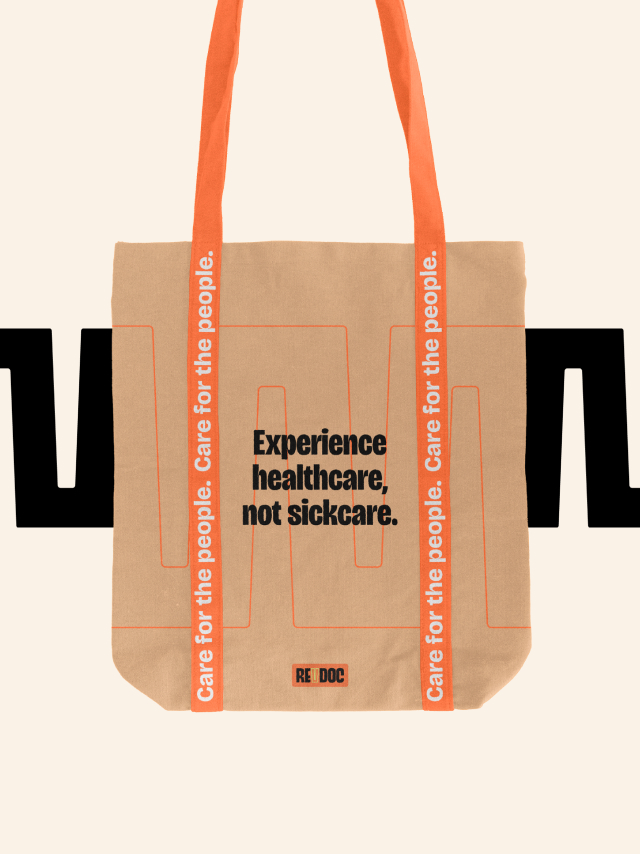
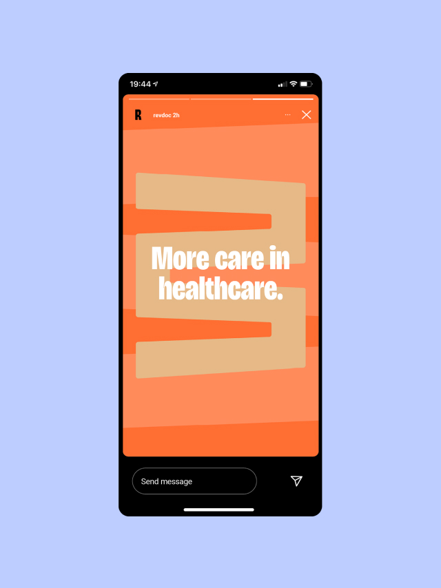
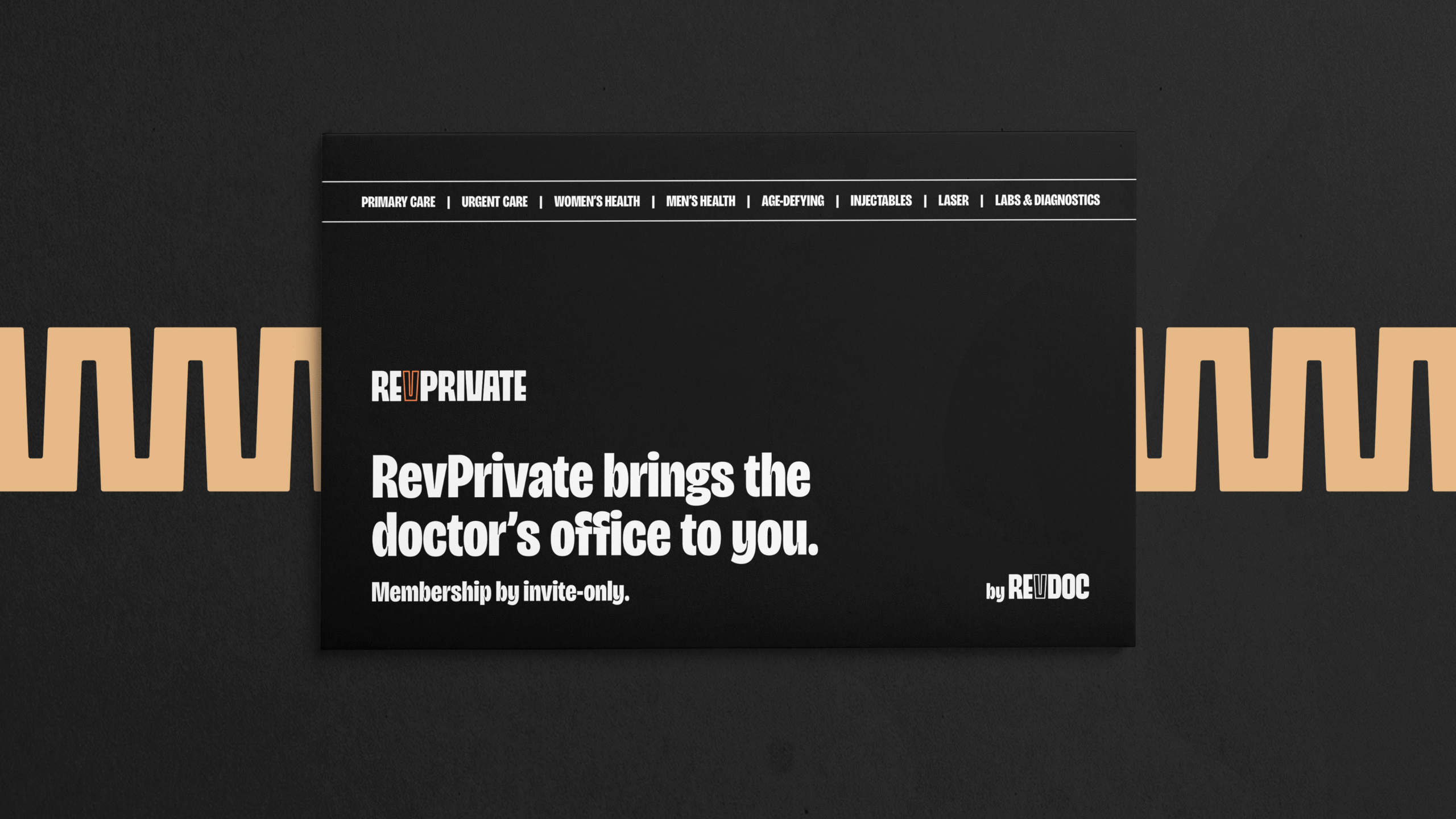
The tone and mood behind these elements needs to be set with color, and enthusiastic orange was the clear winner. Encompassing energy and creativity, immediacy and optimism, confidence and warmth, this hue drove everything from logo development through app buttons. Orange became the focal point of a palette anchored by black and white, which are direct and straightforward. Accents of lime and light blue encourage progress, prosperity, and communication.
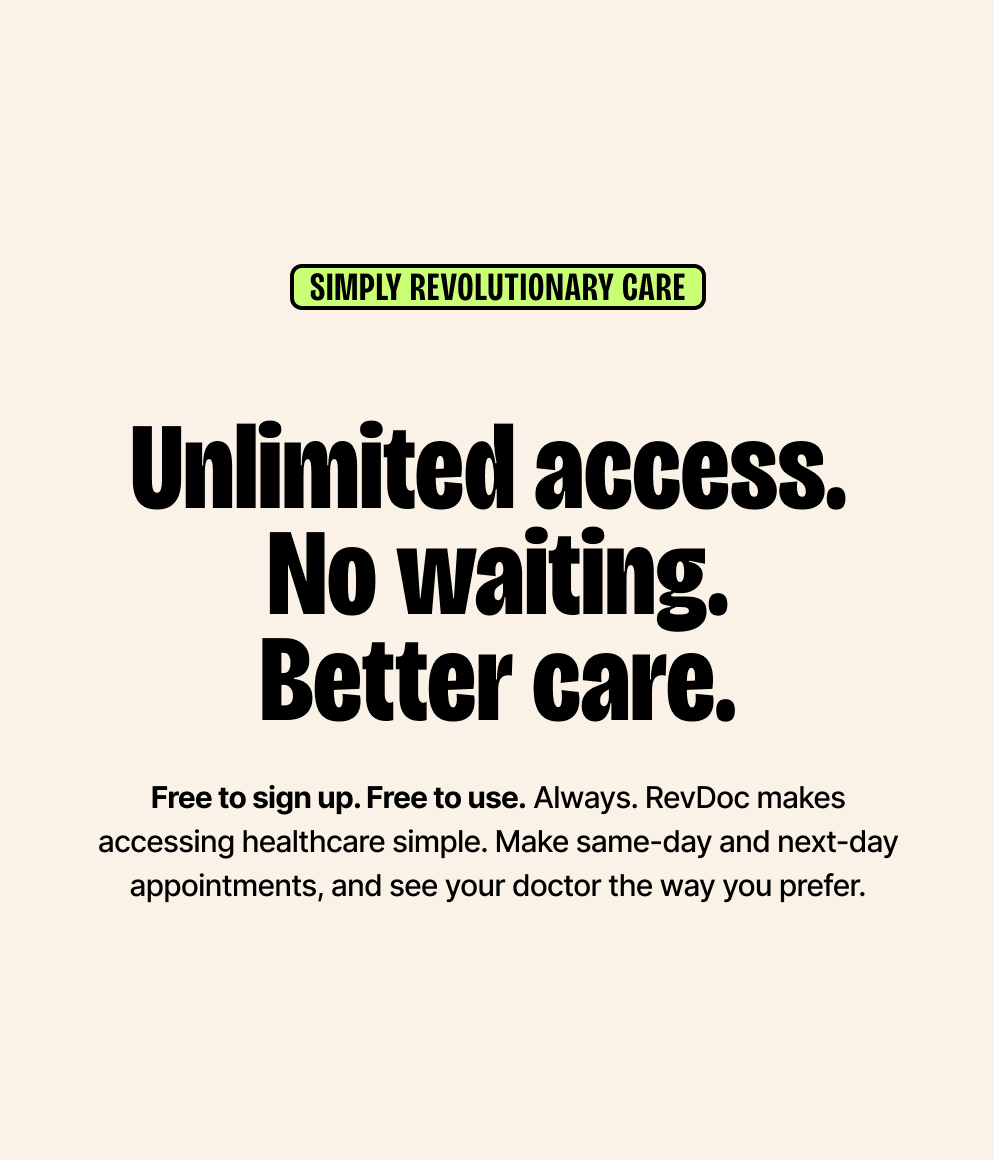
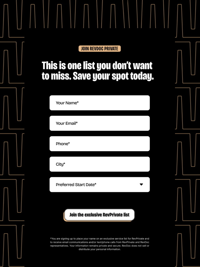
RevDoc strives to be direct and cut out the bloated insurance intermediaries so that people can take charge of their health. Decisions around typography yielded bold, uppercase sans serifs to be both empowering and rousing, conveying a call to arms with a commanding presence. Each capital letter stands as a visual proclamation, while the simple, unadorned lines stay direct and focused.
While assembling the visual brand and app designs, C42D built a comprehensive brand messaging system. Using provider, audience, and industry insights, specific words, phrases, and themes were developed and incorporated into a framework that allows RevDoc to show up consistently across all channels.
RESULTS
C42D delivered the majority of the work within three months. Within this timeframe, C42D met with RevDoc’s team and delivered creative direction in parallel to a full brand platform and an entire app redesign. Visit the site