CHALLENGE
The Sage brand has received few updates since the 1980s. Attitudes were steadfast and new management wanted to re-invent the brand from the ground up, to present a new company to employees, investors, tenants, agents, and the public. This was a massive undertaking where we had to go deep and wide as well. Finally, the co-working and membership models had upended traditional real estate and were causing a re-shuffling of the expectations of tenants.
SOLUTION
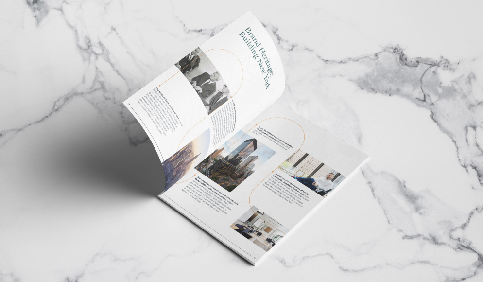
C42D employed our proprietary process for developing brand identity. It begins with thorough, in-depth stakeholder discovery to understand the goals, objectives, and current brand perceptions of leadership. Then, with this understanding, we conduct research to understand how these stakeholders’ objectives align with the market situation and competitive dynamics. With the brand challenges in mind, we analyzed the various audience’s needs and examined in-depth what Sage stood for, what it is (and is not), and what its impact on the workplace is.
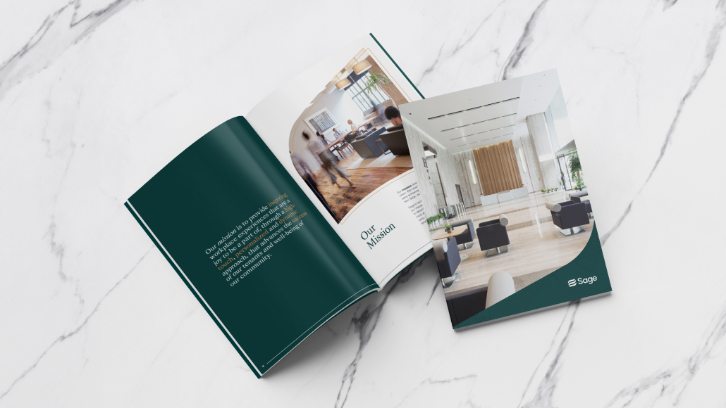
Guided by this work, we defined and developed language around internal and external values, value proposition, brand vision, and mission statement. We landed on the messaging platform of “More Here” as an action-oriented foundation for all brand communications. With the strategic foundation in place, brand personality, tone, and manner are defined to align with the brand attributes and competitive differentiation. Finally, we wrote a brand manifesto that reflects the strategy and established points of differentiation and the brand’s value proposition.
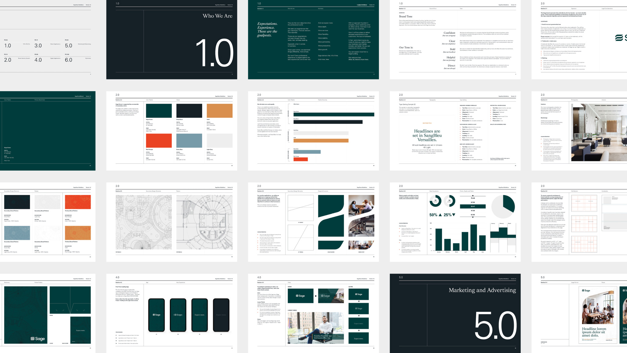
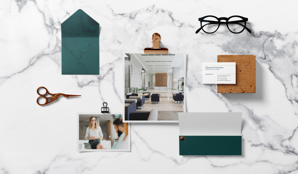
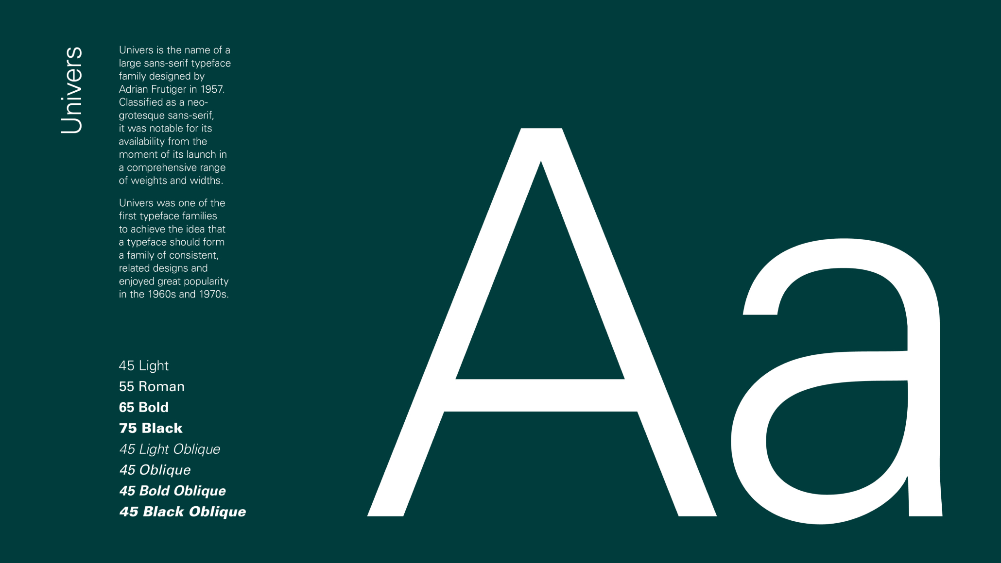
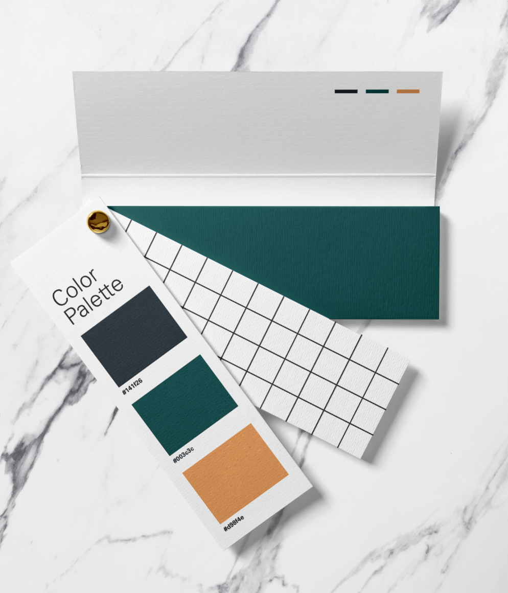
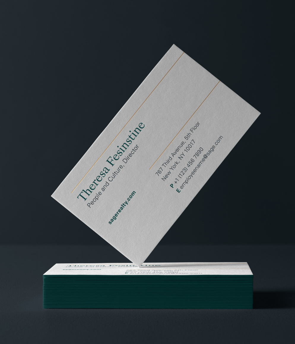
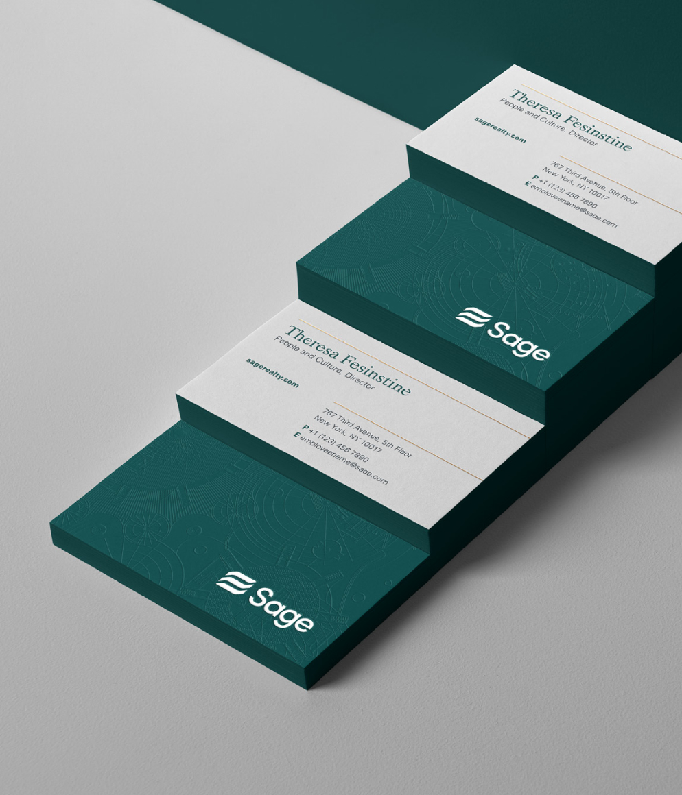
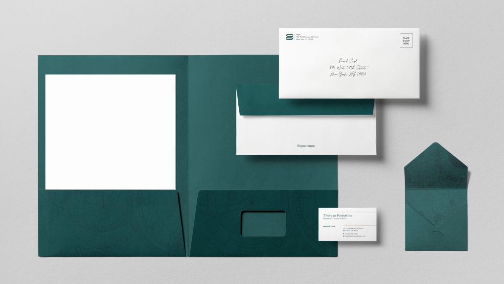
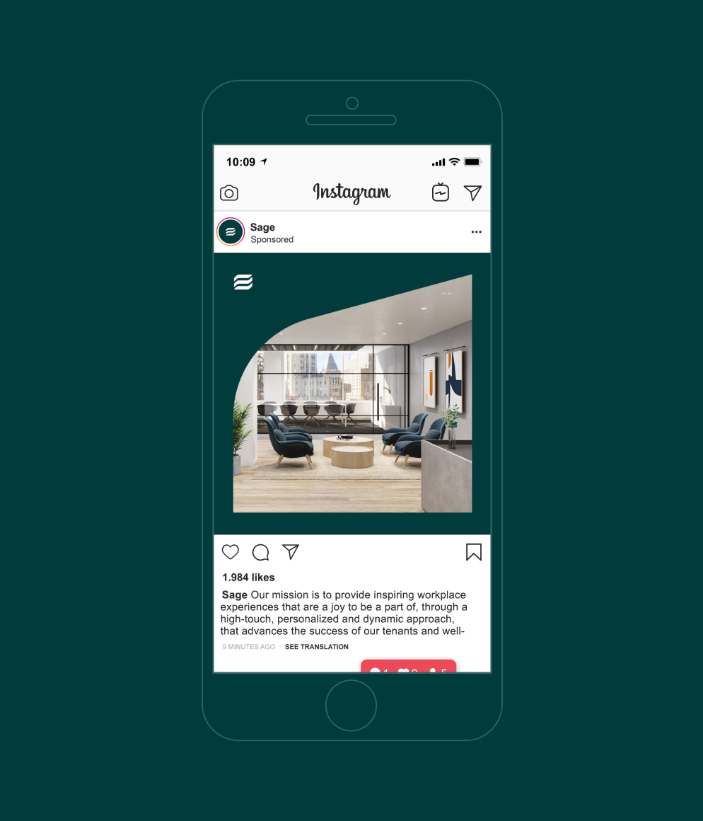
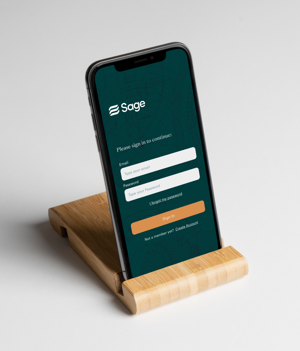
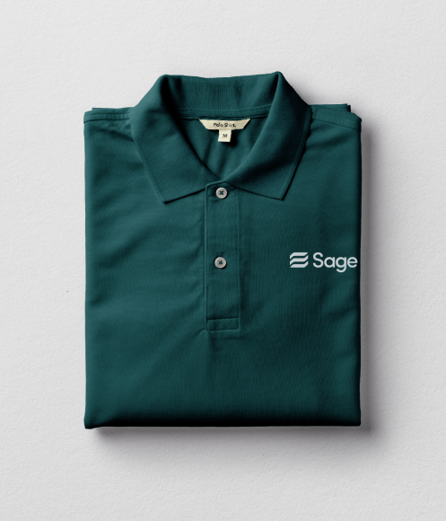
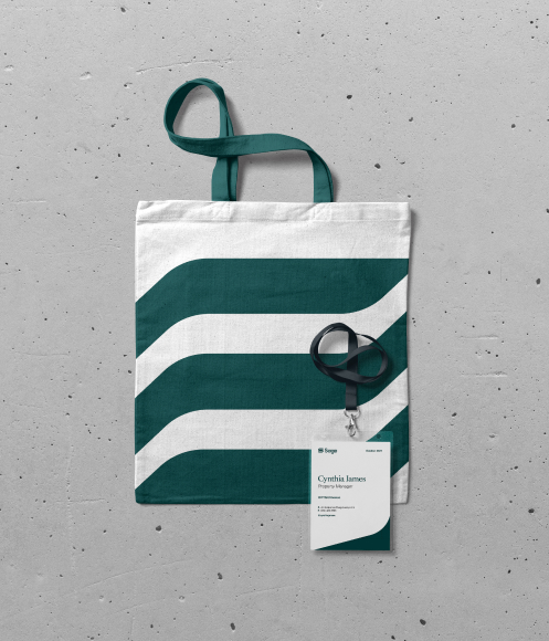
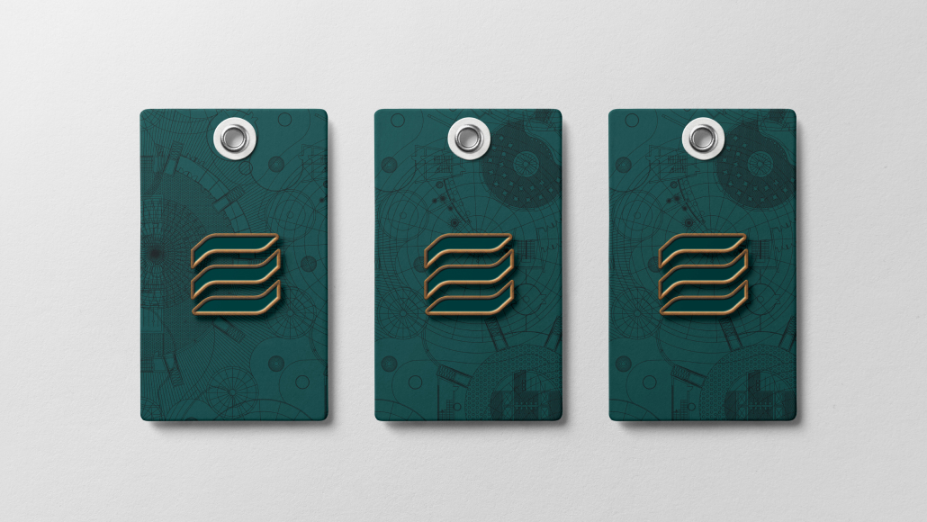
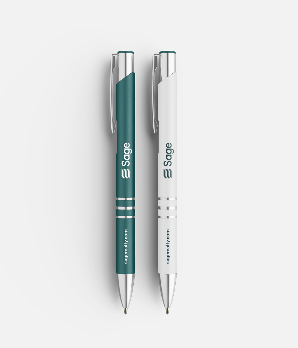
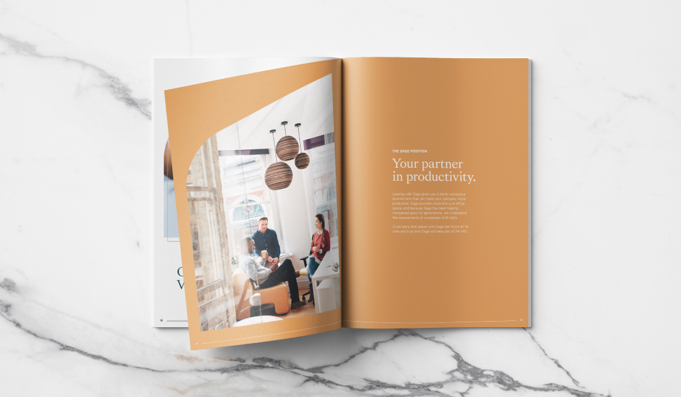
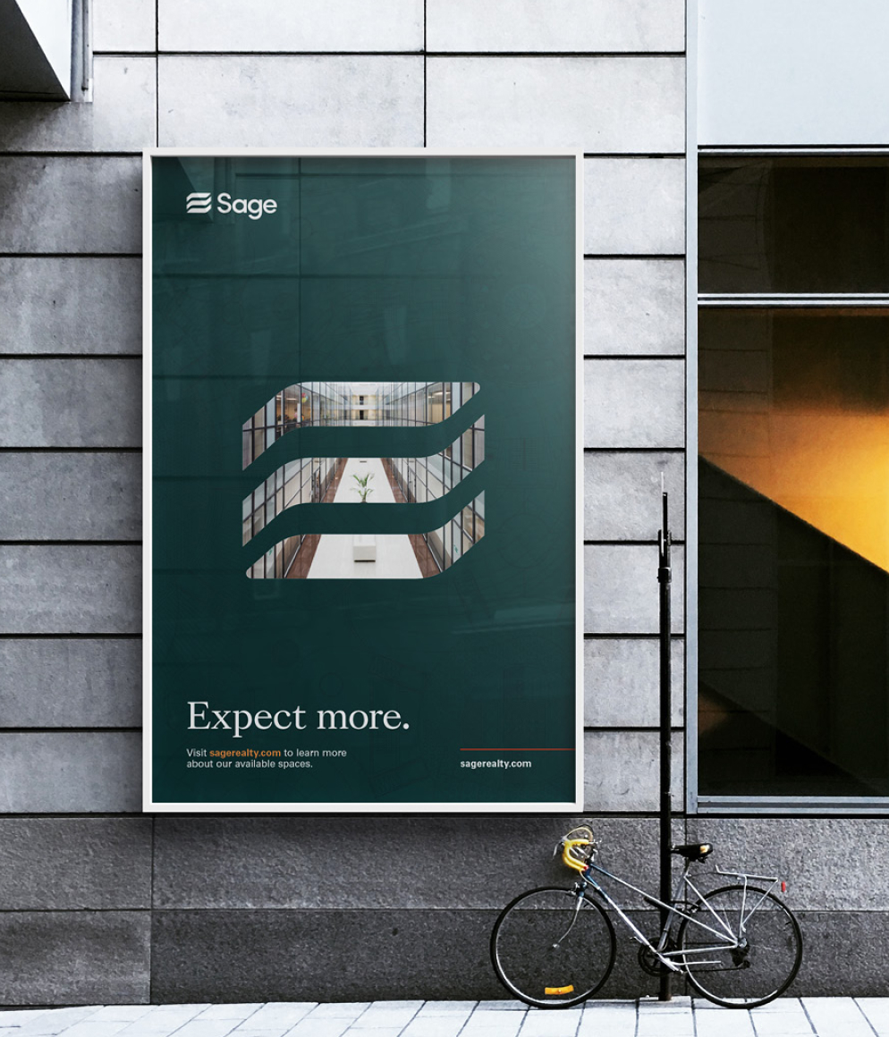
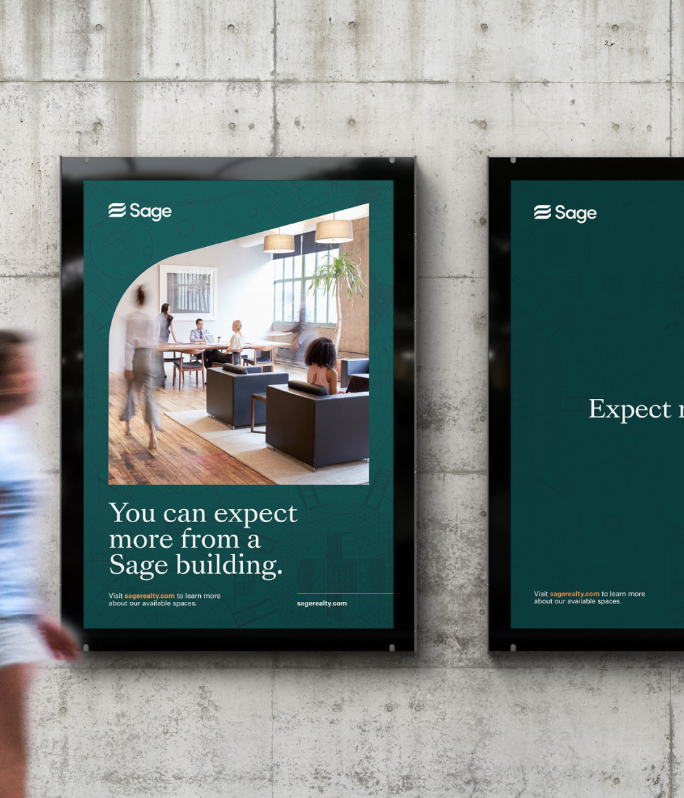
The primary brand mark was inspired by the shape of one of their premier properties on Third Avenue. We chose green as the color of growth and renewal. It is symbolic of balance and harmony. It projects a calm and sophisticated feeling to all communications. Commercial real estate is a category where brand expression spans numerous touchpoints: Print, digital, environmental, signs, advertising, marketing, tenant materials, leases, reports, and photography, to name a few. C42D developed a comprehensive brand standards guide that ensured the entire brand expression, both visual and verbal, is consistent and strong.


They were always very collaborative and thoughtful in what they brought to the table. I also appreciated their ability to get into the heart of our organization, and there was always a good reason for all of the stylistic choices that they made for our brand.