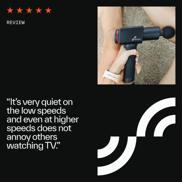
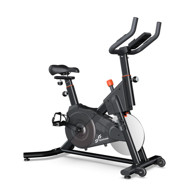
We interviewed the Sportneer team, explored customer feedback as well as engaged in research to better understand the space. Beginners and pros alike loved the brand’s customer service, product quality, and ease of use. Feedback loops drove product improvements and development, and high levels of quality control provided consistently great products.
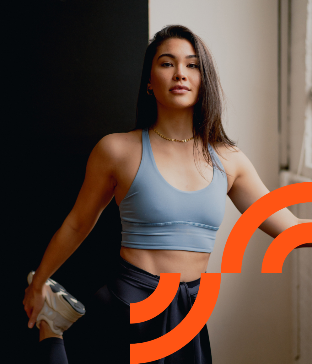
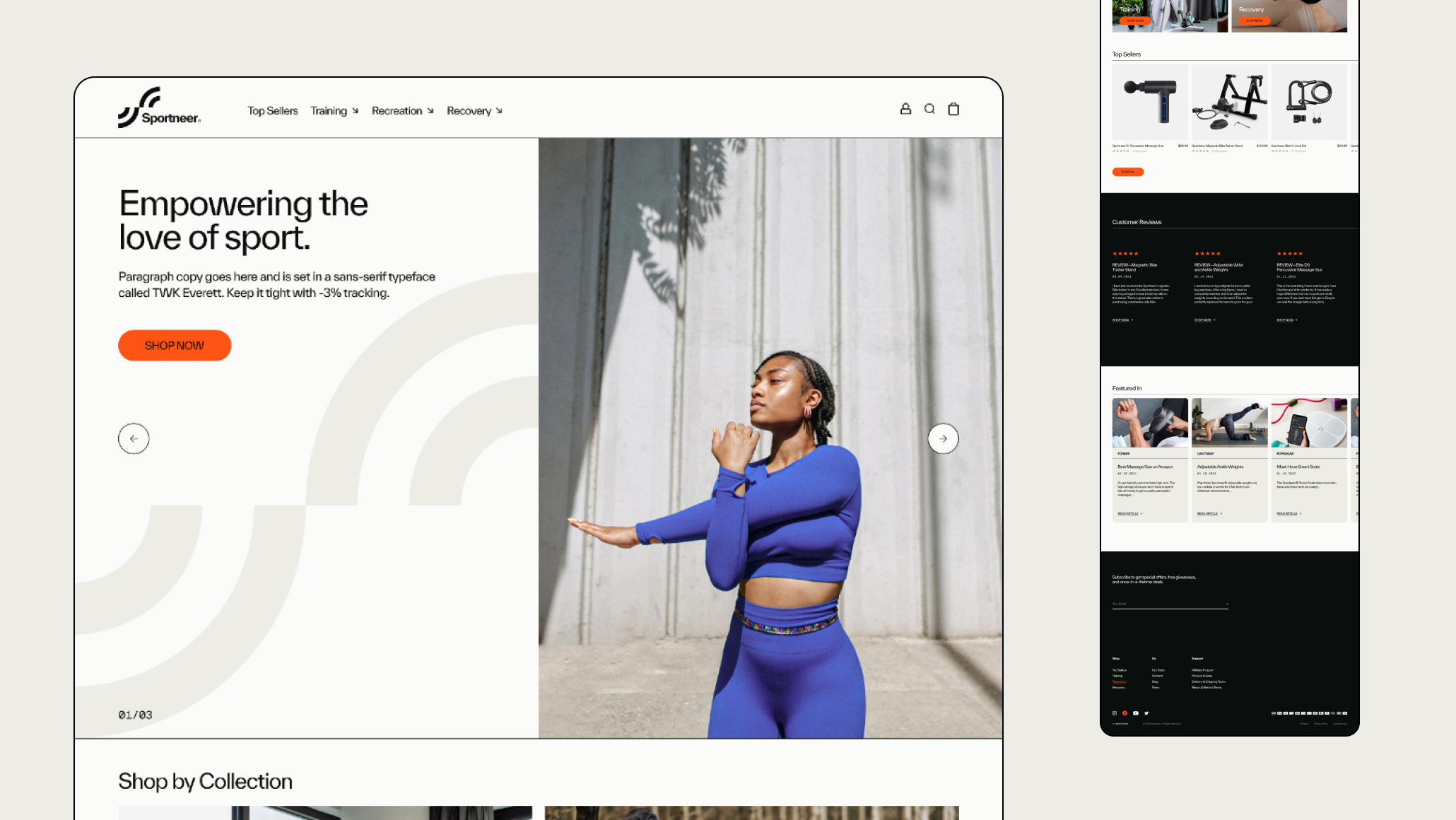
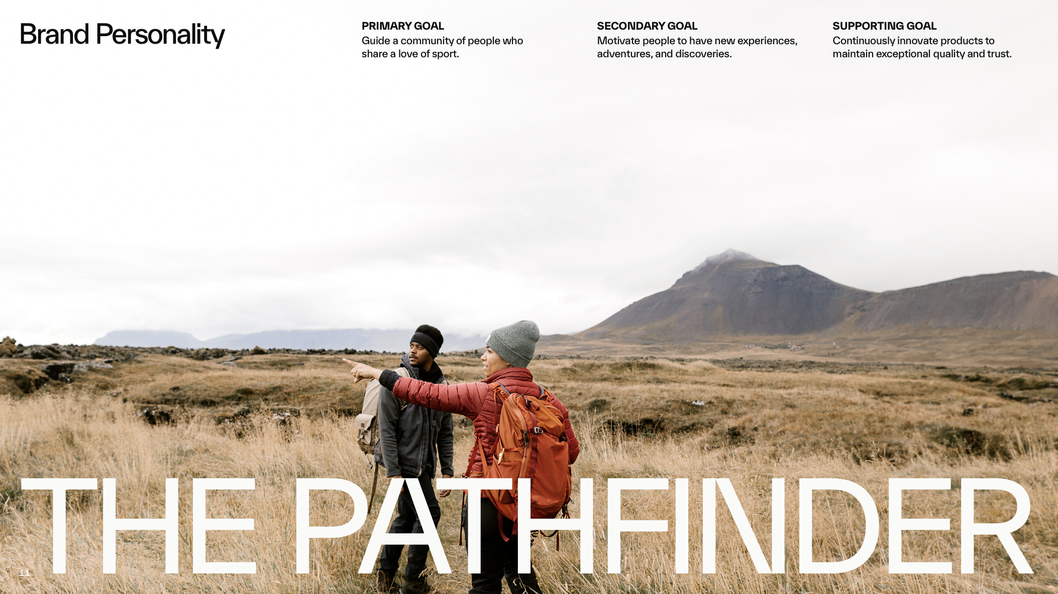
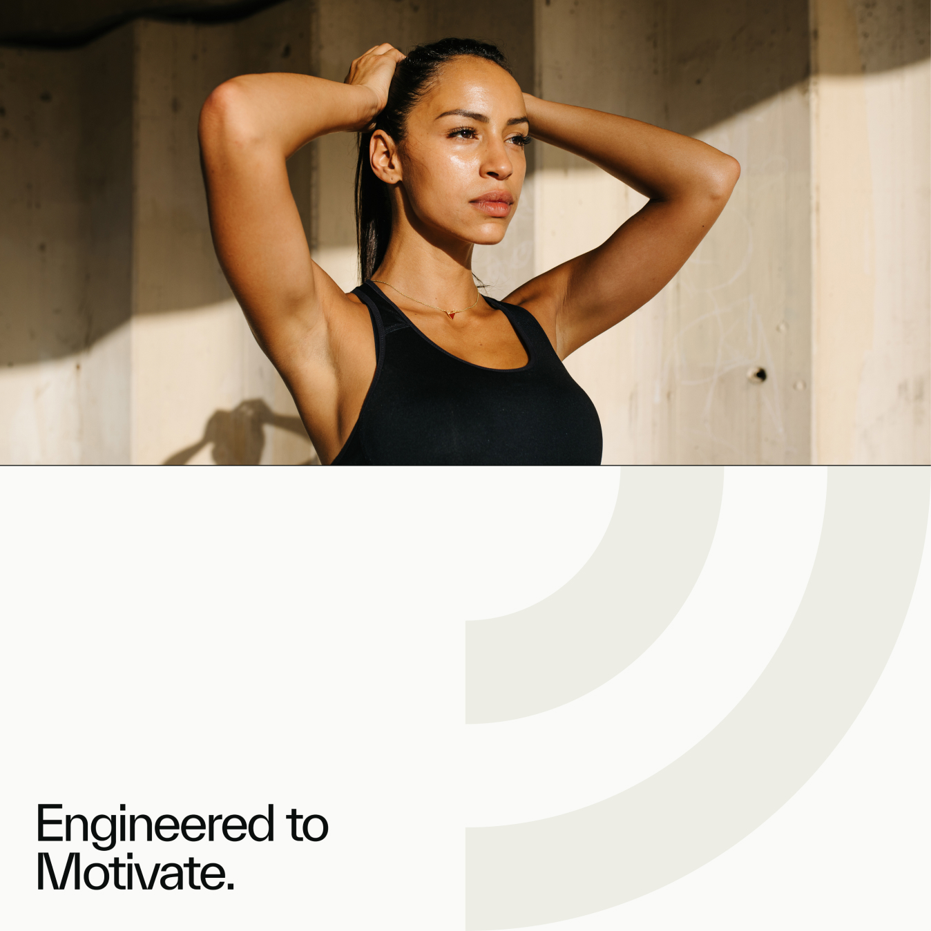
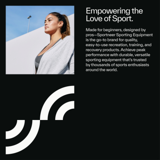
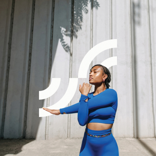
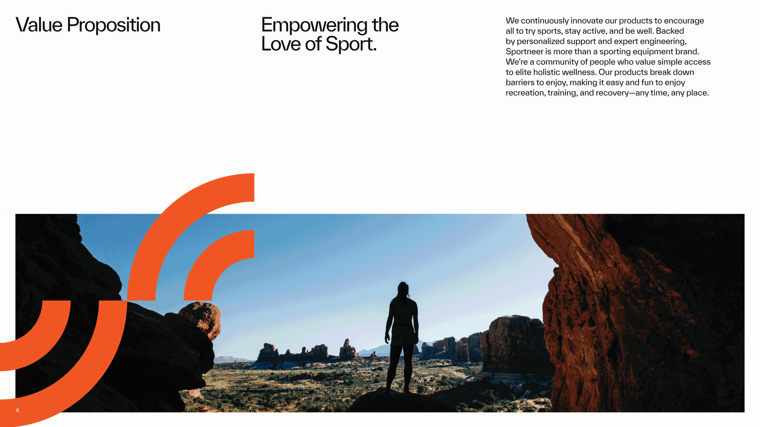
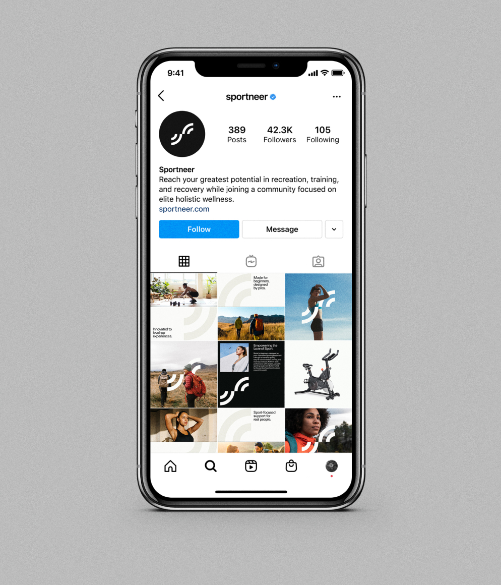
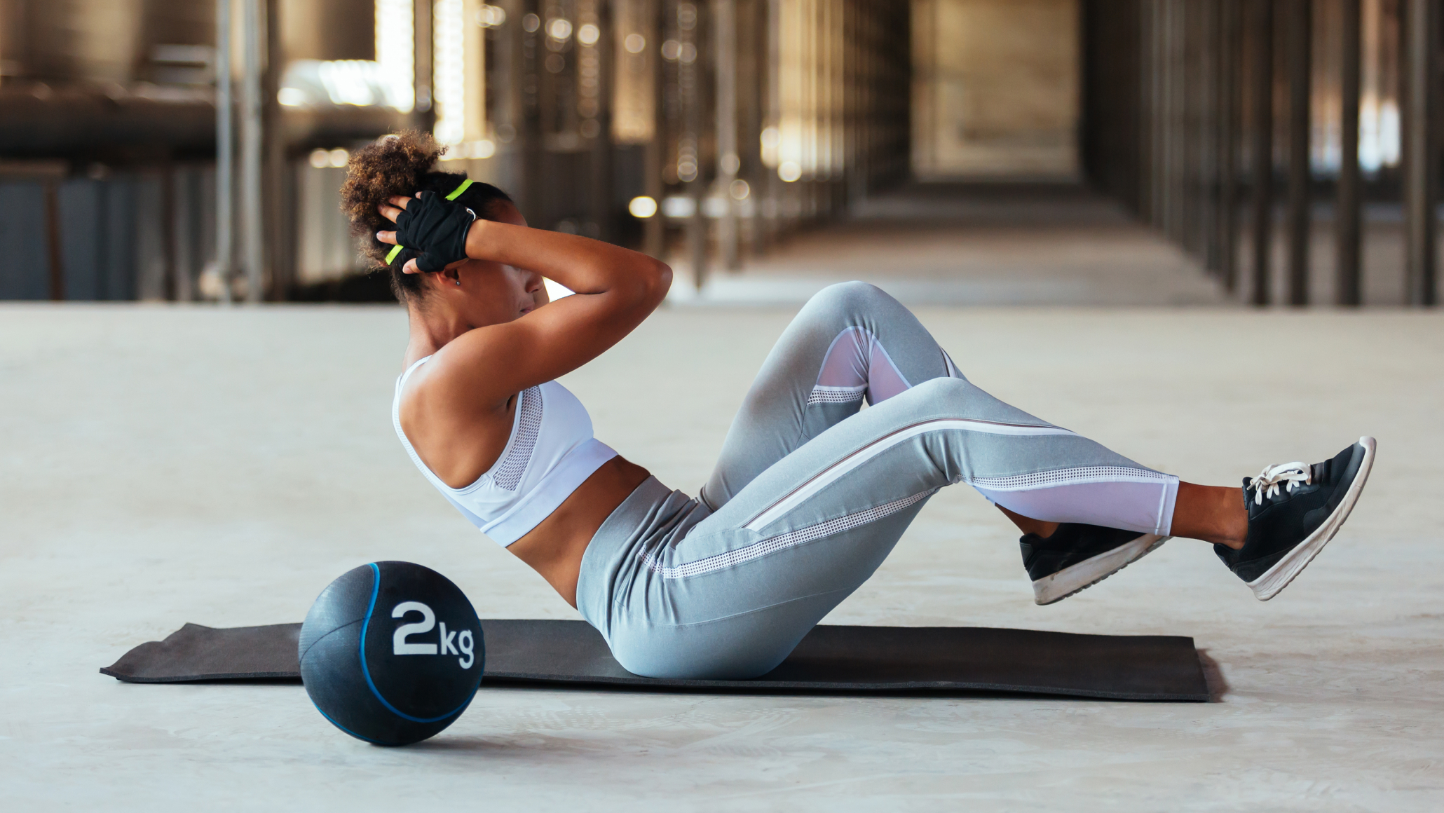
Our Story was centered around “empowering the love of sport.” Whether it’s the expanse of the great outdoors or a gritty concrete gym floor, beginners want to start their fitness journey on the right foot, while pros expect peak performance. Sportneer bridges the gap between first-time adventures and pro-level results with products engineered to motivate, not intimidate. Brand pillars, an archetype, and personality traits were all created to support this story.
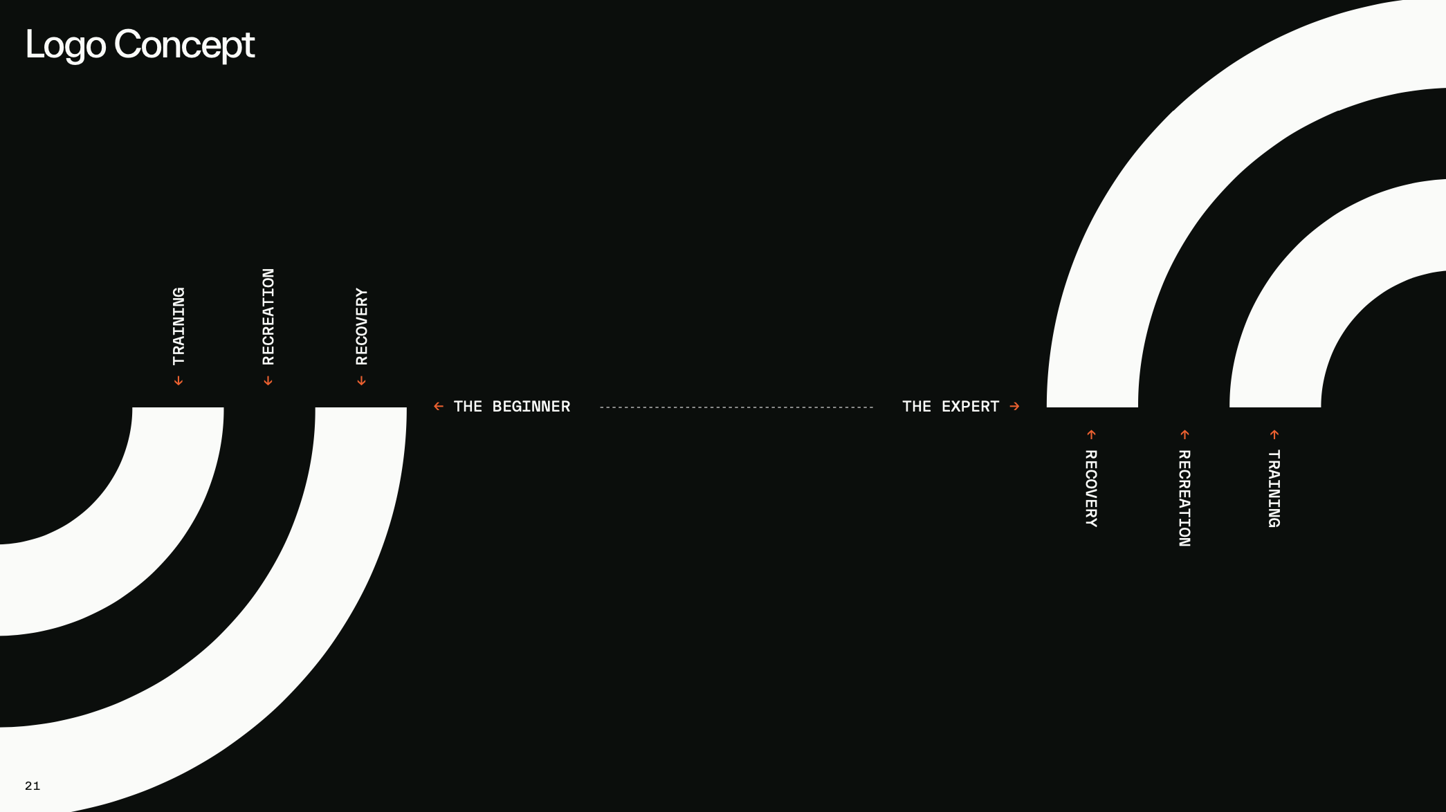
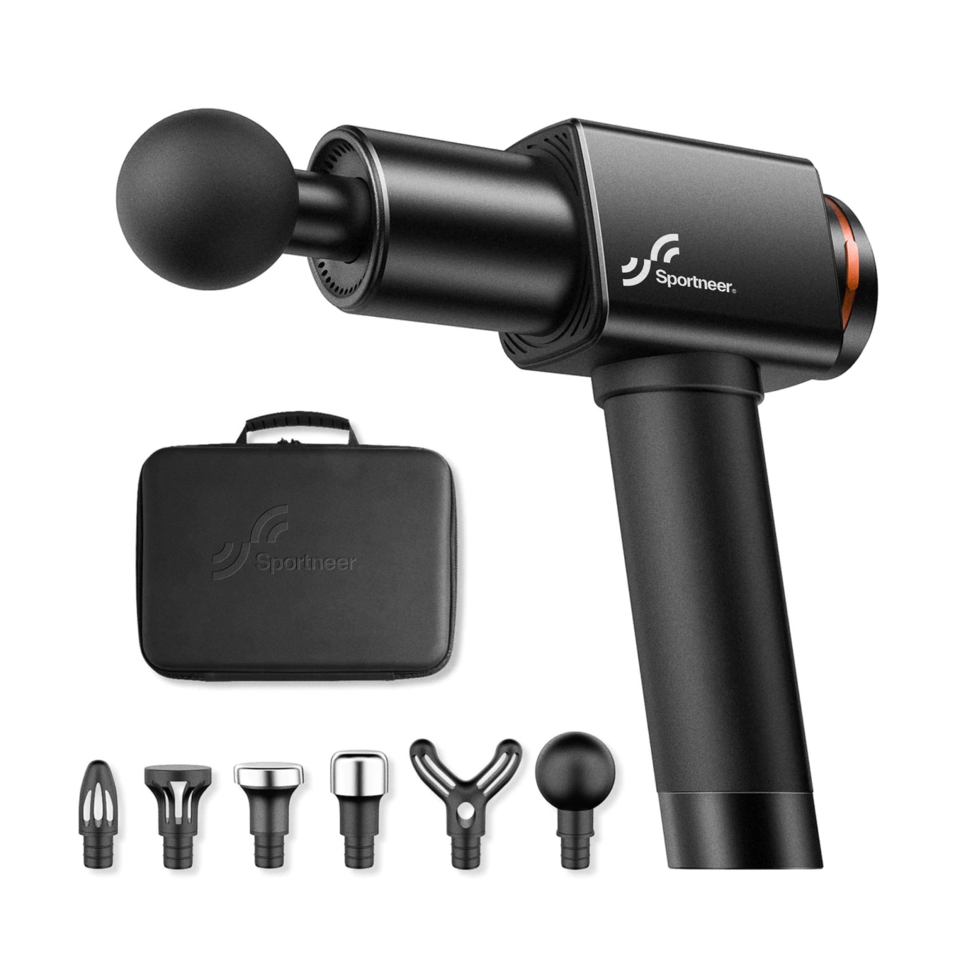
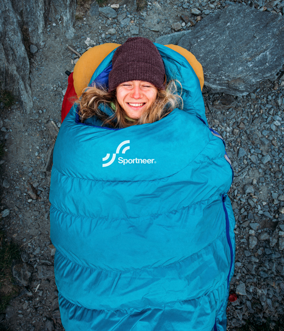
This concept of bridging the gap between beginners and pros comes full circle in the logo concept, a stylized and modern S connecting two halves. A bold color palette and modern typography system rounded out the identity system for this successful brand.
Special thanks to Iconoclast Design Co. for the collaboration and creative direction on this project.