CHALLENGE
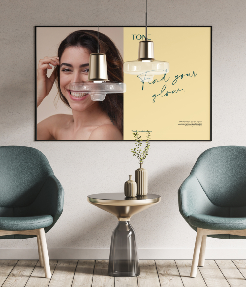
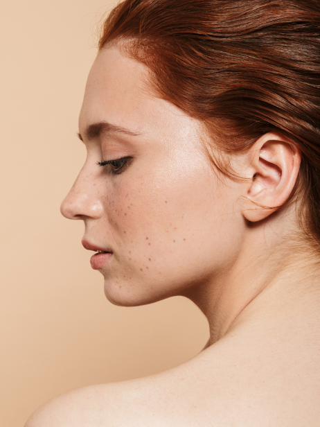
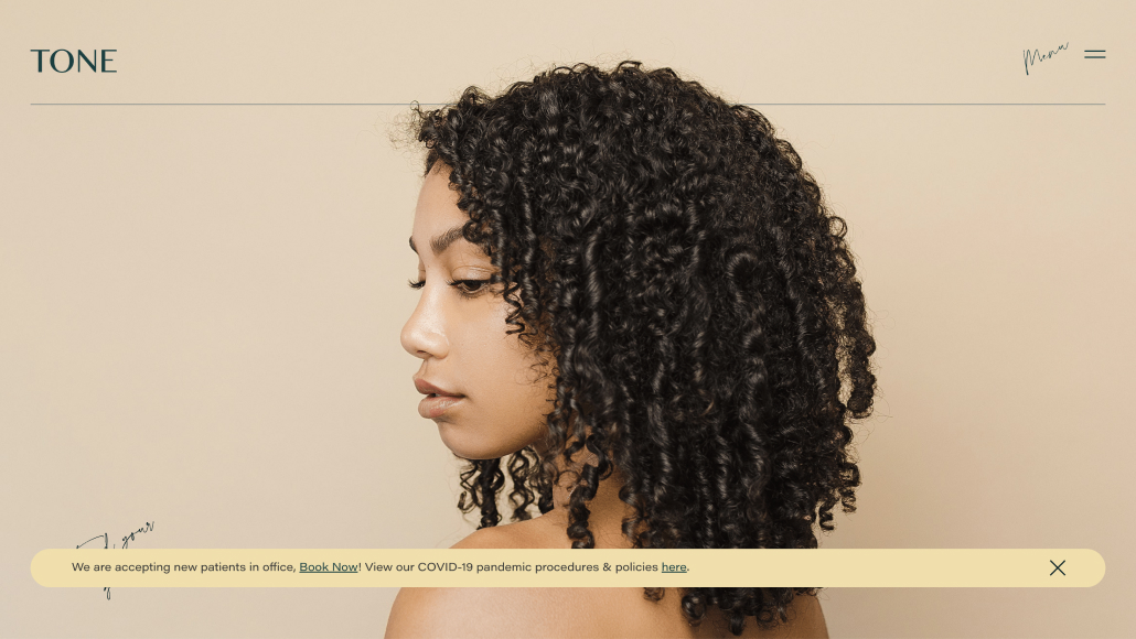
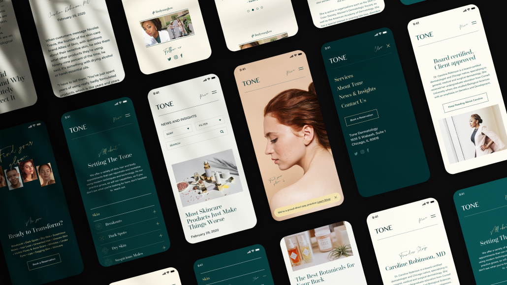
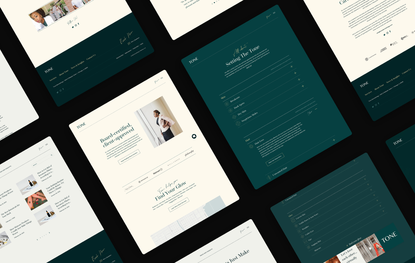
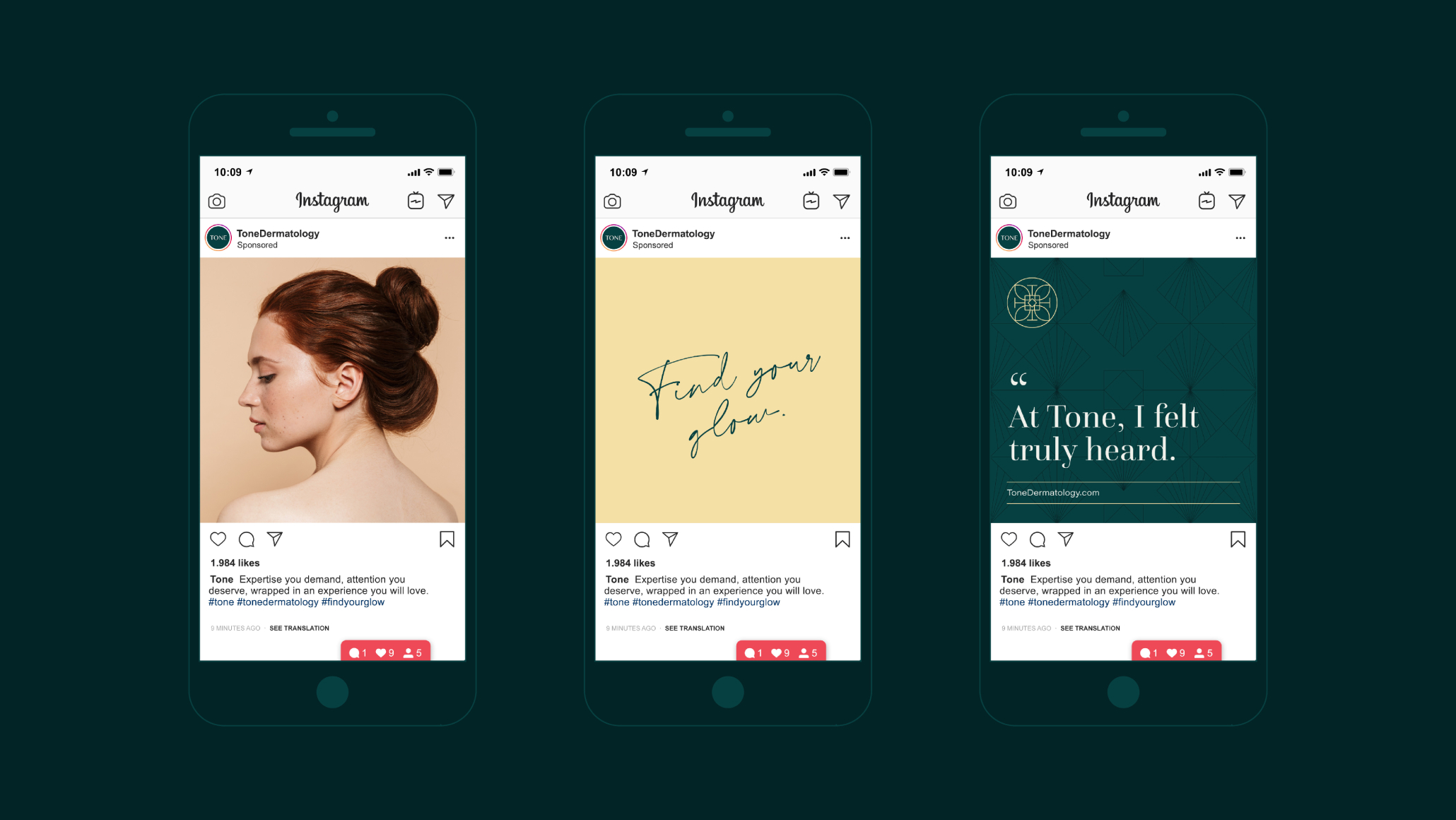
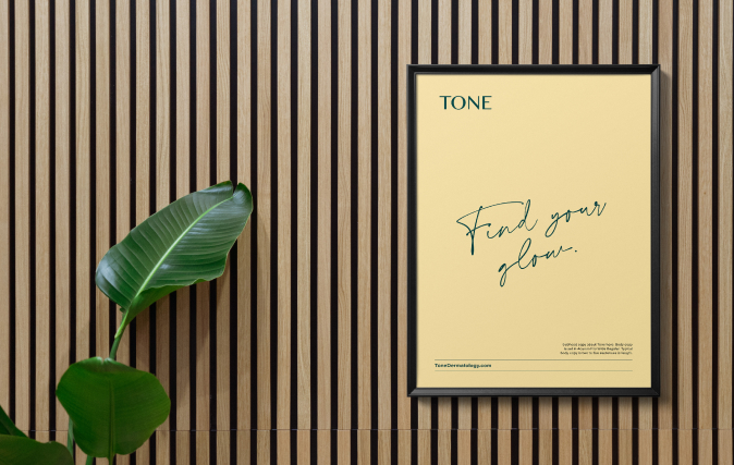
Branding in the medical space is transforming, and many understand that a thoughtful patient experience is essential. Modern urban offices are well-designed, and there is a shift towards a more lifestyle approach. Still, most are stumbling on digital expression. By building a brand around patient experience and translating that experience across the physical space, the website, a premium patient experience, and targeted and strategic messaging, Tone will stand out from the pack.
SOLUTION
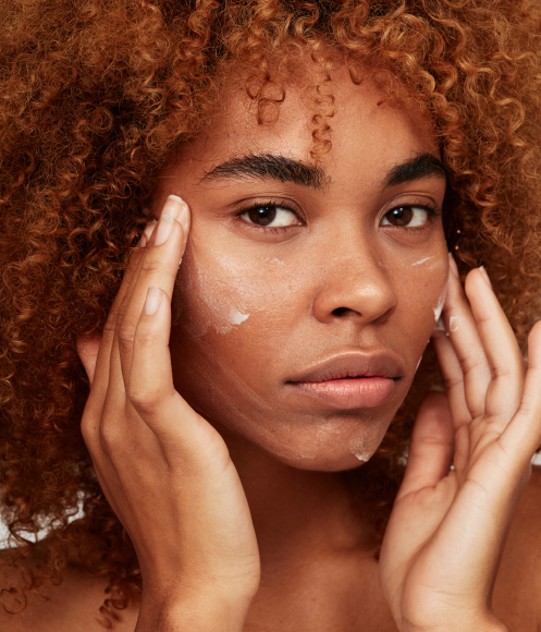
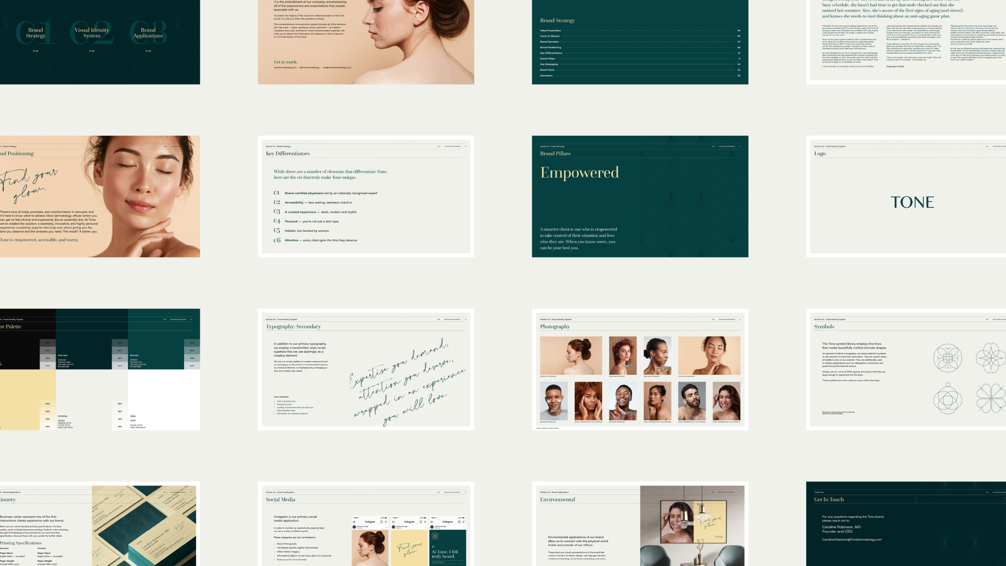
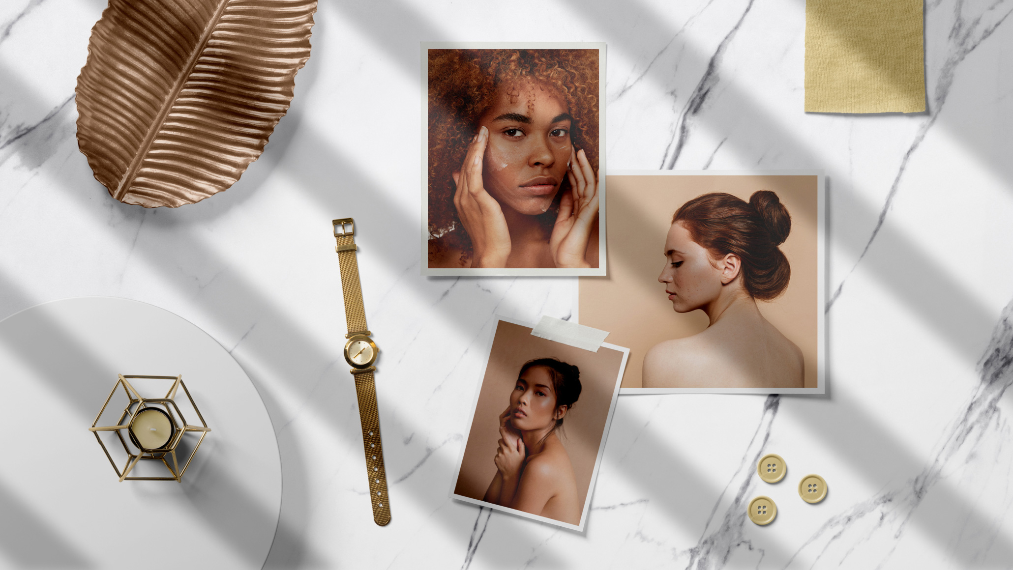
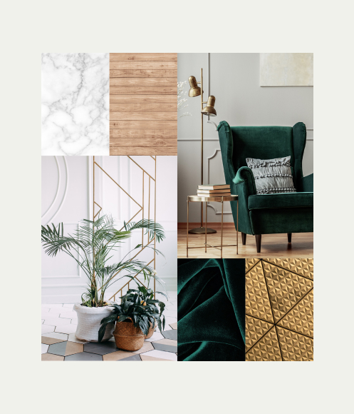
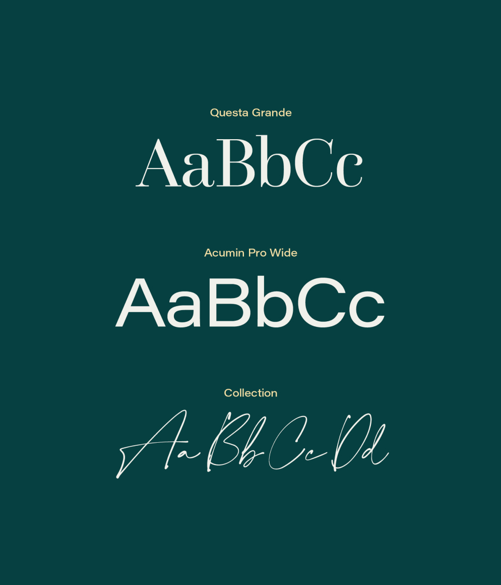
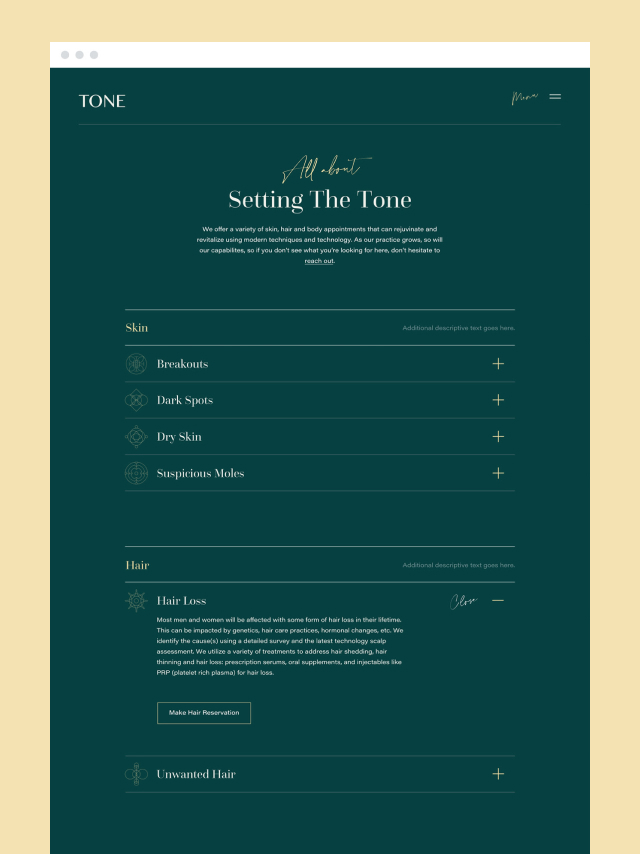
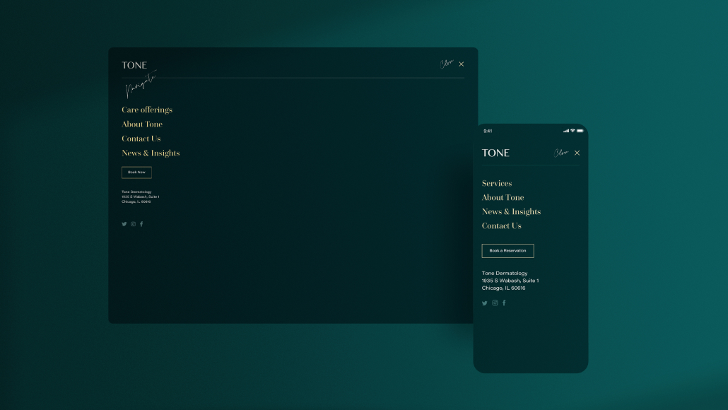
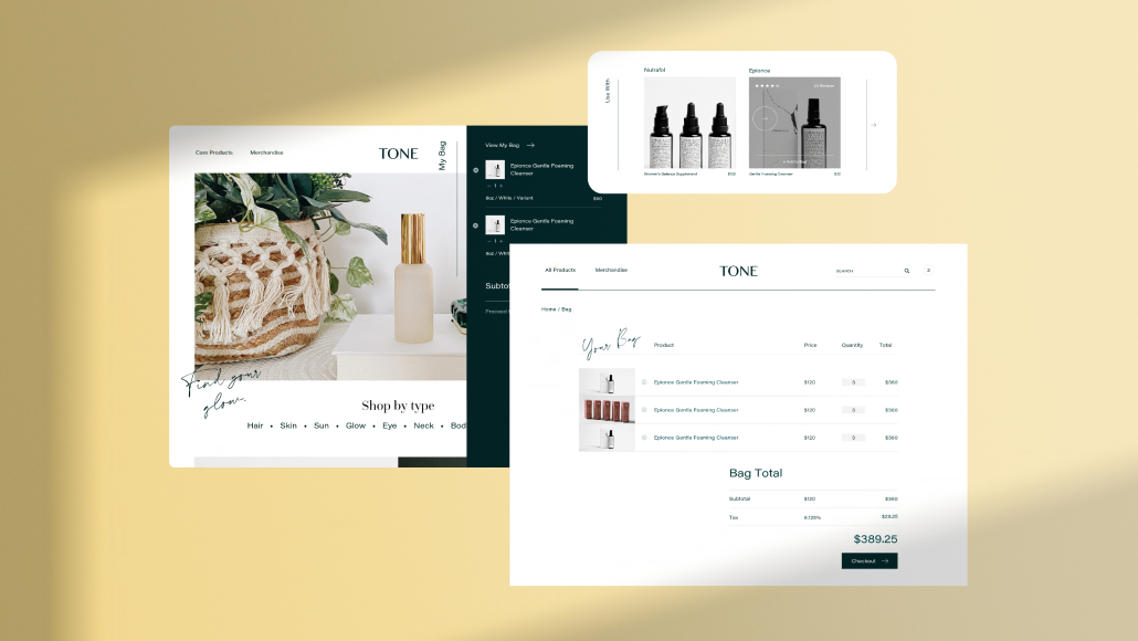
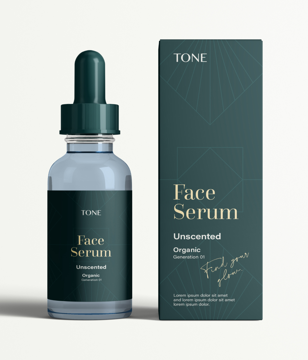
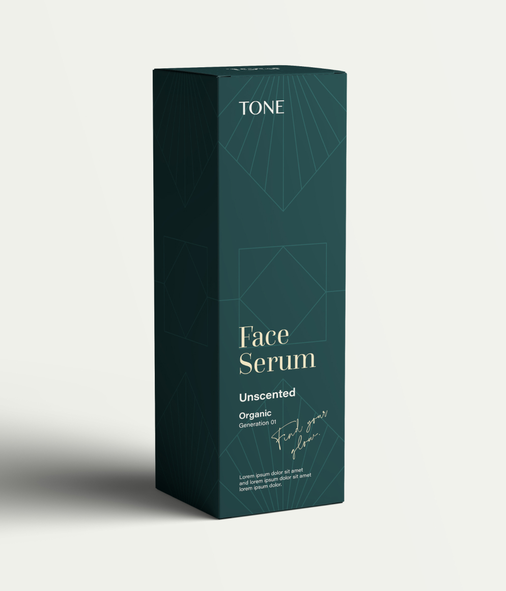
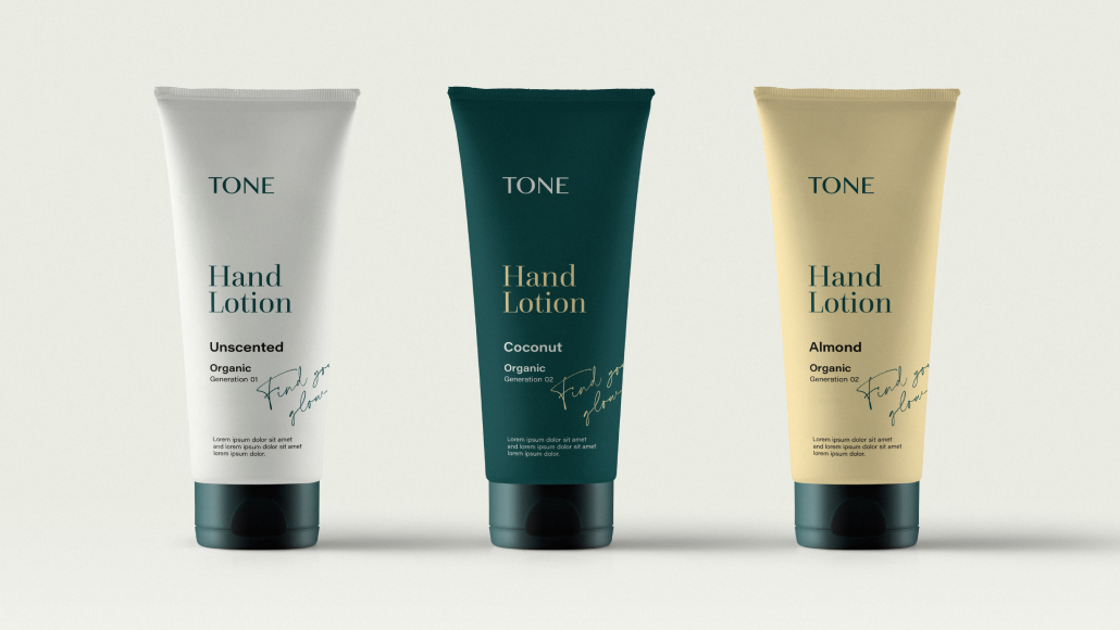
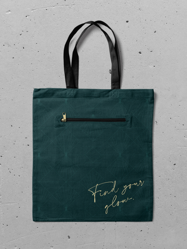
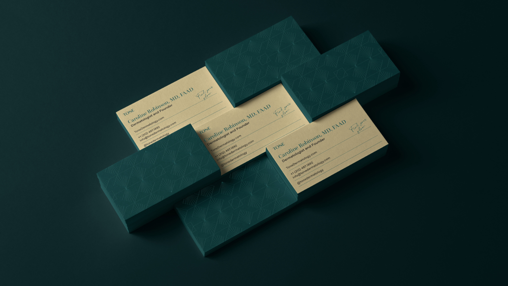
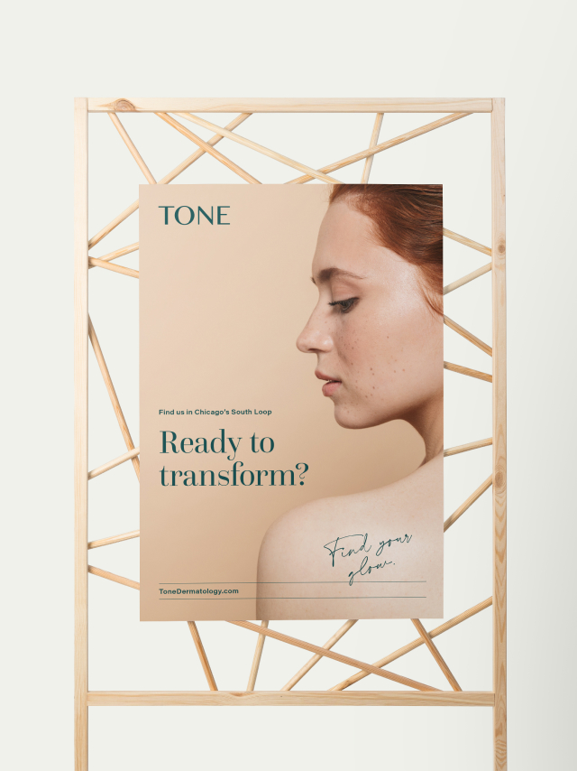
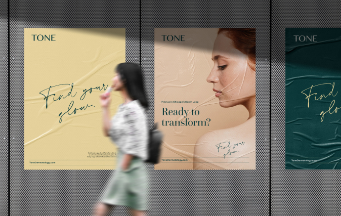
It was essential to strike a balance between elegance, beauty, and expertise. Beautiful jewel greens were paired with a bright yellow and deep black to create a sophisticated palette. The fonts Questa Grande and Acumin Pro Wide complement and contrast each other to create a balanced typography system that is legible, premium, and trusted.