Branding 101: Why does brand typography matter?

You want your brand to be both memorable and effective with your target audience. The font you choose can be a powerful visual tool to help you get there.
Back in Art School, we had entire courses in typography. One teacher made us hand-draw two letters (an A and an O, chosen because they are the most difficult letters to draw by hand) every week in a different font.
They really wanted us to know our typography. And for good reason: its one of the primary ways your brand communicates it’s personality.
Remember that typography is more than just selecting a font; more than arranging letters to be easily readable and appealing. To be effective, brand typography requires a mindful approach, factoring in principles of graphic design and behavioral psychology.
Famous examples of good brand typography
You’ve been exposed to strong typography before.
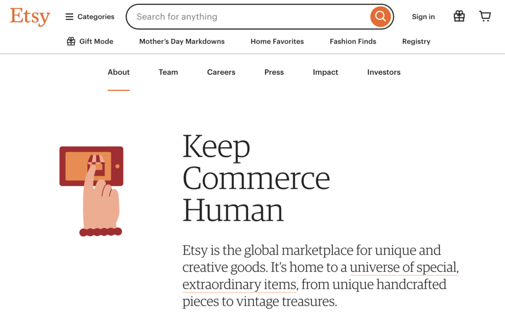
Etsy is a good example; its entire logo centers around typography. You can recognize the orange color and the “E” of Etsy anywhere. Etsy does a nice job of carrying its font onto its website to maintain a consistent yet friendly feel.
Apple might be one of the most famous examples of typeface being used effectively in marketing. Distinct Apple product cycles have been marked by specific fonts, helping both reinforce brand and signal progress. Think of how much Apple could communicate in fewer words and how well they trained the general public to keep an eye out for what they would do next – all because of very simple design choices.

What makes brand typography “good” or “strong”?
The answer to this question can be found in a few key considerations that center around considering your audience’s needs and values and building an identity that stands out. Some of these considerations may seem more obvious to you than others, but take a moment to consider each of them whenever you review your typography.
1. Legibility and Readability
The most fundamental aspect of good typography is legibility. This might seem obvious, but you’d be surprised by what’s out there. If your brand’s typography isn’t legible, how can anyone read your messaging and learn who you are?
Consider how legibly fonts appear when used in various sizes and different mediums, including both digital and print.
Mental health start-up Actify needed a font that was easy-to-read, both for legibility as well as to convey trustworthiness and reliability for its vulnerable audience.
2. Personality
We start with research and work on defining the brand so that we can understand and apply its personality to design choices like typography. Whether it’s professional, friendly, innovative, or traditional, your typography should convey the same qualities and values that the brand embodies.
Size and spacing are helpful ways to manipulate an existing font, but choosing fonts that align with brand values requires some careful consideration. What are you trying to convey within your industry and niche? What room is there for playfulness and non-literal approaches?
For example, many tech companies think they want a sans-serif font for their name to convey modernity. With the right touch and for the right brand, a serif font might actually make more sense for its potential allusion to nostalgia and history. Curvy or handwritten text can convey reduced formality/rigidity and even a sense of humor that reaches audiences more consistently than a (potentially misinterpreted) joke.
You can elicit feelings from your audience in subtle ways using visual cues, including those from typography. If your audience is global, you can transcend borders and avoid getting lost in translation.
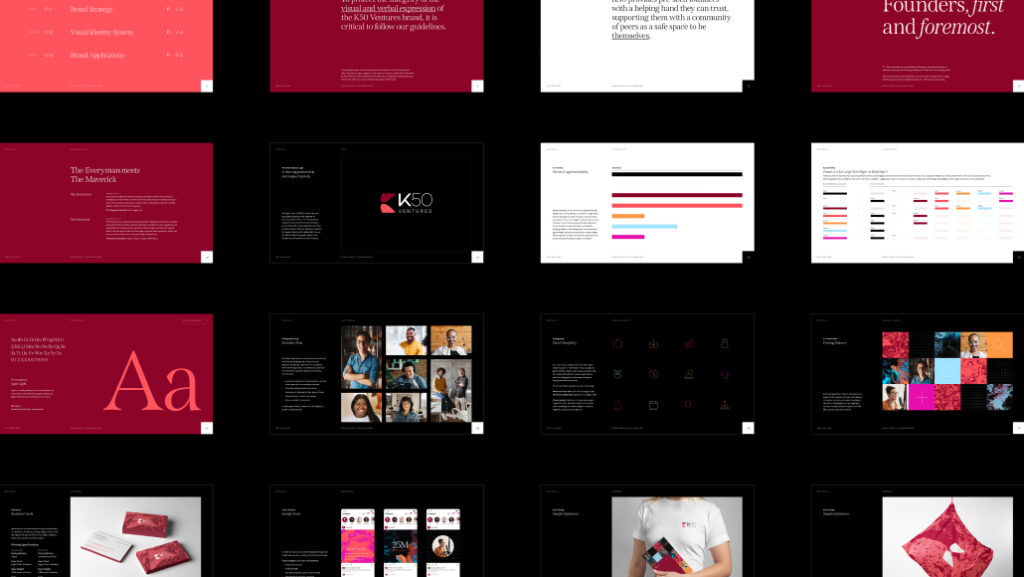
For venture capital firm K50 Ventures, a simple combination of distinctive font, disruptive color choices, and real-world portrait photography helped capture their core value: staying true to the humanity behind the firm.
3. Distinctiveness
Unique fonts can be one way to visually differentiate a brand in a crowded marketplace, but there is room for much nuance here to create distinction. Typography should help to set a brand apart from its competitors, but this extends far beyond the font choice. The way font and color interact, for example, can create a distinct and memorable feeling, even if other brands use the same font.

We might be biased, but we can immediately spot Kindbody’s typography anywhere. The use of a typewritten font for the logo is a reference to women’s liberation as 81% of women entering the workforce at the turn of the last century began their careers as typists.
4. Consistency
Consistent use of typefaces, sizes, and styles across brand materials helps reinforce brand identity. To make your brand recognizable and reliable in your audience’s eyes, you must show up in the same way across channels. This is how brand guidelines ensure brand typography is well-documented and clearly communicated to everyone in your organization and external partners.
Although perhaps not the sexiest part of brand typography, consistency is a powerful tool. Being consistent with a memorable experience helps your audience feel a sense of familiarity with your brand, even if they are just seeing it in passing while scrolling through ads. Over time, this exposure can have a powerful effect.
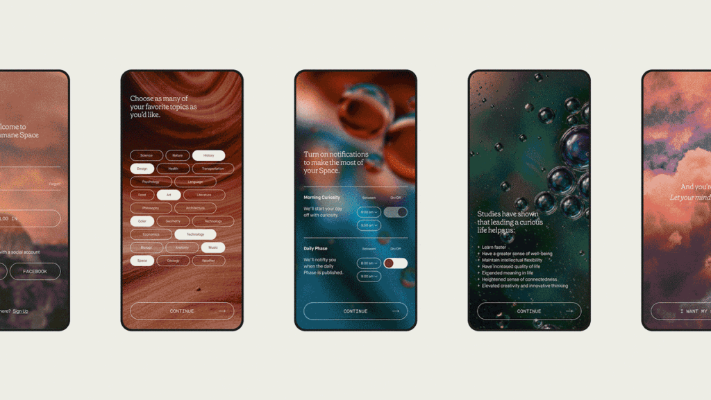
The typography for The Humane Space is intentionally warm and is set to create a feeling of personal discovery.
5. Color
As we keep repeating, typography isn’t just about identifying the font to use; it’s about carefully considering how those fonts are presented as part of your brand experience, and generating the set of rules for how they are applied to your materials.
The color of text affects both readability and mood, while also immediately conveying the brand personality. Color should help reinforce the overall design and contribute to the brand’s visual harmony in a way that makes sense for everyone.
Even seemingly conservative color choices can be compelling. The sharp contrast between black and other colors will have a totally different, bolder feeling than if you choose to play with shades of grey for your text, which may impart a sense of compassion or ease. Don’t consider color in a silo: depending on your personality and both the size and spacing of your characters, color may complement or impact other style choices, allowing you to fine-tune your visual messaging.

Hybrid medical startup Author Health employs a color palette outside the norm in its space, instantly reinforcing its status as a disruptive force while staying true to its organic, grounded nature.
6. Adaptability
Typography choices need to work across channels to display across both digital screens and print effectively. Typography must be versatile enough to maintain its integrity across these different platforms. Fortunately, typefaces are increasingly designed to be optimized for web and mobile interfaces in addition to print, as the public increasingly recognizes the need for mobile-friendly, accessible communication.
The ways fonts interact with other design features—from contrast through colors—is important. How well do fonts scale up in size and maintain both identity and legibility? When put together, do your brand choices create the expected (and desired) experience?
We hope this piece has given you a bit of a framework for considering your brand typography, and having discussions—whether internal or with your branding agency—about opportunities to improve.
We’ve included some examples here, but check out our Case Studies for a deeper dive into how we collaborate with our clients to build out their brands.